

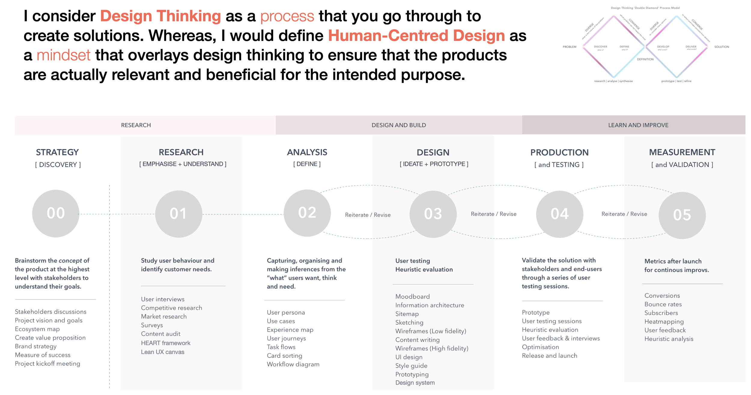
SaaS Experience
Product Design, UX & CRO
at GBG / Loqate
Over the past decade at GBG/Loqate, my role evolved across three deeply connected paths: Product Design, UX Design, and CRO.
Roles evolved, the core stayed constant: translating complex technical capability into clear, trustworthy, revenue-driving product experiences. I design where user behaviour, product strategy, and system constraints meet, using clarity to reduce friction, build trust, and drive adoption.
Disclaimer: Due to the sensitive nature of location, identity, and fraud-related products, I’m unable to share detailed project screens or client-specific information.
Product Design for SaaS Platforms
My work combines product design, behavioural UX, and growth optimisation within SaaS environments, particularly across location intelligence, identity verification, fraud prevention, and address services.
These are not “just” products people “browse”. They are products people rely on. I design experiences where accuracy, speed, and trust are non-negotiable, where design decisions directly influence conversion, compliance, and long-term customer value.
-
I design scalable SaaS products that sit inside complex, business-critical workflows, with a focus on clarity, usability, and platform growth.
Design intuitive flows that support confident, efficient decision-making
Simplify complex systems into clear, usable experiences
Improve onboarding and activation for both technical and non-technical users
Embed behavioural insight and CRO principles into core product journeys
The outcome is reliable, thoughtful SaaS products that reduce cognitive load and scale gracefully as complexity grows.
-
I design end-to-end SaaS experiences that help people understand, adopt, and rely on products over time, not just individual screens.
Owned UX across onboarding, activation, daily use, and edge cases
Designed flows that help users see value quickly without feeling overwhelmed
Balanced user needs with product strategy, roadmap priorities, and business goals
Contributed to scalable design systems to keep growing products consistent and usable
For me, good UX shows up when people feel confident using a product, make fewer mistakes, and trust it as part of their everyday work.
-
Alongside product UX, I build behavioural optimisation into the product lifecycle, focusing on where hesitation actually shows up.
Analysed behaviour across funnels, forms, and conversion-critical moments
Identified points where users questioned accuracy, legitimacy, or next steps
Designed and tested UX, copy, and interaction changes to improve completion and adoption
Used evidence and real behaviour to guide decisions, not opinion
In trust-based SaaS products, conversion isn’t about persuasion. It’s about removing doubt at the moment it appears.
-
I approach digital marketing as an extension of product design, focusing on how messaging, UX, and behaviour work together across the customer journey.
Align positioning and messaging with real user intent
Design acquisition and onboarding flows that reduce hesitation
Use behavioural insight to improve conversion across touchpoints
Embed CRO thinking into product and content decisions
The result is growth that feels natural, built on clarity, trust, and a product experience that supports users from first touch through long-term use.
-
I approach SaaS product design as a strategic craft, not just delivery.
Design for real behaviour, not assumptions
Think in systems, journeys, and outcomes
Focus on clarity and trust over surface polish
Comfortable working where scale, regulation, and responsibility meet
Whether I’m designing complex workflows or everyday product moments, the goal is always the same: help people move forward with confidence and speed, while the product grows in a way that feels calm, reliable, and sustainable.
Where Product Design, UX, and Behaviour Meet
I design enterprise and hospitality SaaS products and platforms where getting it right matters and getting it wrong is expensive. In these environments, design isn’t visual polish, it’s the difference between hesitation and action, doubt and trust. I specialise in making complex systems usable. Products like identity, location, and fraud tools sit quietly behind major business decisions, and my job is to turn that complexity into clear, reliable experiences that scale.
Grounded in real behaviour and constrained by real systems, my work focuses on building products people trust, adopt quickly, and continue to rely on.
-
I think in terms of systems, behaviour, and decision-making rather than screens or features. My starting point is always how people hesitate, decide, and move forward, especially in complex or high-stakes environments.
Clarity is not a nice-to-have, it’s the product.
-
I work iteratively and evidence-led, combining research, design thinking, and testing to reduce risk early. I prefer small, deliberate decisions over big design reveals, using feedback loops to shape direction as the product evolves.
-
I work closely with product, engineering, marketing, and commercial teams to align product UX decisions with real constraints and goals. I’m comfortable translating between disciplines, ensuring design intent supports delivery, scalability, and outcomes.
-
I take ownership beyond design artefacts, caring about how decisions perform once they’re live. I’m invested in outcomes, adoption, engagement, conversion, and long-term trust, not just how something looks at launch.
Designing for Adoption, Not Just Activation
-
![Product Onboarding & Early Value Activation]()
Product Onboarding & Early Value Activation
I designed onboarding flows that moved users into core product workflows, accelerating time to first value and driving sustained adoption.
-
![Product UX Design]()
Product UX Design
Creating UX for SaaS products that reduces cognitive load, supports real user behaviour, and performs in high-intent, business-critical moments.
-
![Product Demo Experience & Adoption Design]()
Product Demo Experience & Adoption Design
I designed demo experiences that mirrored real product use, enabling safe exploration of core workflows and driving adoption intent.
-
![Developer Experience & Self-Serve Enablement]()
Developer Experience & Self-Serve Enablement
I streamlined developer journeys by optimising documentation, onboarding flows, and self-serve paths to support faster activation and adoption.
-
![UX Testing & Mental Model Insights]()
UX Testing & Mental Model Insights
I used usability testing to uncover user hesitation and mental models, shaping clearer flows, stronger affordances, and more confident product decisions.
-
![A/B Testing, UX Validation & CRO]()
A/B Testing, UX Validation & CRO
I ran controlled experiments to validate UX and messaging decisions, reducing friction and improving conversion across key product and acquisition flows.
-
![Product-Led Optimisation & Adoption]()
Product-Led Optimisation & Adoption
I drove ongoing, product-led optimisation by refining core workflows, interaction patterns, and system feedback to support sustained adoption.
-
![Research-Driven Product Iteration]()
Research-Driven Product Iteration
Research didn’t sit in a document, it directly drove meaningful product design changes, accelerating iteration and improving usability and adoption.
-
![Usage-Led UX Optimisation]()
Usage-Led UX Optimisation
Product interactions, drop-offs, and repeat behaviours informed continuous UX refinement, ensuring the experience evolved from real user behaviour.
-
![Designing Personalised Experiences]()
Designing Personalised Experiences
Personalisation was driven by behaviour using real usage signals to adapt content, flows, and messaging to user intent.
-
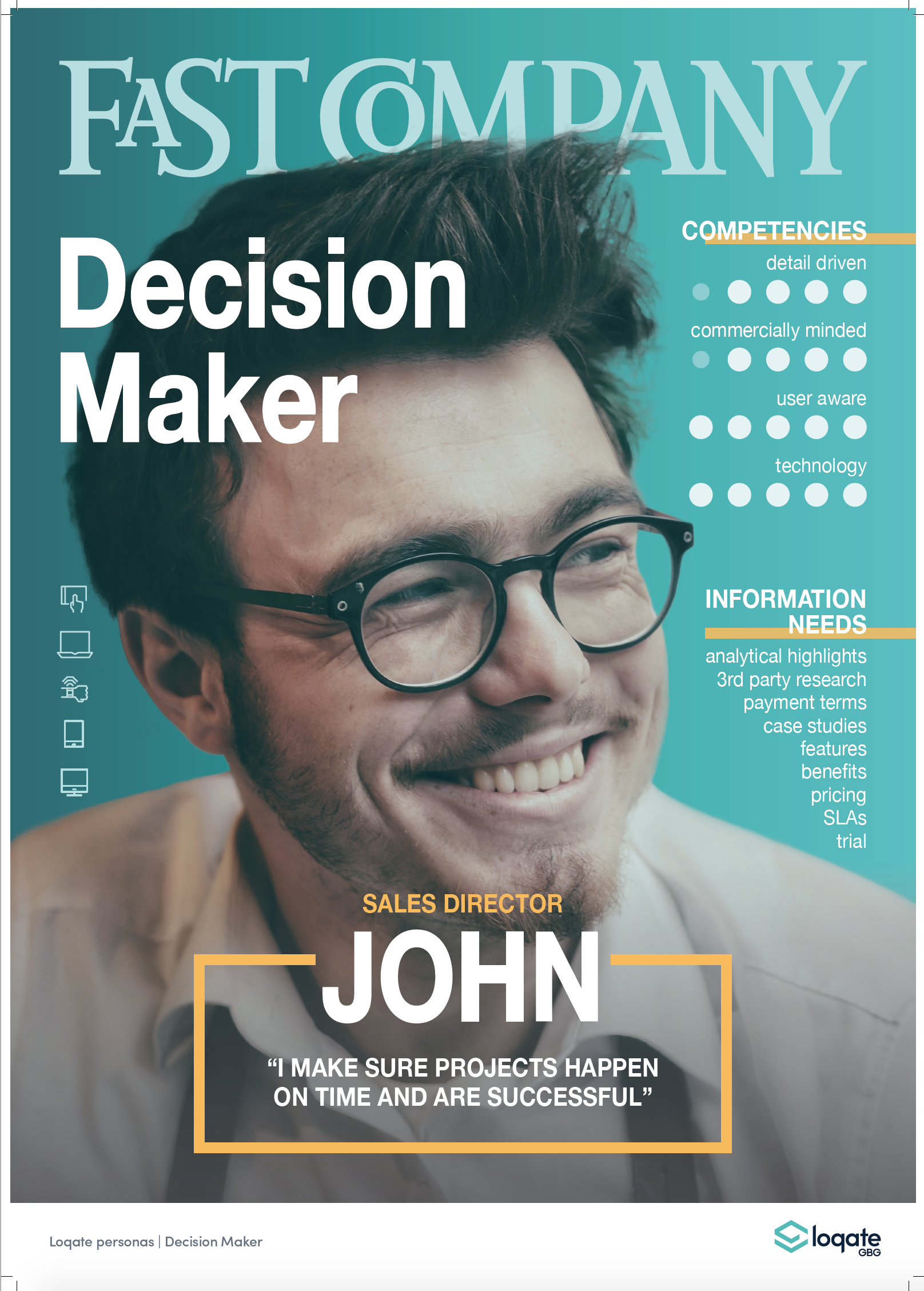
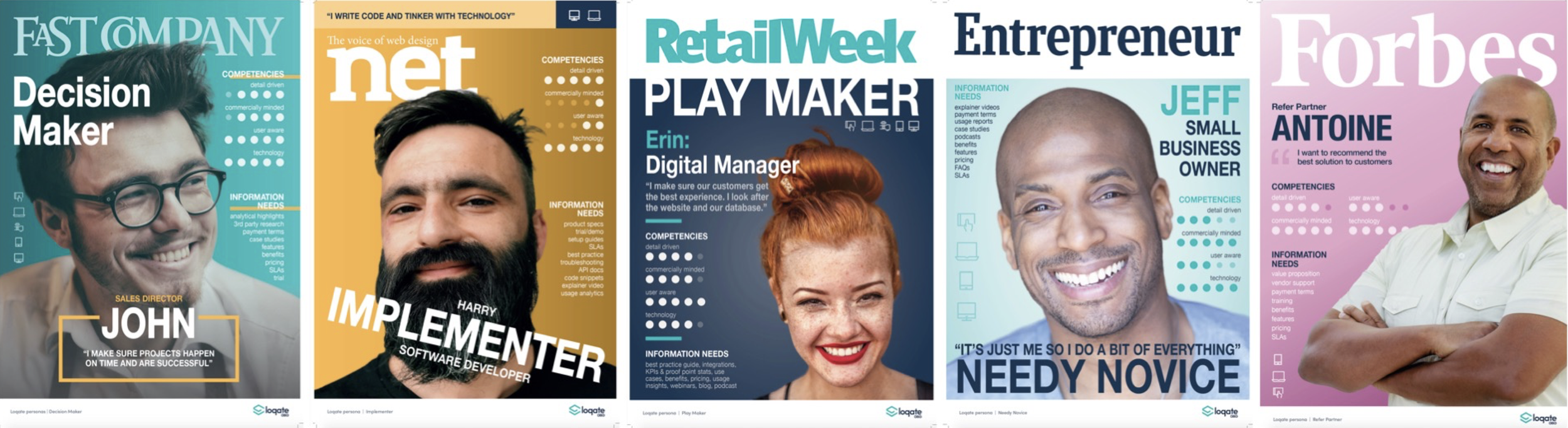
![UX Personas]()
UX Personas
I built personas from real user behaviour, combining qualitative insight and usage patterns to shape product flows, content, and experiences.
-
![Product User Testing]()
Product User Testing
I embedded user testing across the product lifecycle, using real tasks to validate assumptions, uncover friction, and refine product flows.
-
![Product Best Practice Reports]()
Product UX Customer Consultancy
I created best-practice guidance by synthesising research, usage data, UX testing, and customer reviews into clear, actionable insights.
-
![Partner Marketing UX]()
Partner Marketing UX
Partner journeys were explored through low-fidelity + high-fidelity designs, aligning messaging and flows for partner engagement.
-
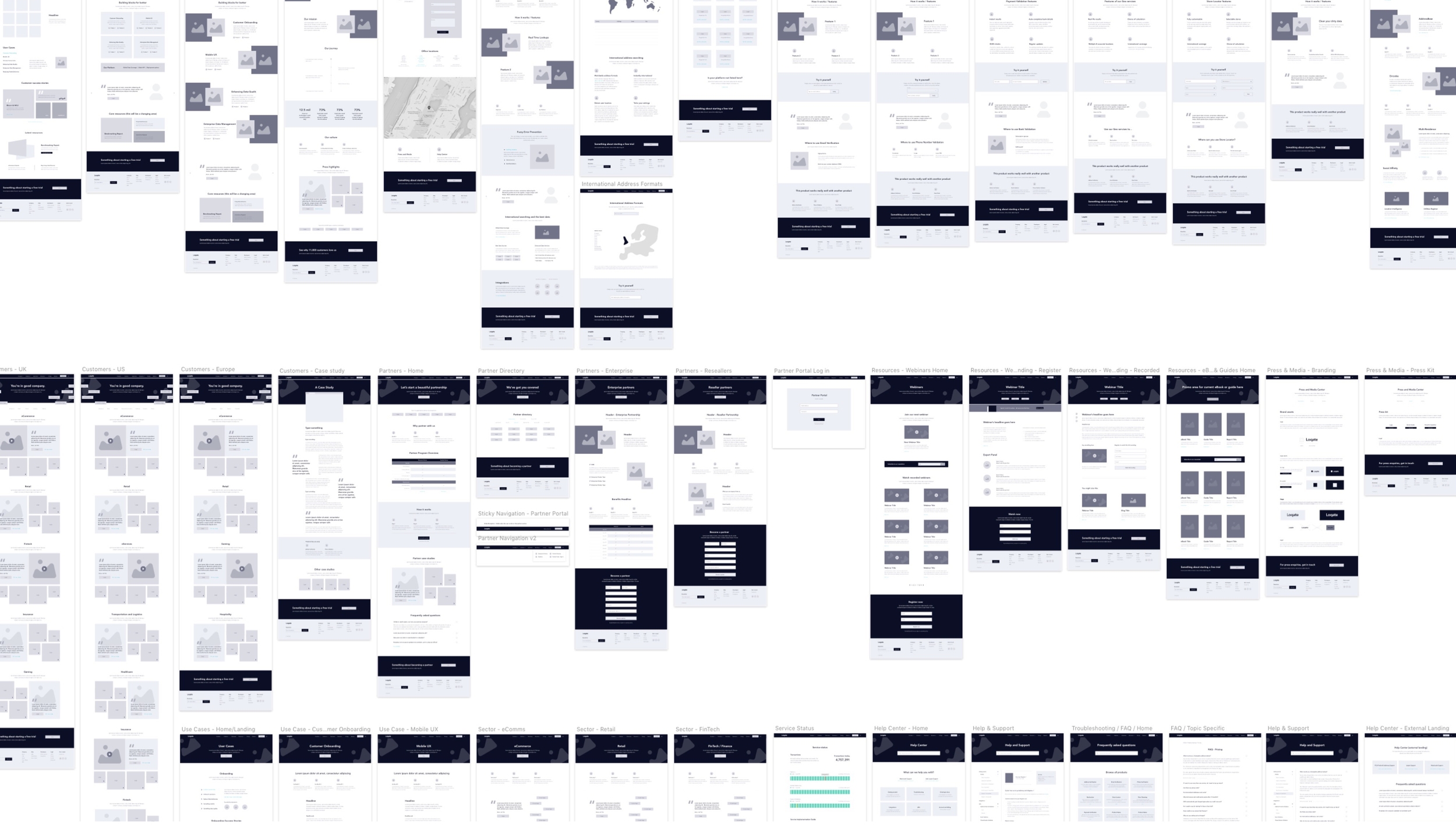
![Wireframing, UX Testing & CRO for Loqate Website]()
Wireframing, UX Testing & CRO for Loqate Website
I led wireframing and UX testing for Loqate’s website, validating layouts, messaging, and user flows through CRO insights.
-
![Human-Centred by Design]()
Human-Centred by Design
Design thinking gives structure to my work, while human-centred design ensures the outcome truly matters to the people using it.
-
![Website Restructure, IA & Conversion-Focused UX]()
Website Restructure, IA & Conversion-Focused UX
I redesigned Loqate’s website IA and UX around user intent and decision journeys, improving clarity and conversion through testing and CRO insights.
-
![CRO Experiments and Testing]()
CRO Experiments and Testing
A CRO experiment testing clearer navigation hierarchy, simplified labels, and improved product grouping to reduce cognitive load and help users find the right solution faster.
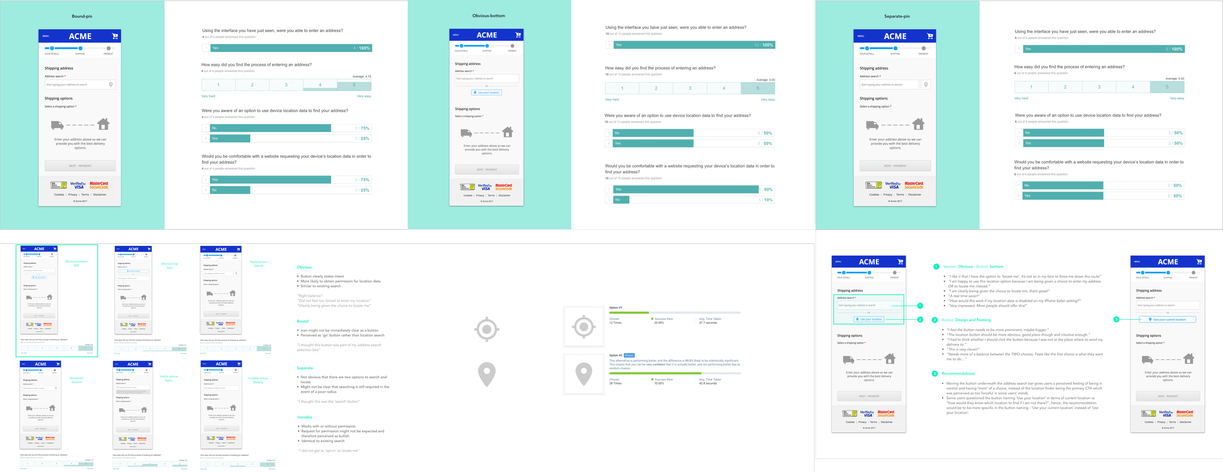
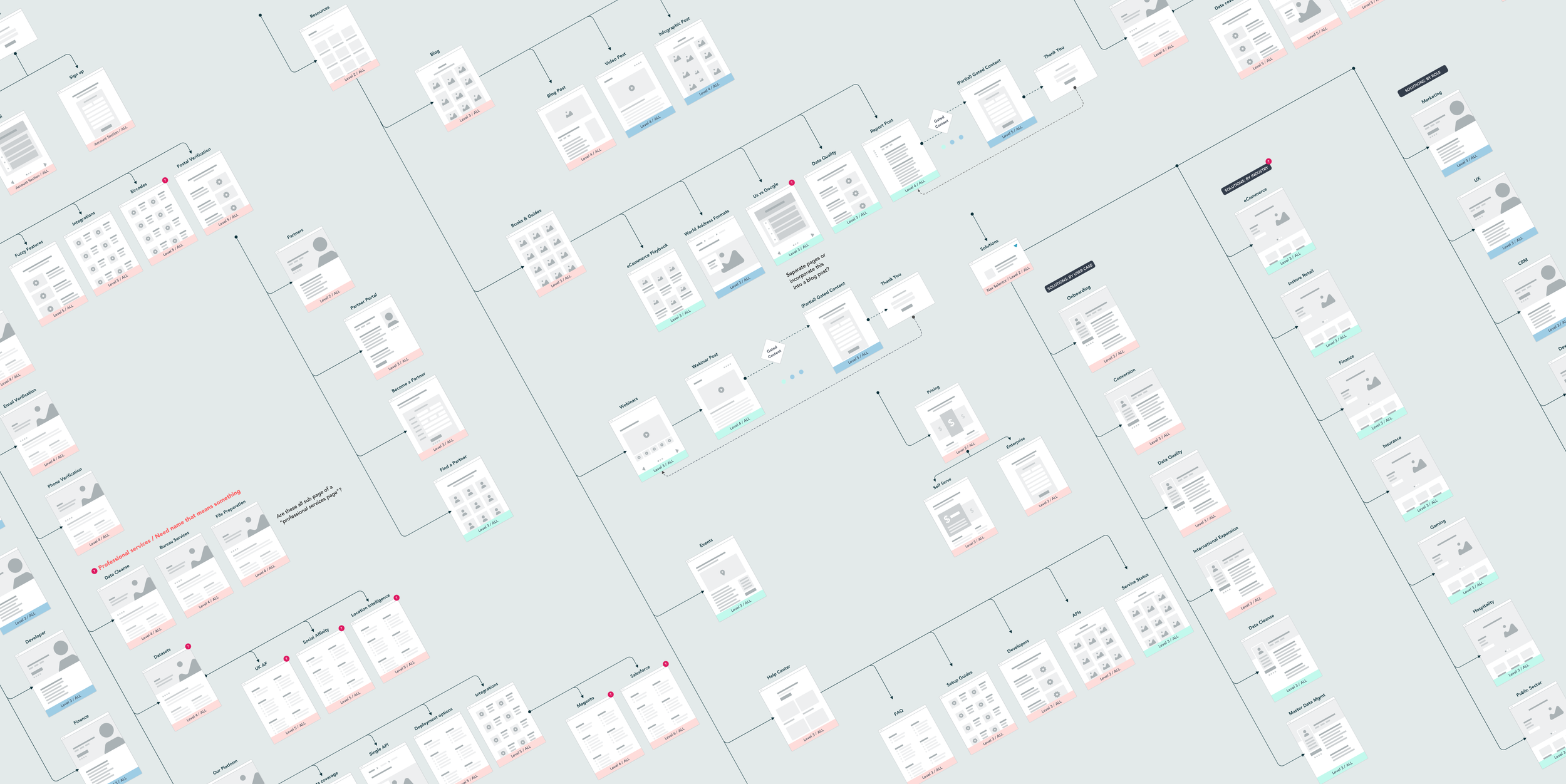
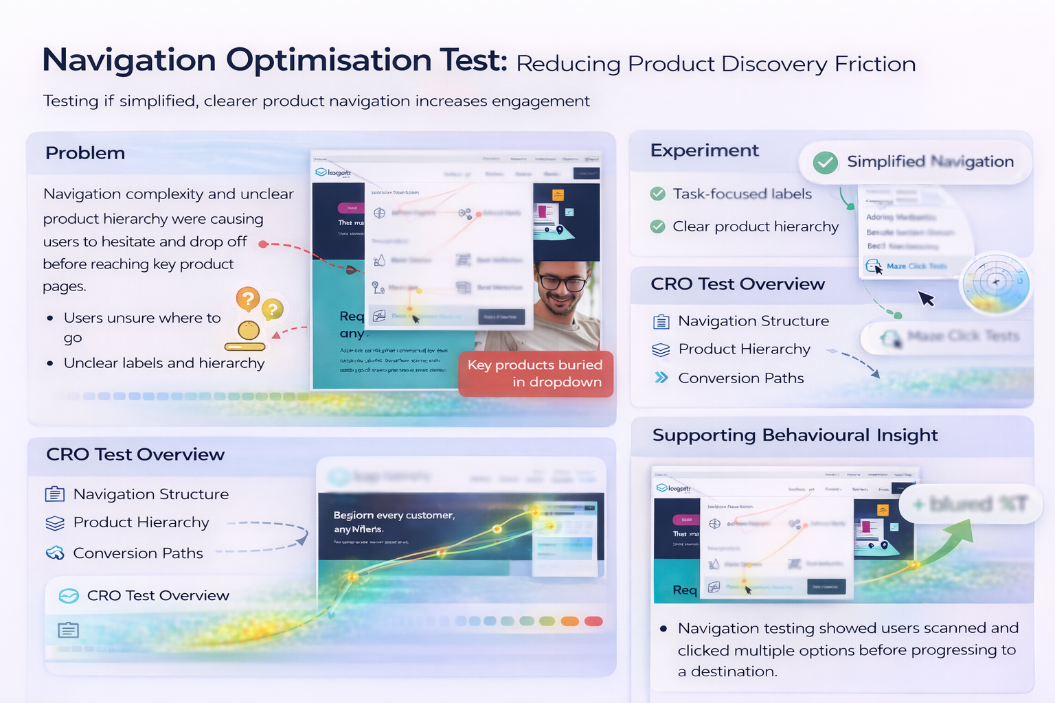
Good Product Design / UX doesn’t remove complexity, it organises it.
… and that belief sat at the centre of my role at GBG / Loqate. I worked on highly technical SaaS products where complexity is a feature, not a flaw, because precision, compliance, and trust are non-negotiable. My focus was on structuring that complexity into clear journeys, predictable patterns, and progressive disclosure so users could move quickly without losing confidence. Rather than oversimplifying, I designed interfaces that explained what was happening at the right moment and in the right amount. This approach consistently reduced friction, improved decision-making, and helped users feel in control inside business-critical workflows.

I believe the best products combine user-centred design with data-driven optimisation, creating experiences that are both enjoyable and effective.
Designing clarity, trust, and transparency across the user journey
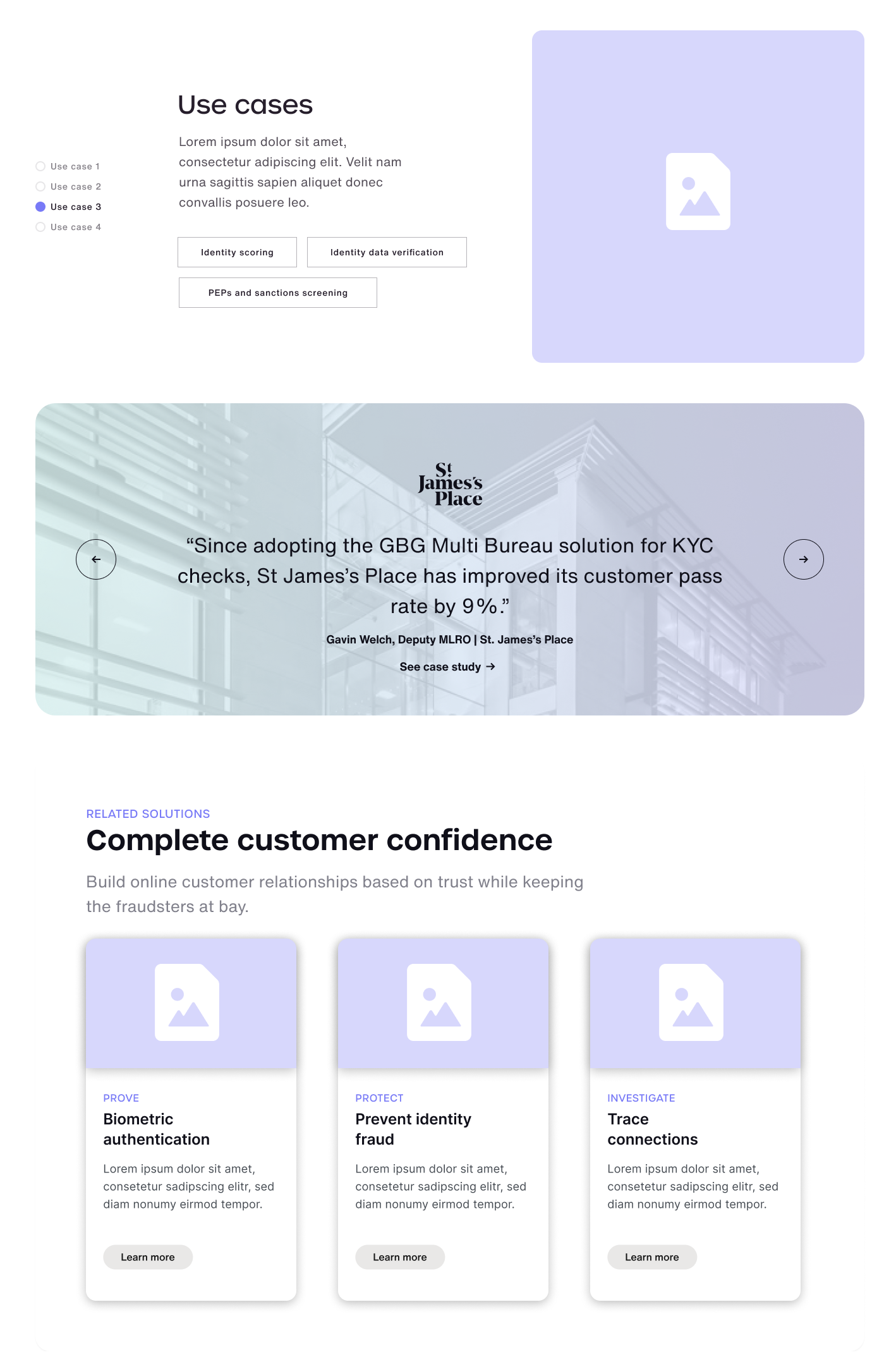
Use cases for instant clarity
Use cases help users quickly recognise relevance by framing complex capabilities in familiar scenarios, reducing effort and speeding up understanding.
Trust designed into the UI
Trust signals are embedded directly into the experience, reinforcing credibility at key decision points without adding friction or noise.
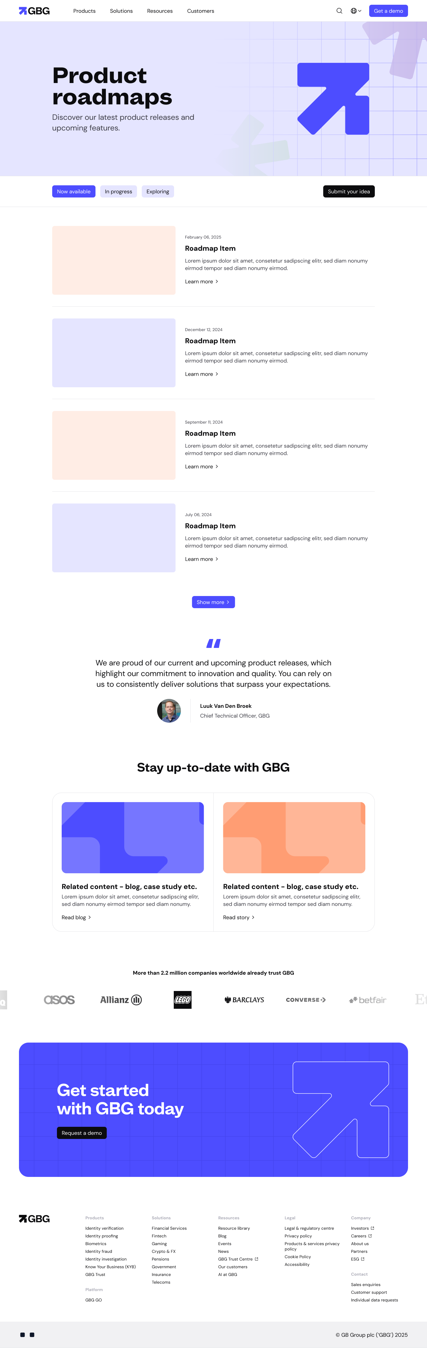
Roadmap as part of the experience
A visible roadmap builds confidence by showing progress and intent, positioning the product as transparent and continuously evolving.
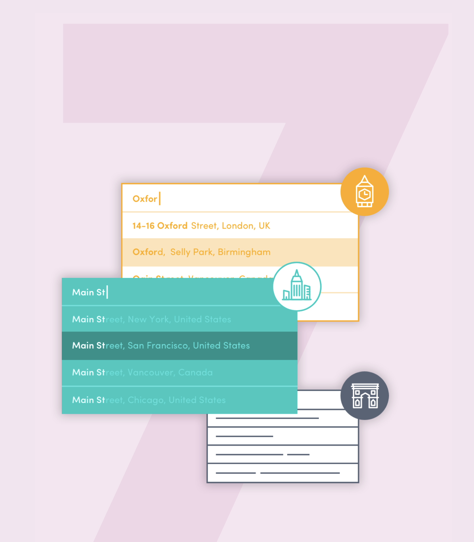
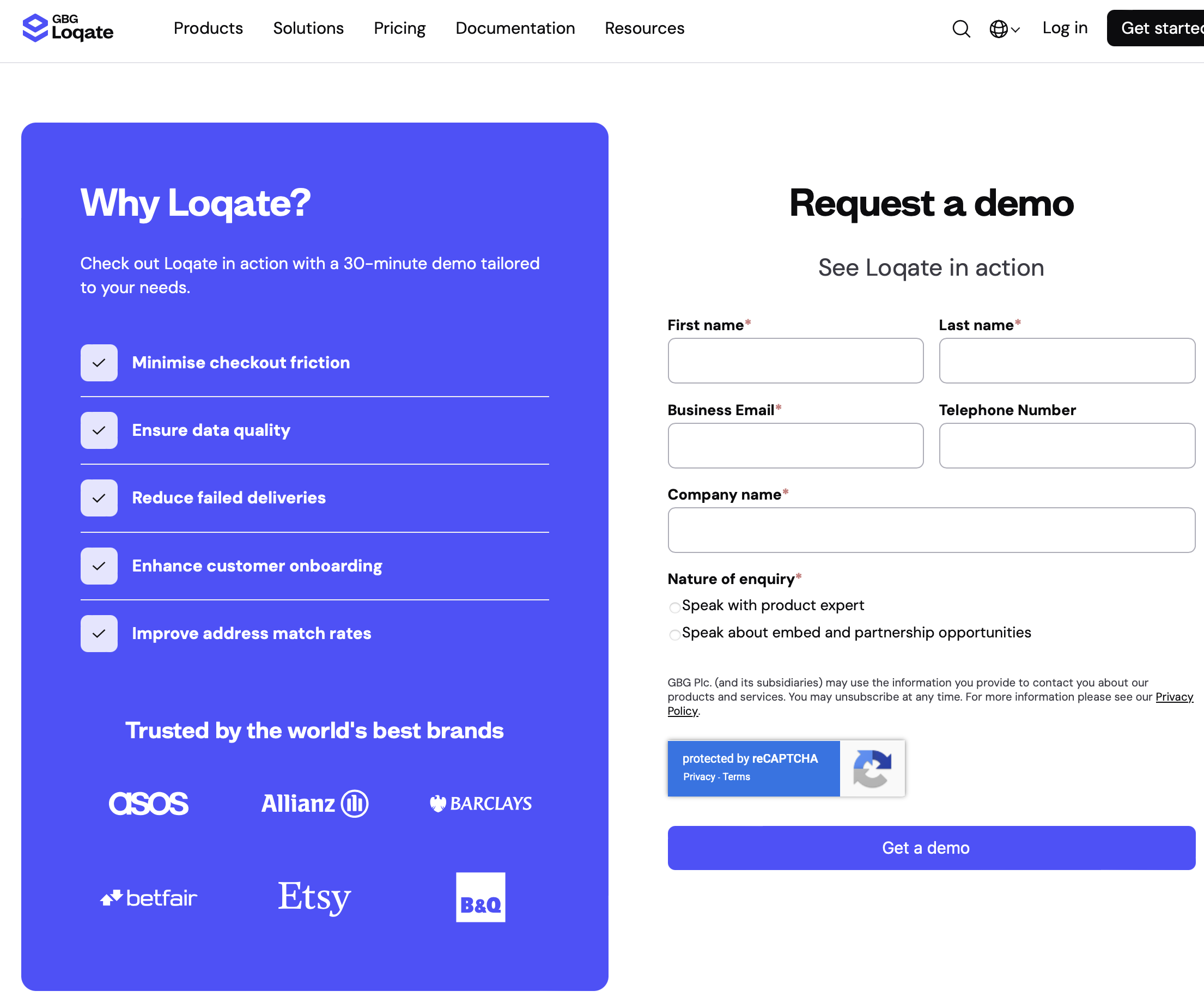
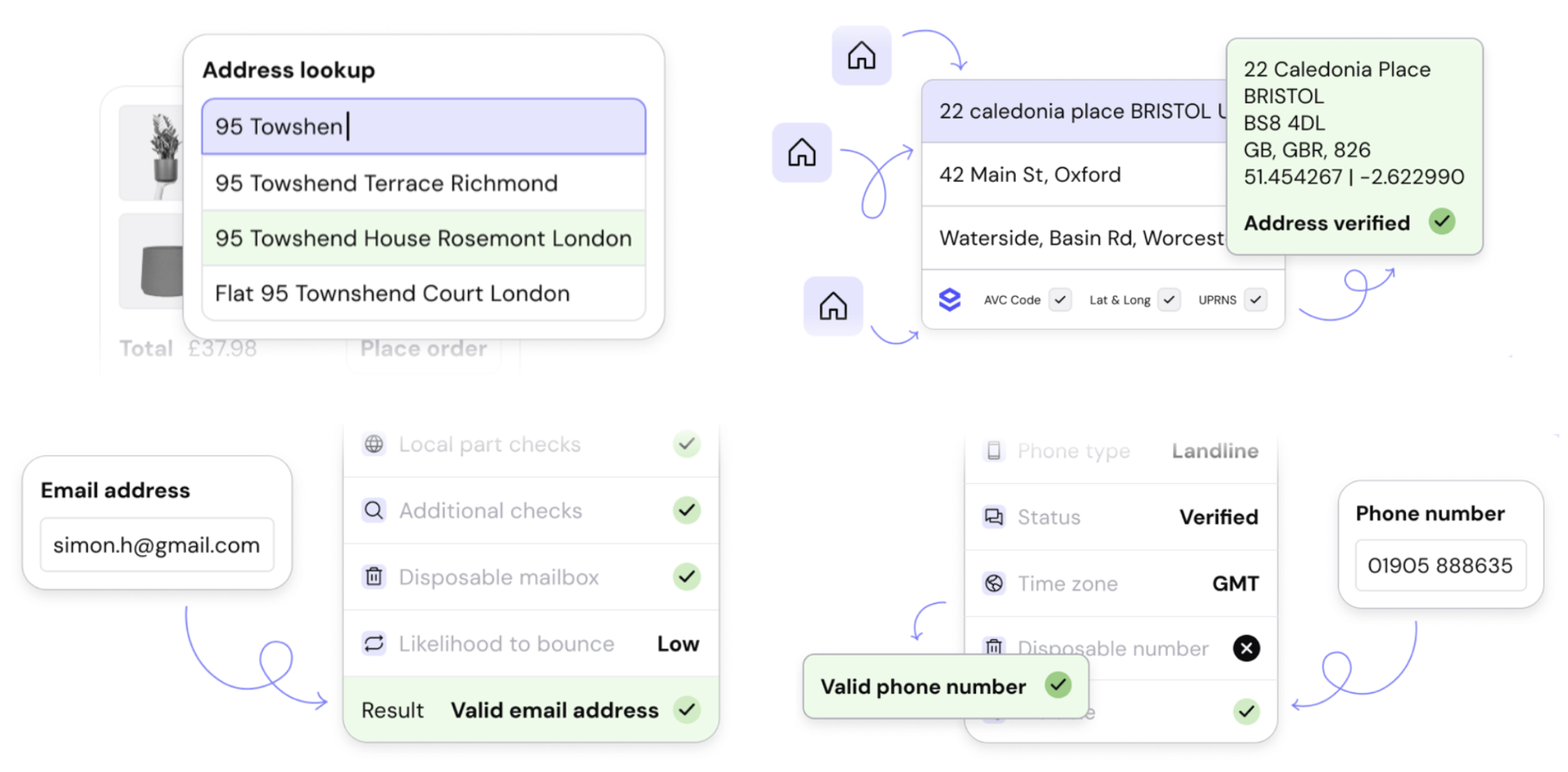
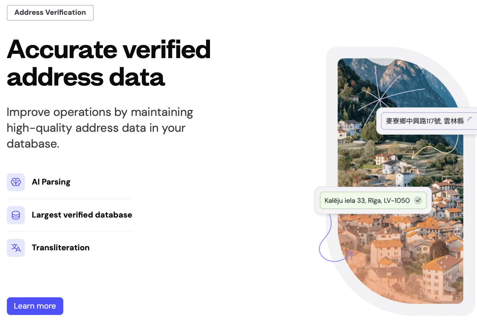
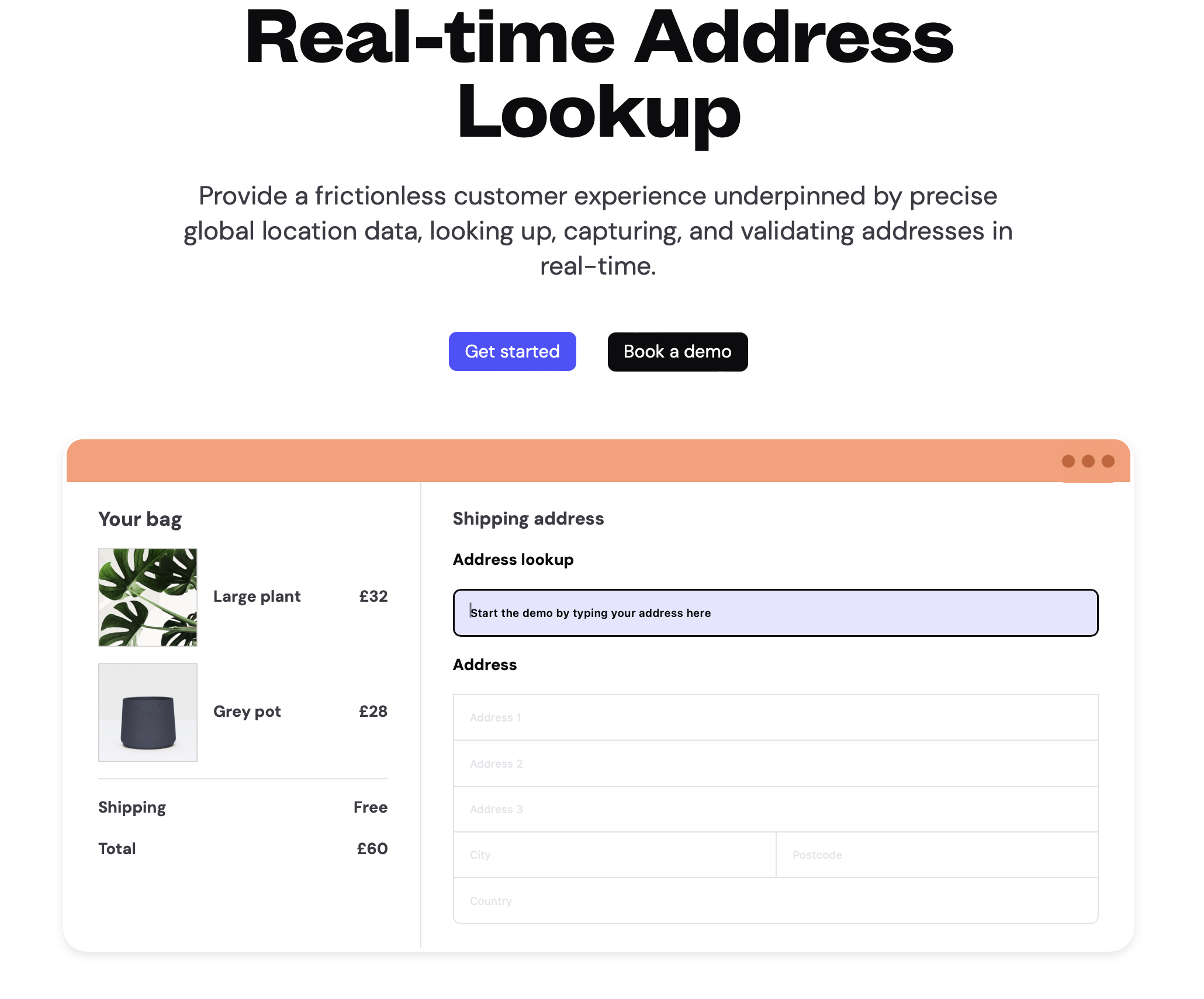
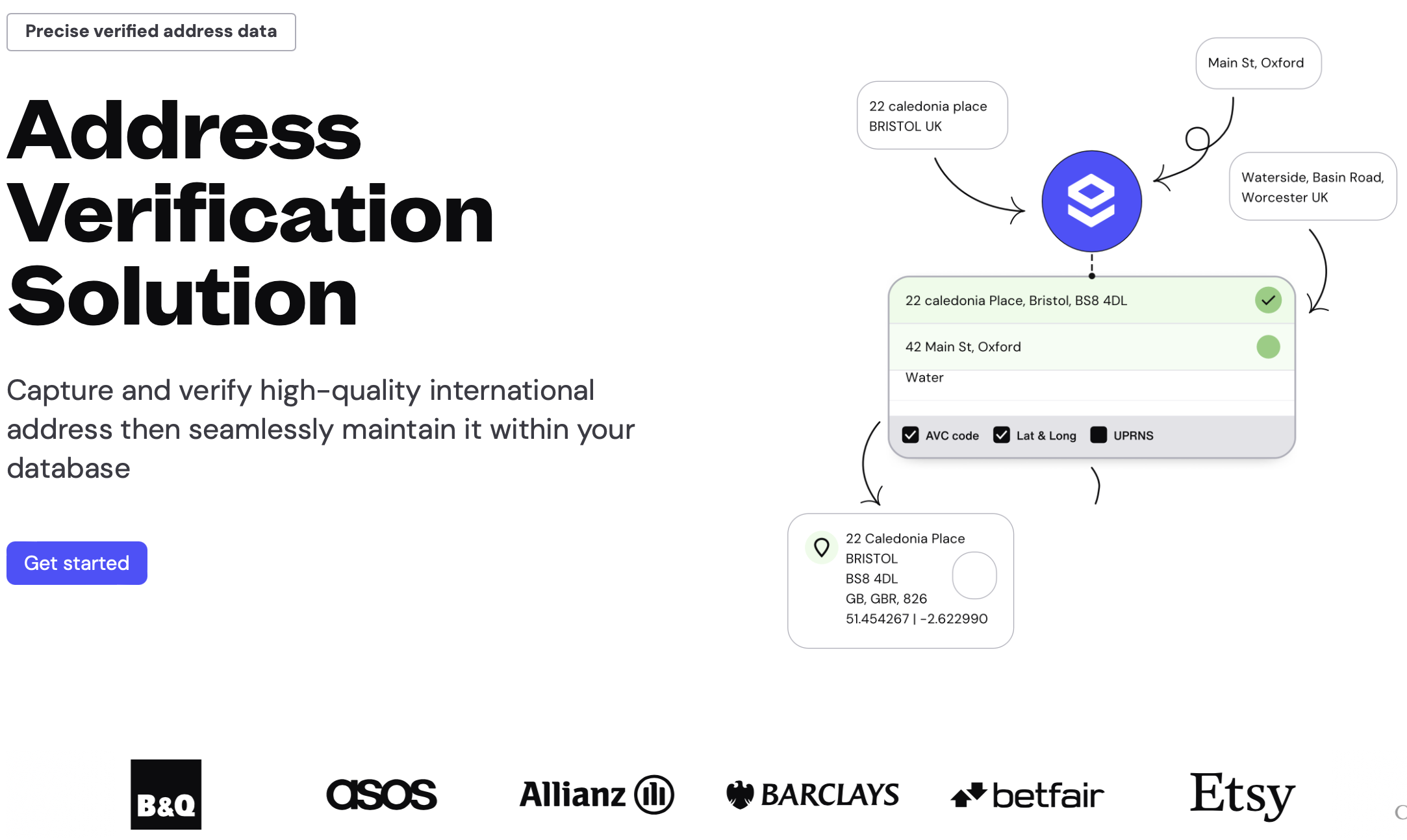
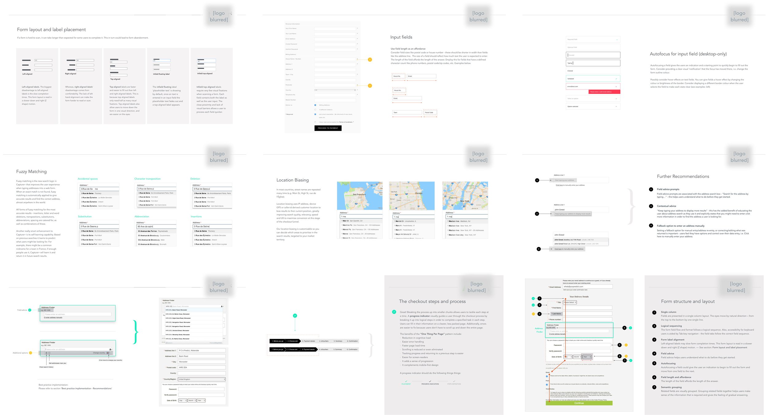
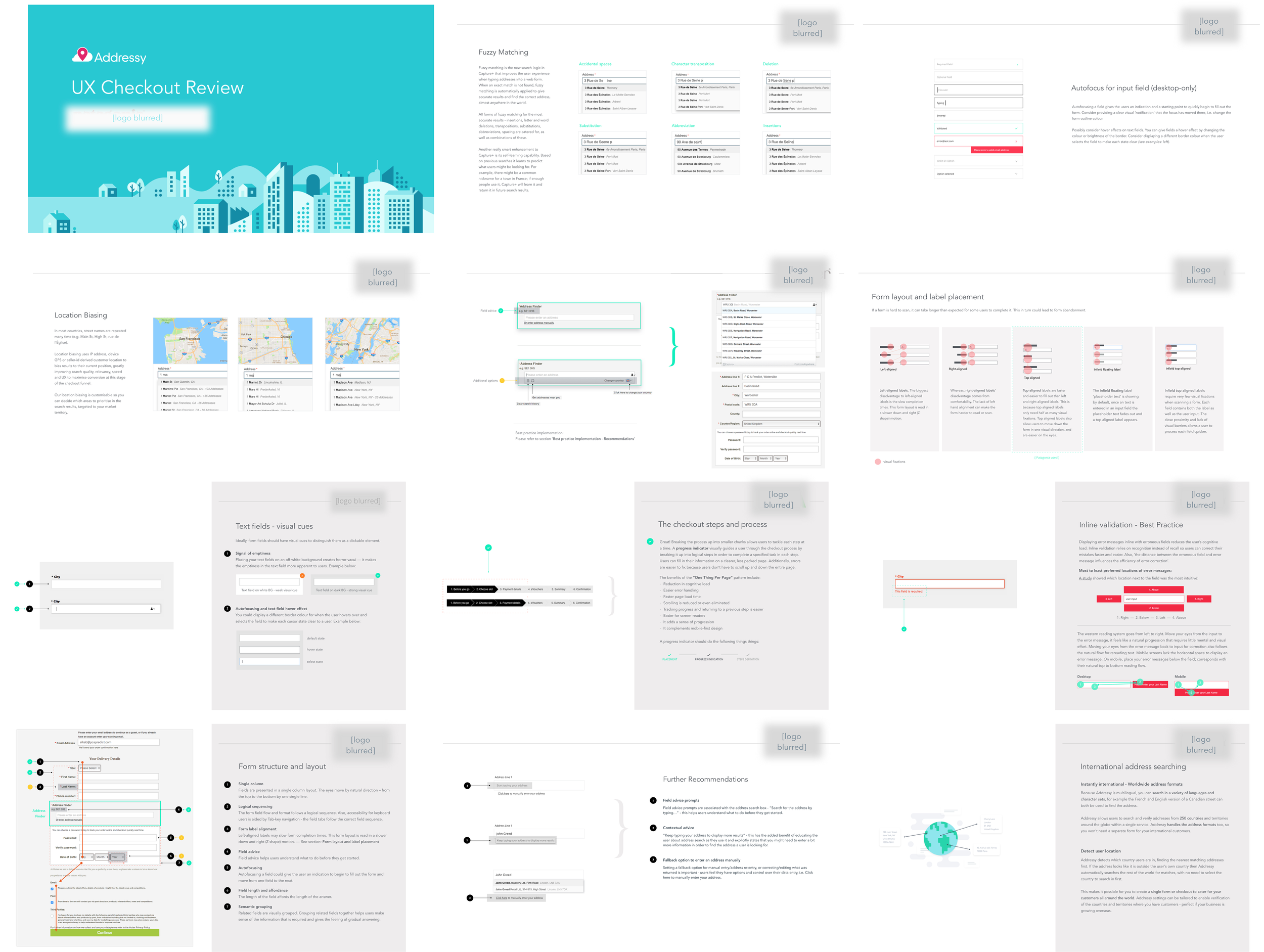
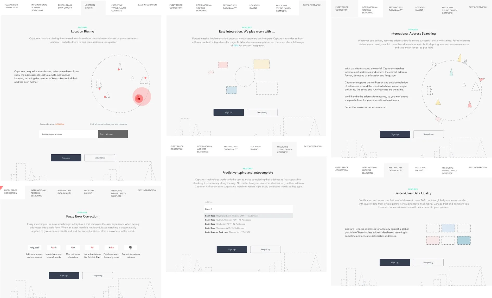
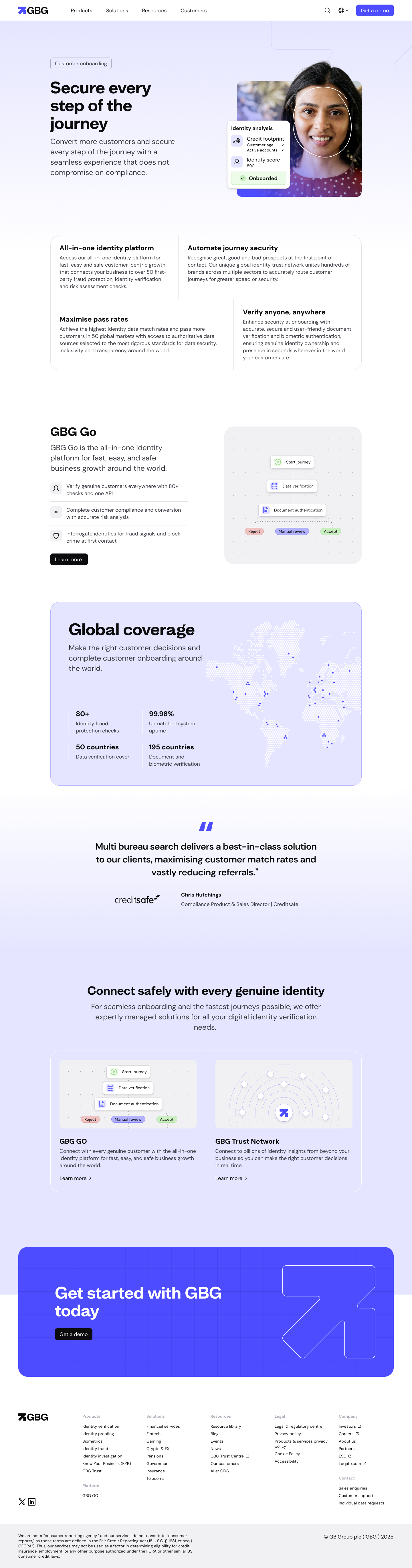
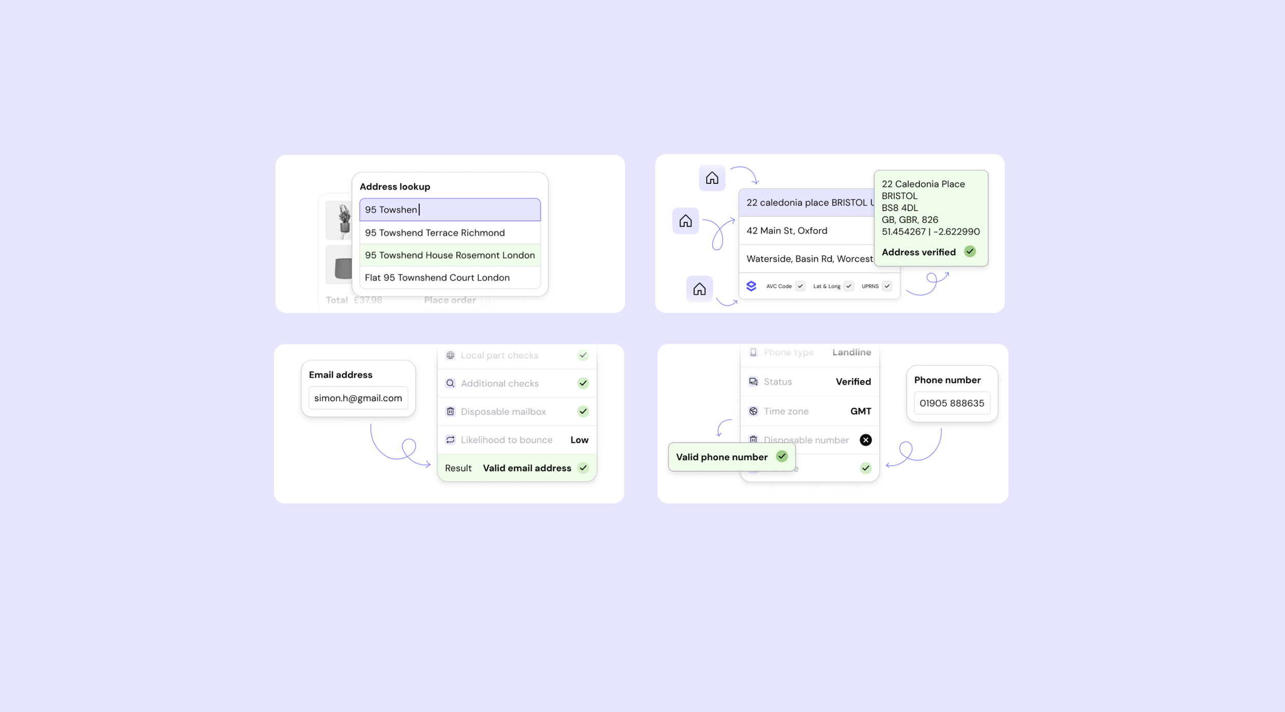
Project Overview: Address Verification SaaS Platform
Product Design for Address Verification
The Loqate address verification platform is a global SaaS product designed to help businesses capture, verify, and standardise postal addresses accurately across international markets. Used within high-impact moments such as checkout, onboarding, and form completion, the product plays a critical role in reducing friction, preventing errors, and improving conversion and data quality at scale.
I approached this project as a product UX and design challenge, not a technical validation tool. The goal was to design an experience that feels fast, reliable, and invisible when it’s working well, while still giving users clarity and control when things go wrong. Address verification is inherently complex, involving international formats, partial inputs, edge cases, and system confidence scoring. The design challenge was to translate that complexity into an interface that feels calm, predictable, and easy to trust.
The result was a more intuitive, behaviour-led product experience that balanced automation with transparency, delivering a 78% reduction in address data entry time and a 20% reduction in input errors. This measurably improved usability and reduced friction in key user flows, while reinforcing Loqate’s role as a dependable infrastructure product.
—
What I Learned, the Challenges I Met, and My Biggest Takeaway: This project reinforced that great UX often goes unnoticed. When address verification works, it disappears; when it fails, frustration is instant. Designing for pressured, mid-task moments, often on mobile, meant refining feedback, prediction, and error language to reduce uncertainty without adding cognitive load. Address verification isn’t a destination, it’s a dependency, and success is measured in calm, predictable behaviour, fewer errors, and faster completion, because when systems feel trustworthy, users move forward without hesitation.
-
Address verification is a critical product dependency, influencing data quality, conversion, and trust, while operating under high variability and time pressure.
Address formats vary widely by country, region, and language
Users often enter incomplete, misspelled, or informal information
Errors surface at high-stakes moments like checkout or signup
Too much system feedback creates friction, too little reduces trust
Outcome Focus
The challenge was to design a system that safeguards accuracy without slowing momentum, guiding users quietly, correcting errors gracefully, and enabling confident decisions without interrupting the task at hand. -
Product UX and product design
UX research and usability studies
Interaction design and behaviour mapping
Error handling and feedback design
Cross-functional collaboration with product and engineering
-
I focused on behaviour-driven design, starting with how users actually enter addresses rather than how systems expect addresses to be structured.
This included:
Mapping real-world address entry behaviours
Identifying hesitation points, corrections, and abandonment triggers
Designing progressive feedback rather than immediate interruption
Aligning UX patterns with user mental models, not backend logic
-
From a product design perspective, the work centred on:
Clear visual hierarchy in suggestion lists
Predictable interaction patterns across markets
Subtle system feedback that reassures without distracting
Designing for speed, especially in transactional contexts
The interface was intentionally restrained. The product needed to feel reliable and invisible, not clever or expressive.
-
UX decisions focused on:
Reducing cognitive load during address entry
Designing forgiving flows for partial or incorrect input
Improving clarity around system confidence and suggestions
Supporting both automated and manual correction paths
The aim was to let confident users move quickly while supporting uncertain users without judgement or friction.
-
Research included:
Reviewing usability data from real customer implementations
Analysing error patterns and abandonment points
Collaborating with stakeholders to understand industry-specific needs
Validating assumptions through usability testing and behavioural analysis
Rather than asking users what they wanted, the focus was on observing where they struggled, paused, or second-guessed themselves.
-
Usability testing revealed that:
Timing of feedback mattered more than the amount of feedback
Language choices strongly influenced trust in system suggestions
Users preferred confirmation through behaviour, not explanation
Small delays or unclear states disproportionately increased frustration
These insights directly informed interaction refinements and micro-copy decisions.
-
The work delivered a behaviour-led product experience that prioritised speed, accuracy, and trust at scale.
78% reduction in address data entry time
20% fewer input errors at checkout and signup
Less typing, fewer decisions, lower abandonment
Higher data quality and delivery confidence downstream
UX consultancy model for scalable custom enterprise installs
Outcome
By balancing automation with transparency, the product became faster to use, easier to trust, and more reliable in the moments that matter most.
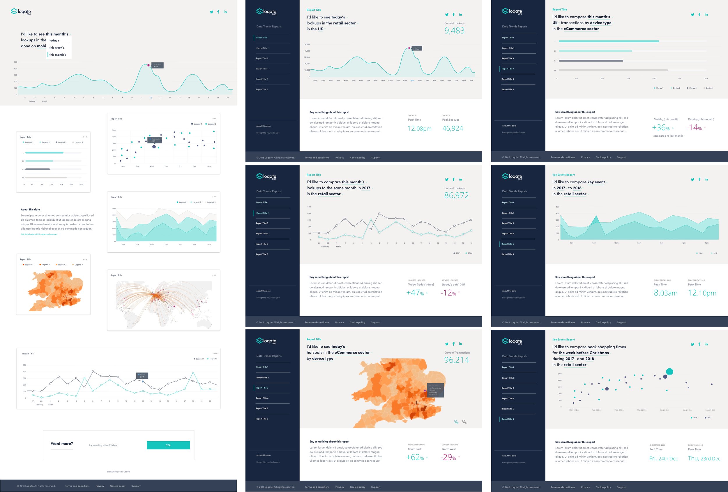
Project Overview: Product Design for Behaviour-Driven eCommerce Intelligence
eCommerce Trends Platform
The eCommerce Trends Platform is a SaaS analytics product designed for eCommerce customers to understand how shopper behaviour changes over time. It combines real-time and historic data to make trends easy to explore, compare, and customise across time, geography, and key events. Instead of a fixed workflow, the product supports insight discovery, helping eCommerce customers move quickly from data to confident, evidence-based decisions.
I approached this project as a product design and UX challenge, not a reporting tool. The focus was on designing an experience that helps users ask better questions, spot behavioural correlations, and build confidence in interpreting data, rather than simply displaying charts. The result is a modular, scalable analytics product that blends data science with UX principles, demonstrating my ability to design insight-driven SaaS platforms where clarity, adoption, usability are as important as the data itself.
—
What I Learned, the Challenges I Met, and My Biggest Takeaway: This project reinforced that data products succeed or fail based on comprehension, not capability. Even the most powerful insights lose value if users can’t quickly understand what they’re seeing or why it matters.
The biggest challenge was designing an experience without a linear “task to complete.” Users weren’t trying to finish a flow, they were exploring, comparing, and forming questions in real time. Solving this meant shifting from traditional funnel thinking to insight-led navigation, where structure, visual hierarchy, and familiar data patterns guided exploration without dictating it. My biggest takeaway is that when users trust the interface, understand the story the data is telling, and feel free to explore without fear of getting lost, insight becomes actionable and adoption follows naturally.
-
Designing for insight rather than conversion meant supporting exploration in a space where users arrive with questions and data complexity can easily block adoption.
Non-linear analytics journeys designed for exploration, not step-by-step tasks
Historic and real-time data unified to enable comparison across time, geography, and events
Flexible filtering and data mixing that surfaces behavioural correlations, not just metrics
Clear, navigable presentation that builds confidence instead of cognitive load
-
Product Designer responsible for UX, interaction design, and insight-led structure.
Defined product UX principles and interaction patterns
Designed user flows, IA, wireframes, and prototypes
Translated data science requirements into usable interfaces
Advocated for UX-led analytics alongside engineering and data teams
I owned the experience layer of the product from concept to launch.
-
UX-Led Analytics, not engineering-first dashboards.
Started with user questions, not datasets
Designed interfaces before data pipelines were finalised
Used familiar mental models to reduce adoption friction
Treated confidence and clarity as core success metrics
The goal was insight delivery, not visual complexity.
-
Designing a system that supports exploration, comparison, and discovery.
Modular dashboard structure for scalability
Clear hierarchy between overview and deep insight
Flexible filtering without disorientation
Separation of insight layers to prevent cognitive overload
The product was designed to evolve without breaking usability.
-
An experience built around “insight stories” rather than rigid flows.
Users move between questions, not steps
Natural language inspired comparisons (e.g. year-on-year events)
Easy navigation between related insights
Clear visibility of applied filters and context
Finding one answer naturally leads to the next question.
-
Pragmatic research grounded in real analytics behaviour.
Leveraged existing personas and prior research
Conducted internal interviews across data, product, and commercial teams
Benchmarked leading analytics dashboards for UX patterns
Identified common UX failures in insight-driven platforms
Research focused on confidence, familiarity, and speed of understanding.
-
Delivered an analytics platform that makes complex data easy to explore, trust, and act on.
Designed non-linear flows and IA to support exploration
Simplified complexity through wireframes and prototyping
Validated behaviour early and refined interactions
Built a modular system for scale and consistency
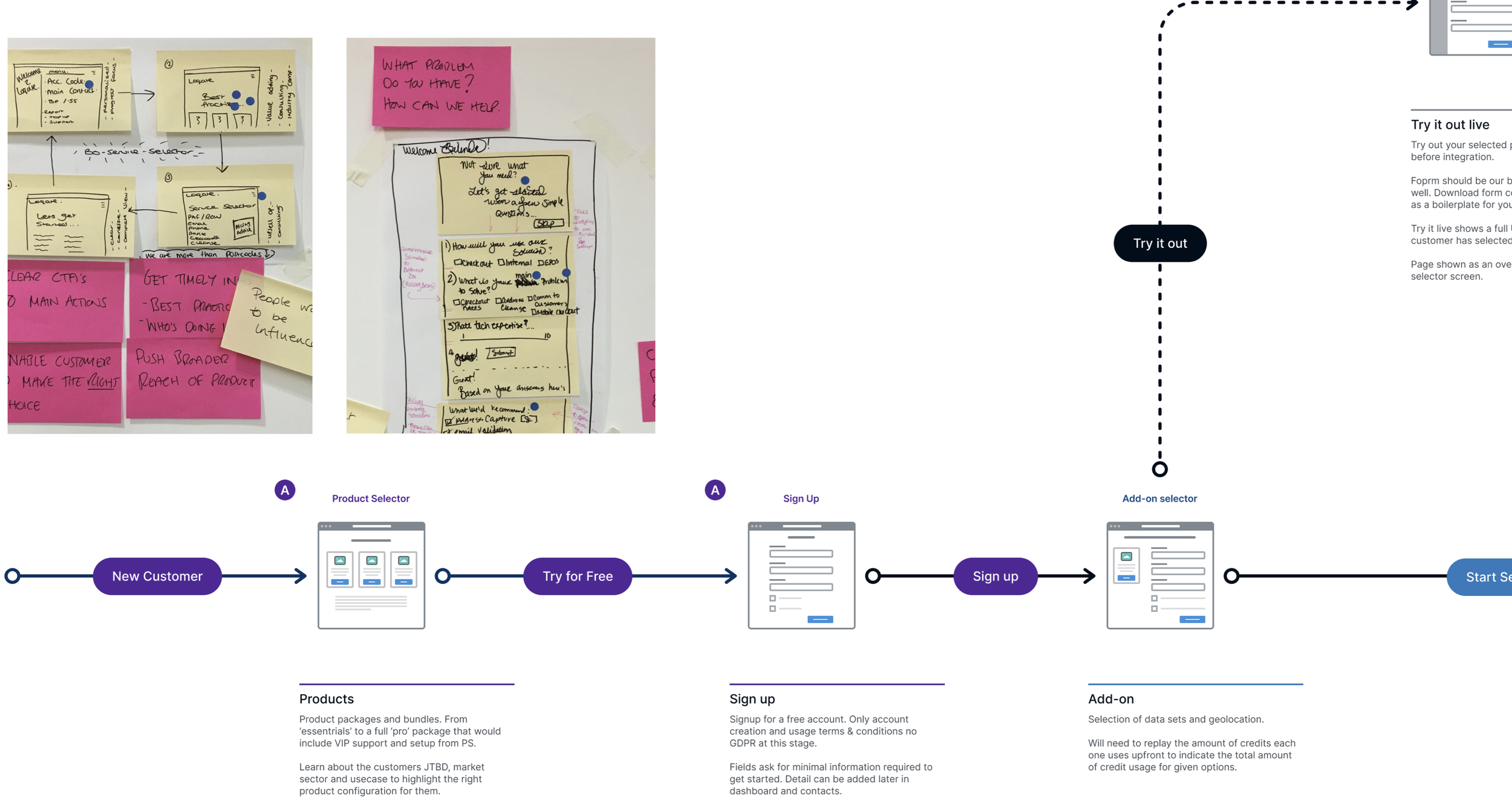
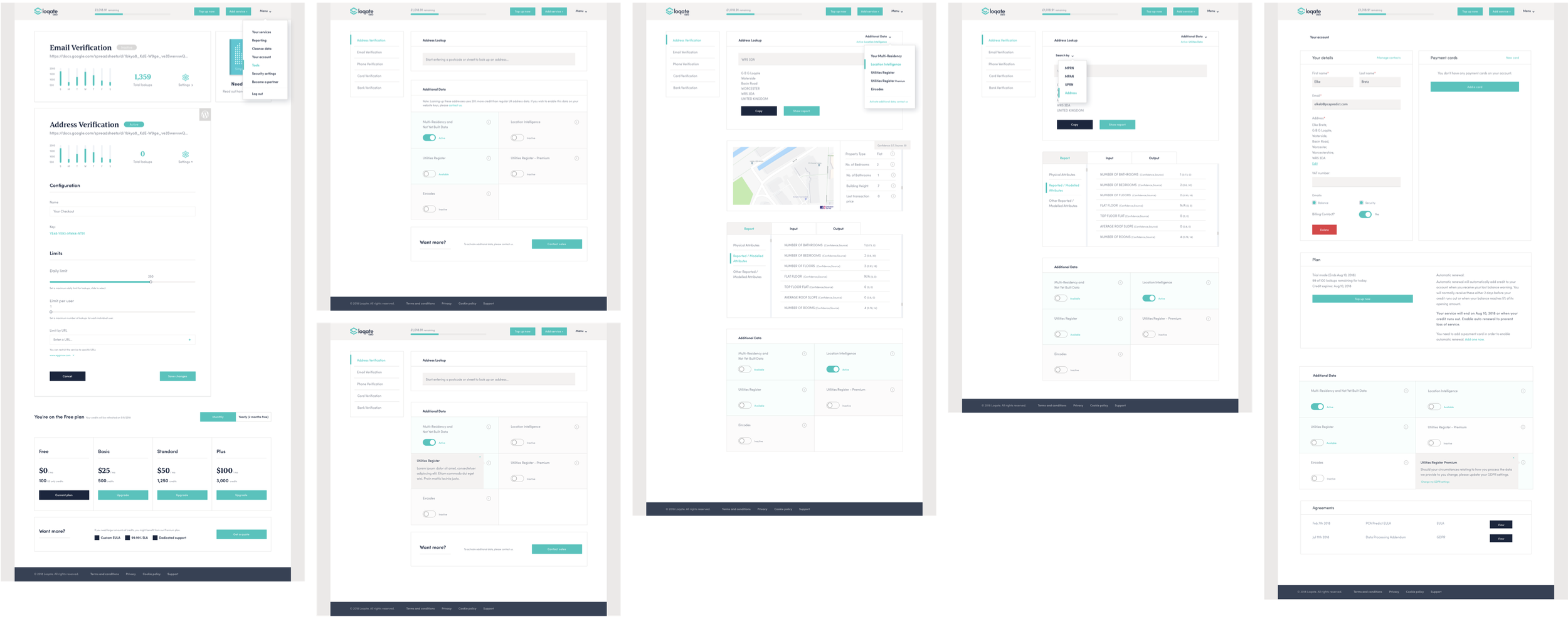
Project Overview: Designing a Location-Based SaaS Platform
SaaS Platform: Address, Identity & Location Services
This project focused on designing a self-serve SaaS platform for address, identity, and location services that makes complex infrastructure products easy to trial, configure, and scale. The platform supports fast onboarding, API-ready integration, and clear visibility into usage, costs, and account health, serving developers, product and operations teams, and commercial users with equal clarity and confidence.
As Product Designer and UX lead, I owned the end-to-end product experience, from website discovery and trial sign-up through onboarding, activation, usage monitoring, and lifecycle communication. The goal was to turn technical, data-driven capabilities into intuitive and scalable product journeys that supported confident decision-making for both technical and commercial users.
The outcome was a SaaS experience that reduced friction, improved activation and engagement, clarified value early, and supported long-term retention through thoughtful UX, behavioural insight, and continuous optimisation.
—
What I Learned, the Challenges I Met, and My Biggest Takeaway… This project reinforced that great SaaS UX is about decision-making, not decoration. The biggest challenge was designing trust without slowing users down. In high-stakes products, clarity must coexist with speed. Solving this required restraint, prioritisation, and constant behavioural validation.
My biggest takeaway is that product design becomes most powerful when it supports confidence over time. When users understand what’s happening and feel in control, adoption, retention, and revenue follow naturally.
-
Location-based products power business-critical decisions, yet their complexity often blocks adoption. Users struggled to understand how to start, see value, and stay in control over time. The core challenge was simple: activate without overwhelm.
Make technical services feel approachable
Drive fast time-to-value with clear usage and billing
Surface timely notifications and smart upsell paths
Support multiple roles while building trust
The real risk wasn’t failed conversion, it was abandonment driven by uncertainty.
-
I worked as Product Designer, Product UX lead and optimisation, collaborating closely with product, engineering, sales, and marketing teams.
I owned:
Prospect-to-customer journey design
Trial, demo, and onboarding UX
Account dashboards and developer experience
Usage visualisation and lifecycle messaging
CRO experimentation and UX language testing
Email and in-product communication flows
This was hands-on product design with clear ownership of outcomes, not just artefacts.
-
I treated the platform as a decision-support product, not just a technical interface.
My approach focused on:
Reducing cognitive load in complex environments
Designing for accuracy, trust, and confidence
Using behavioural signals to guide UX decisions
Applying CRO as a product discipline, not a marketing layer
Every design decision asked: Does this help the user understand what’s happening, why it matters, and what to do next?
-
The platform handled dense data, validation logic, and high-risk workflows. My focus was on making complexity usable without hiding risk.
Structured complex services into clear, logical flows
Designed interaction models that supported speed and accuracy
Simplified validation, error states, and exception handling
Used progressive disclosure to surface detail only when needed
The result was an experience that felt calm and controlled, even when the underlying systems were not.
-
From website to active account: onboarding was designed as a continuous journey from first visit to active use, not a handover.
Aligned website and in-product messaging
Progressive demo with guided configuration
Early clarity on pricing, limits, and credits
Contextual prompts for first-time actions
-
Decisions were continuously validated through real user behaviour, including moderated usability studies with developer teams.
Usability testing and task-based research
Moderated usability studies with developer teams
CRO experiments across sign-up, trials, and demos
UX language and messaging tests
Behavioural analytics, heatmaps, and session recordings
When users hesitated or dropped off, it became insight, not failure, driving changes in language, structure, pricing tables, and user flows.
-
Designing Calm Signals, Not Panic Messages meant treating notifications and emails as core product moments, not afterthoughts.
Low-credit and usage alerts
Payment and card-expiry reminders
Tier and limit notifications
Each message explained what’s happening, clarified the impact, and offered a clear next step. The focus was reassurance and transparency, reducing support reliance and preventing last-minute churn.
-
CRO wasn’t limited to entry points.
I applied experimentation across:
Trial and activation flows
Pricing and plan comprehension
Lifecycle messaging and notifications
Demo engagement and sandbox usage
This led to measurable improvements in:
Activation rates
Engagement
Bounce reduction
Renewal confidence
-
Delivered a cohesive SaaS experience that enables fast activation and confident ongoing use.
End-to-end journey design from trial to activation
Clear dashboards for usage, credits, and consumption
Developer portal UX for confident API integration
Lifecycle messaging that guides without disruption
Ongoing CRO and UX copy optimisation
Usage was designed to be understood at a glance.
Clear views of credits, volume, and trends
Messages that signal without alarming
Focused dashboards that avoid overload
Complex usage data became calm, readable, and actionable, helping users stay in control.
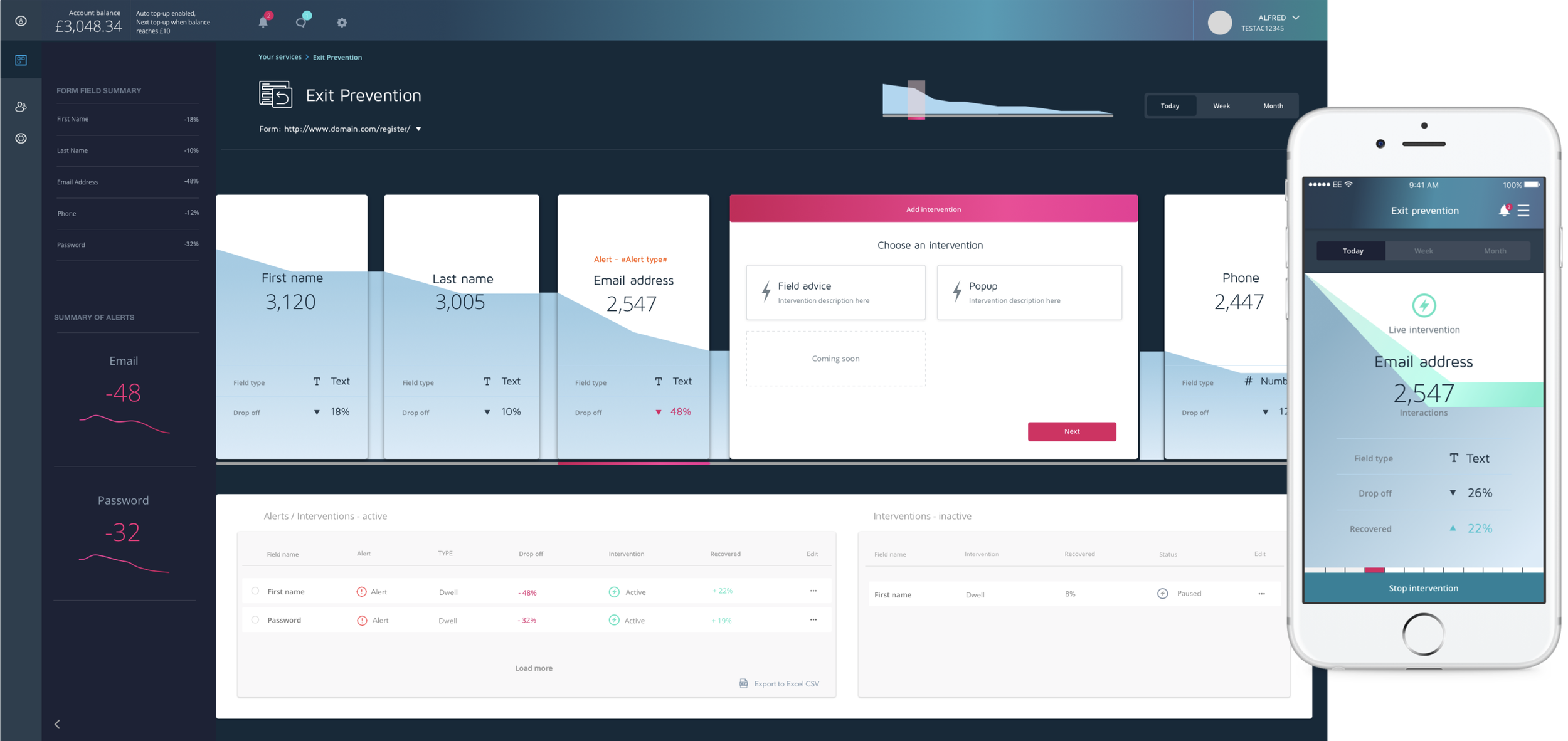
Project Overview: Designing a Behaviour-Driven Exit Intent SaaS Platform
Exit Intent Platform
A behavioural SaaS product designed for moments that unfold in seconds. With over 68% of carts abandoned, the challenge was cutting through noise to surface the right insight at the right moment. The platform detects real-time exit signals, triggers contextual messaging when intent drops, and supports conversion recovery across checkout, sign-up, and forms. Built for proactive intervention, it enables fast, confident action without overwhelming users.
I approached this project as a product design and UX challenge, not a marketing overlay. The goal was to design a clear, confidence-building “digital control room” that surfaces risk, patterns, and opportunity at a glance, without overwhelming users or encouraging reactive behaviour.
The result is a behaviour-led conversion platform that balances real-time decision support, UX clarity, and insight generation, demonstrating my ability to design SaaS products that operate at the intersection of UX, CRO, and data-driven decision-making.
—
What I Learned, the Challenges I Met, and My Biggest Takeaway: This project changed how I think about timing in UX. It’s not just a technical trigger, it’s a design material. Designing for hesitation meant paying attention to how people feel in the moment they pause, doubt, or almost leave, not just what they click. When a product responds with clarity instead of pressure, it doesn’t just recover a conversion, it earns trust. The Exit Intent Platform reinforced that conversion design is really behavioural design. By focusing on hesitation, guidance, and confidence rather than persuasion, the platform helps people act calmly in high-pressure moments while delivering real commercial impact.
-
Designing an exit intent platform meant creating a system that thinks and reacts faster than users can decide to leave, with a clear visual flow that guides action in seconds.
Turn split-second behavioural signals into clear, actionable triggers
Prioritise response speed over data depth in critical moments
Use focused visual flow to guide decisions without cognitive load
Design timely interventions that feel relevant, not intrusive
Replace heavy dashboards with decision-ready signals
-
Product Designer responsible for UX, interaction design, and behavioural logic.
Designed the dashboard experience across desktop and mobile
Defined interaction patterns for real-time decision-making
Translated behavioural signals into usable UI states
Balanced insight depth with clarity and speed
I owned the experience layer from concept through high-fidelity delivery.
-
The platform was designed for at-a-glance understanding, using clear visual hierarchy and prioritised risk signals that can be understood in seconds. Every design decision asked the same question: can this be grasped immediately, with minimal interaction? The result is a product that functions as a control room, not a reporting dashboard.
Design started with real exit scenarios, not features. Moments of hesitation, confusion, and distrust were mapped first, then translated into glanceable, prioritised insights. By treating insight as guidance rather than raw data, the platform supports calm, informed decisions under intense time pressure.
-
Product UX
Designed for interruption, not flow. The experience supports fast scanning and respects limited attention during active tasks.Optimised for quick comprehension, not prolonged use
Contextual cues reduce cognitive load
Adapts seamlessly across desktop and mobile
Assumes interruption, not sustained focus
Behaviour-Led Research
Grounded in real exit and hesitation behaviour, not assumptions.Analysed abandonment and hesitation patterns
Defined behavioural scenarios triggering exit intent
Studied form breakdowns and friction points
Benchmarked exit-intent tools to surface UX gaps
The research focused on why users hesitate, enabling calm, confident guidance in high-pressure moments.
-
Real-world moments of indecision.
Cursor movement toward browser exit
Copying product data for price comparison
Form interruption and stalled completion
Hesitation around personal or sensitive data
Repeated field edits indicating confusion
Each scenario informed both messaging logic and dashboard insight.
-
Delivered an end-to-end UX and interaction model for a real-time behavioural platform, designed to help teams detect, understand, and act on exit intent in seconds.
Behaviour-led user flows mapped to real hesitation scenarios
Wireframes translating complex signals into fast, glanceable structure
Dashboards optimised for speed across desktop and mobile
Real-time interaction states that surface change without distraction
Built for clarity, iteration, and decisive action, the platform turns fleeting behaviour into confident, timely intervention.
What I Value, Work Ethic and Where I’m Heading Next
I value product and UX design that’s built with integrity. Products that respect people’s time, attention, and intelligence, especially in SaaS, where clarity, trust, and commercial reality all matter. I’m drawn to systems that are thoughtfully designed, genuinely useful, and built to last, not just polished on the surface.
I do my best work in environments built on trust, ownership, and collaboration, where people care about the product and each other, and where outcomes matter more than ego. Looking ahead, I want to keep working on complex SaaS products with real purpose and scale, products that demand clear thinking, ethical decisions, and long-term stewardship. Remote work supports how I work best, with focus, balance, and accountability, and I’m motivated by building products people can rely on, alongside teams that feel like a shared journey rather than a hierarchy.
-
I’m most motivated by products (and services!) that sit inside real, business-critical workflows. These are environments where accuracy matters, decisions carry weight, and users rely on the product to do their job well. Designing for those moments feels meaningful and responsible.
Products that support real decisions, not vanity metrics
Systems where trust and reliability matter
Platforms designed to scale and endure
-
I don’t measure success by launches or titles. I measure it by whether users feel more confident, whether teams are aligned, and whether the product genuinely improves over time. Feeling accomplished comes from knowing the product works better because of the choices I helped shape.
Users move with clarity and confidence
Design decisions are backed by evidence
The product continues to improve after release
-
Growth, for me, means sharper judgement, deeper ownership, and greater impact. I’m motivated by learning through complex problems and real trade-offs, not climbing a career ladder. Progress is about momentum, mastery, and contribution.
Ownership across discovery, design, and delivery
Learning through real product challenges
Measuring progress by outcomes, not titles
-
I don’t separate strategy, UX, and delivery, they inform each other constantly. Strategy shapes design decisions, UX exposes gaps in strategy, and delivery validates both. I’m motivated by keeping design grounded in reality while still pushing for meaningful improvement.
Strategy informed by real user behaviour
UX aligned with commercial and product goals
Delivery used as a learning loop, not just execution
-
Remote work is where I’ve found my rhythm. Since Covid, working remotely has allowed me to design with focus, intention, and balance, without losing connection or momentum. It supports healthier routines, deeper thinking, and consistently better output.
I work best when trust replaces presenteeism and impact matters more than visibility. That doesn’t mean working in isolation, I actively seek collaboration, reach out to teams, and enjoy working closely together, whether that’s online or in person. I’m just as comfortable contributing from my own studio office as I am joining workshops, reviews, or team sessions.
Fewer distractions, deeper focus
Sustainable work habits and healthier routines
Results driven by clarity, quality, and shared outcomes
For me, remote work isn’t about distance. It’s about creating the conditions where good thinking, strong collaboration, and meaningful work can actually happen.
-
azulomo. I built it end-to-end, independently, as a product-led learning platform, starting from opportunity discovery through UX, research, design, content structure, and go-to-market thinking. I approached it as a product design challenge, not a content one, designing for real behaviour, confidence-building, and long-term use.
Full ownership: strategy, UX, research, design, and delivery
Behaviour-led, modular, and built with SaaS principles
A clear reflection of how I design when I’m fully accountable for outcomes

Frequently Asked Questions
-
No. I do not require a work permit. I’m legally able to work across Europe and the UK, which allows for straightforward hiring without additional visa or sponsorship considerations.
-
I’m based in Portugal, in the Algarve, working from my own dedicated home studio. This setup allows me to work with focus while staying closely connected to distributed teams.
-
Yes. I’m very open to travelling for key moments such as team offsites, planning sessions, workshops, or important project milestones. I see in-person time as valuable when it’s purposeful.
-
I’m proactive, communicative, and comfortable working closely with cross-functional teams using modern collaboration tools. I reach out easily, contribute actively, and don’t wait to be “pulled in” to stay aligned.
-
I work European business hours and flex as needed to support team overlap, workshops, reviews, or launches. I’m comfortable adjusting my schedule to align with UK or wider European teams.
If This Resonates…
If you’re building a complex SaaS product and care about clarity, activation, and long-term trust, I’d love to work together.
I specialise in turning technical capability into confident, scalable product experiences, and I’m happiest partnering with teams who value thoughtful design as a strategic lever.