
Designing Behaviour-Led Travel Discovery
Project: Explore Now
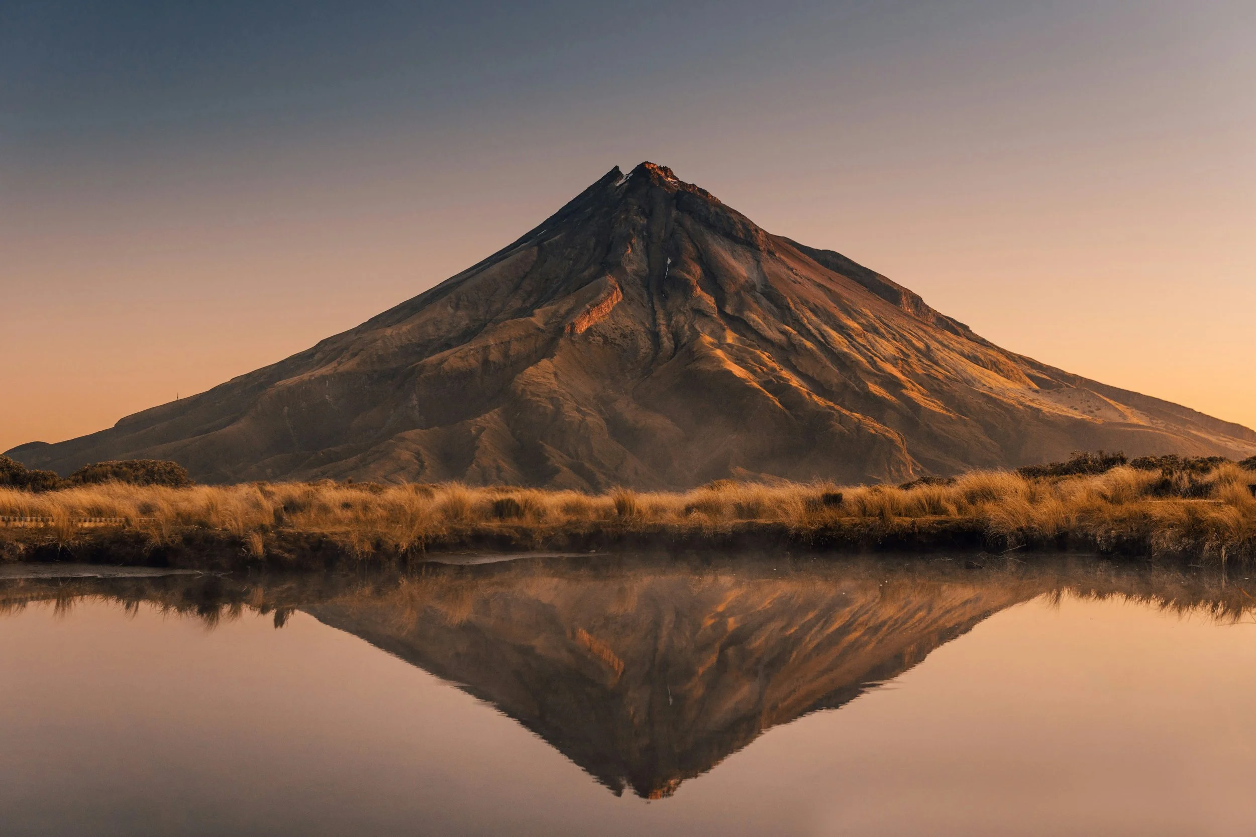
Explore Now was an early-stage product experiment designed to rethink how people discover places worth travelling to, before “social travel discovery” became a recognised product category.
At the time, travel discovery was dominated by generic lists, influencer hype, or algorithmic recommendations detached from lived experience. What was missing was a product built around trust, behaviour, and first-hand insight, a way to discover places through people who had actually been there, stayed there, and could recommend them with credibility.
I approached Explore Now as a minimum viable product (MVP), not to solve travel broadly, but to validate a simple question:
Would people trust and engage with travel recommendations more if they came from a community of like-minded travellers rather than faceless rankings?
Why This Project Mattered
This project came from a gap I couldn’t ignore. Travel platforms were optimised for inventory, not insight. Reviews were abundant, but context was missing. Recommendations felt transactional, anonymous, and disconnected from real experience.
What was missing was trust, relatability, and human perspective.
Explore Now was created as a response: a product that allowed like-minded travellers to discover places through people who had genuinely experienced them, lived nearby, or returned again and again.
In many ways, it foreshadowed platforms that would later emerge in this space, such as community-driven travel discovery apps and social mapping tools. At the time, this concept wasn’t yet mainstream, but the behaviour was already there. The product was simply early.
-
Explore Now was a travel discovery MVP built around a simple idea: Discovery should feel personal, contextual, and grounded in lived experience.
The product combined:
Human-written recommendations instead of aggregated reviews
A sense of community and shared taste
Lightweight contribution rather than heavy publishing
It was not designed as a booking platform.
It was designed as a decision-shaping product, sitting earlier in the travel journey, when curiosity turns into intent. -
At the time, travel discovery was dominated by:
SEO-driven lists
Generic “top 10” content
Volume-based reviews
Commercial bias
Explore Now addressed a different need:
Where would someone like me actually recommend?
What places felt special, not just popular?
Who do I trust when deciding where to go next?
The gap wasn’t content. It was structure, credibility, and point of view.
-
I worked as Product Designer, Product Strategist, and Product Owner for the MVP.
I owned:
Product concept and positioning
User journeys and interaction design
UX and information architecture
Behavioural assumptions and validation
MVP scope definition and prioritisation
I partnered closely with a web and app developer on the technical data layer, translating product intent into a usable, scalable spatial experience. My role was to ensure the map wasn’t just functional, but meaningful, guiding discovery rather than overwhelming users with pins and noise.
-
Explore Now was built with a learn-fast mindset.
Sketch supported rapid wireframing and iteration
InVision enabled quick prototype testing
Lightweight user testing tools and in-person observation surfaced hesitation, confusion, and trust gaps
Close collaboration with a developer enabled fast feedback on feasibility and interaction design
The working loop stayed intentionally simple:
design → observe → adjustNothing was over-engineered before behaviour validated direction.
Driving Engagement Through Action and Storytelling
This project showed me how closely language, behaviour, and product structure are connected. Research revealed that users responded most to action-led language and a sense of belonging, which directly shaped how the experience was designed. From a product perspective, I made an early decision to centre real traveller stories as a core interaction, not a supporting feature. That choice added complexity but strengthened trust and engagement, and taught me how to balance scope, impact, and feasibility in an MVP.
I loved this project because it reinforced how powerful narrative can be when treated as a product input rather than marketing output. Translating behavioural insight into structure, flows, and prototypes sharpened my ability to turn abstract signals into clear, testable product decisions.
The key takeaway was simple: when products are designed around action and identity, engagement follows naturally.
-
Explore Now was conceived as a response to a gap I noticed long before “community-led travel platforms” became a category of their own.
At the time, travel discovery was dominated by generic lists, influencer hype, or algorithmic recommendations still very detached from lived experience. What was missing was a product built around trust, behaviour, and first-hand insight, a way to discover places through people who had actually been there, stayed there, and could recommend them with credibility.
I approached Explore Now as a minimum viable product (MVP), not to solve travel broadly, but to validate a simple question: Would people trust and engage with travel recommendations more if they came from a community of like-minded travellers rather than faceless rankings?
-
From the outset, this was a behavioural design problem, not a demographic one.
Rather than segmenting users by age or location, I focused on how people travel, why they make decisions, and what they outsource versus control themselves. Through personas, empathy maps, and journey mapping, clear behavioural patterns emerged.
Some travellers sought self-indulgent experiences that blended luxury with growth or self-improvement. Others valued simplicity and reassurance, preferring to lean on trusted voices rather than invest time in deep research. These nuances reshaped how “adventure” needed to be defined, not as a category, but as a personal interpretation.
Explore Now wasn’t about suggesting where to go. It was about helping people feel confident in why a place was right for them.
-
Research was deliberately scrappy and human. I combined lightweight quantitative surveys with in-person interviews, sourcing participants through social platforms, personal networks, and spontaneous conversations, often over coffee. These sessions revealed not just preferences, but hesitation, fear, and trust signals that rarely surface in analytics alone.
Key insights shaped the product direction:
Trust and safety outweighed novelty
Reviews and photos mattered more than curated copy
Personal stories created emotional pull far stronger than marketing language
Traditional travel categories were too shallow to support real decision-making
This research became the backbone of the MVP.
-
Using prioritised user stories, I translated insight into clear product structure. Sitemaps and early wireframes focused on:
Fast comprehension
Low cognitive load
Clear signals of credibility
Minimal barriers to exploration
I designed the experience to feel inviting and above all, trustworthy, rather than overwhelming or sales-driven. The goal wasn’t feature depth. It was clarity.
-
Explore Now relied on trust as its primary currency.
The interface prioritised:
Transparency over persuasion
Minimalism over noise
Ease of use over cleverness
Storytelling over slogans
Language played a key role. Action-oriented verbs like explore, discover, belong, share consistently resonated during testing across the various user groups. These weren’t marketing choices, they were behavioural cues, encouraging participation rather than passive consumption.
Community stories and recommendations weren’t add-ons. They were the product.
-
Conversion optimisation was embedded from the start, not layered on later.
I treated sign-up, exploration, and contribution as part of a single behavioural journey. Through observation, early A/B testing, and usability sessions, I identified friction around trust signals, first-time understanding, and perceived effort.
Small changes to flow, language, and hierarchy had outsized impact, reinforcing a key lesson: Good design doesn’t push users forward. It removes the reasons they hesitate.
-
I design from behaviour first, not simply a set of features. I focus on how people think, hesitate, and decide, then shape structure and flows around real use, not assumptions.
I take end-to-end ownership, from discovery and positioning through UX, testing, optimisation, and launch. I’m comfortable in ambiguity, making clear trade-offs and moving ideas forward without waiting for perfect inputs.
I prioritise clarity over complexity, designing calm, intuitive experiences even when systems are complex. I work iteratively, testing early, learning fast, and refining based on real behaviour.
For me, good design helps people move forward with confidence and helps products perform better over time.
Turning Exploration Into a Guided Product Experience
-
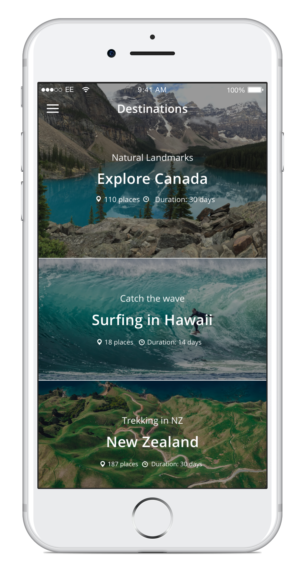
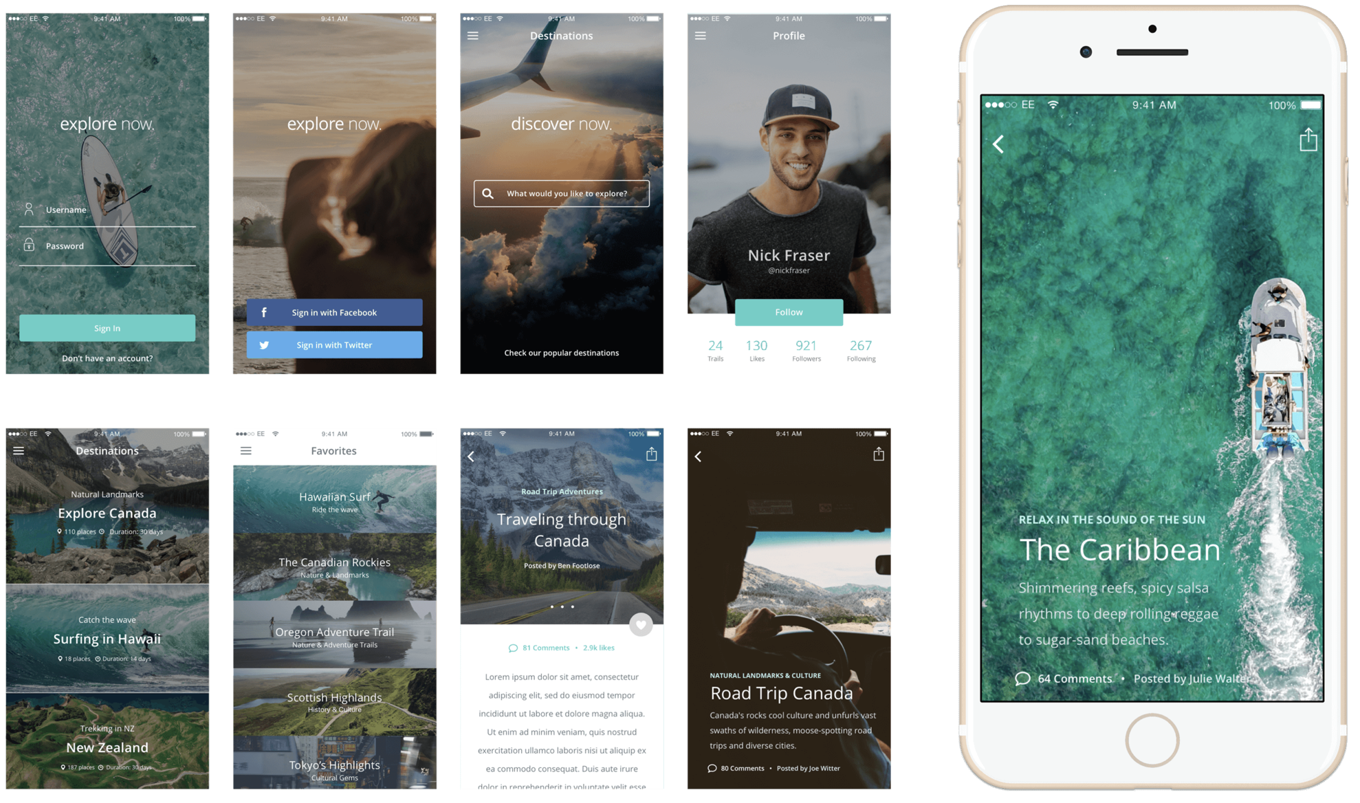
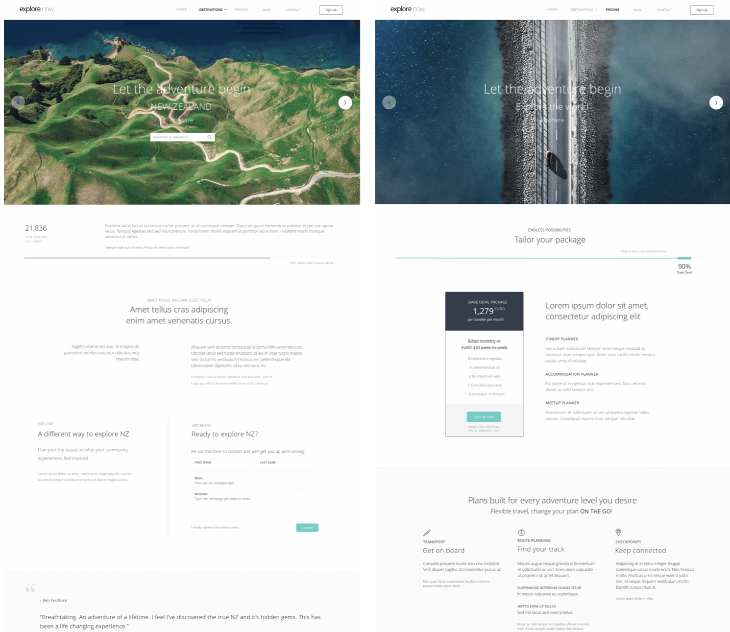
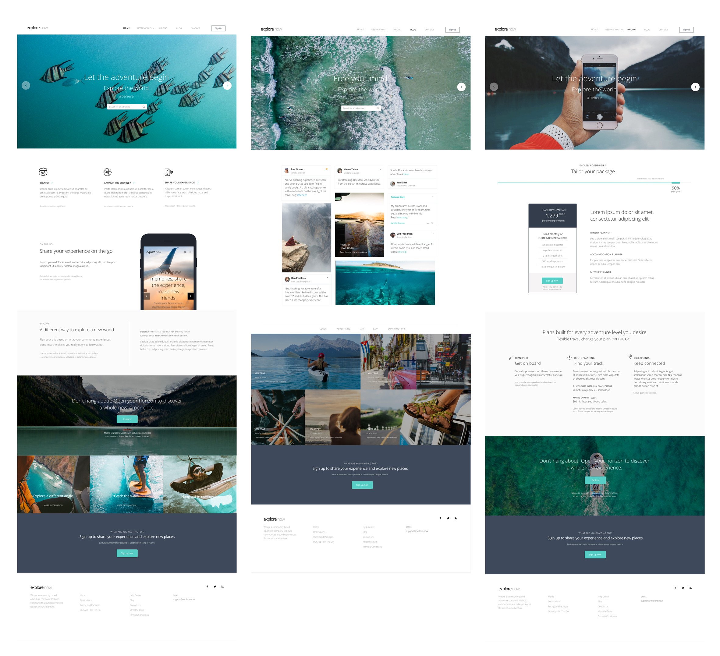
![Tailor-Made Travel Experiences]()
Tailor-Made Travel Experiences
Designed around individual intent and preference, making travel discovery feel personal rather than generic.
-
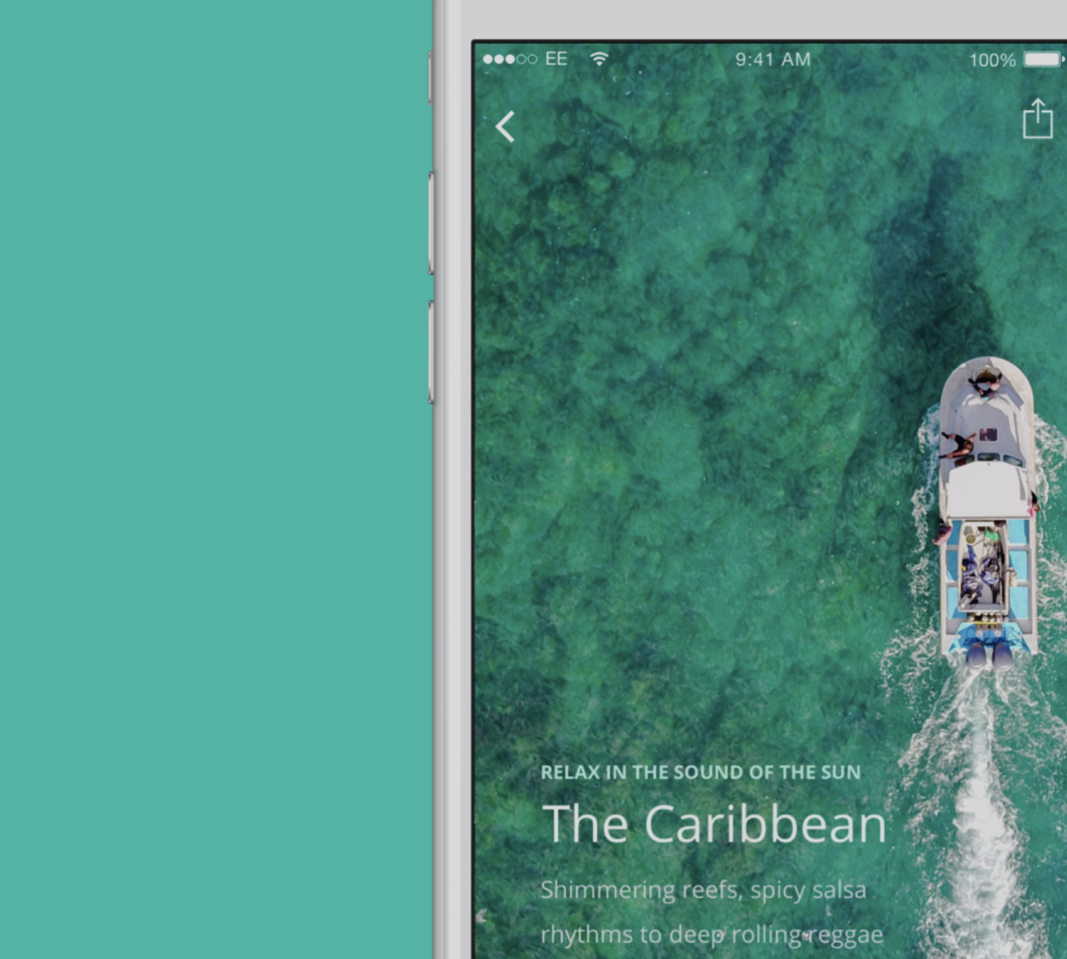
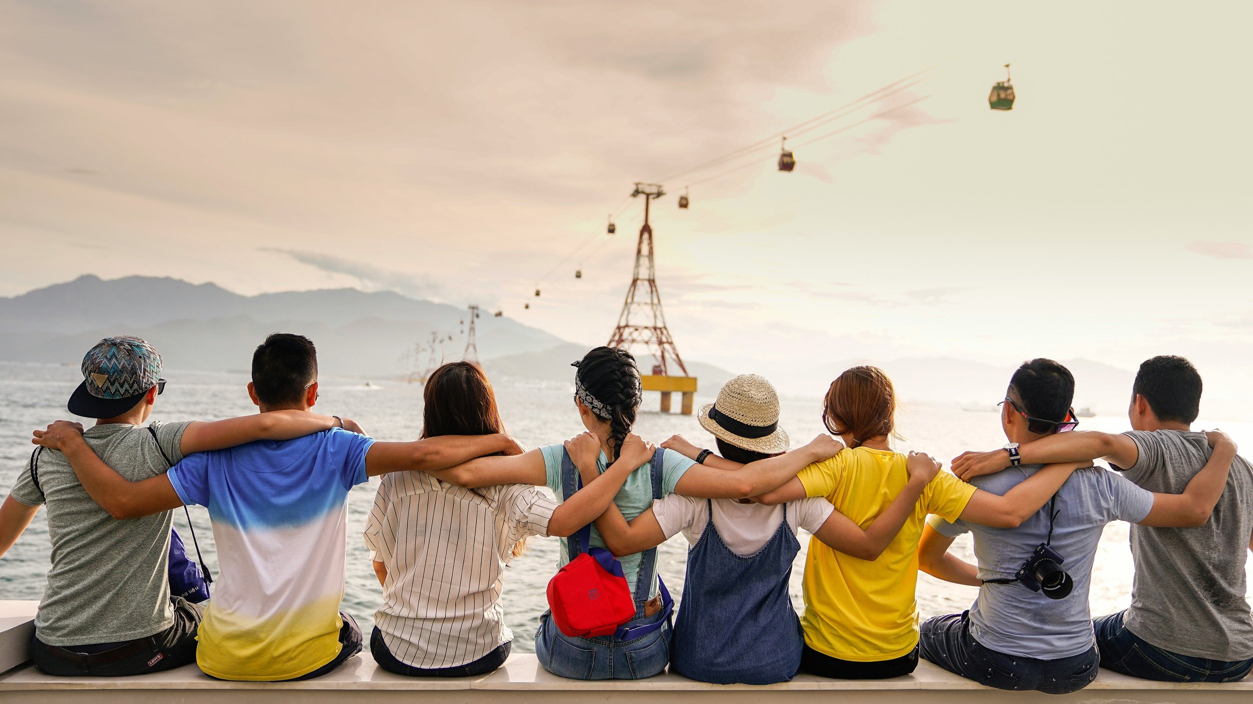
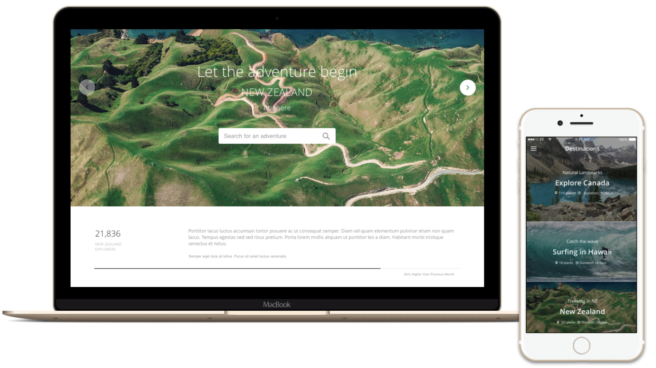
![A New Way to Travel]()
A New Way to Travel
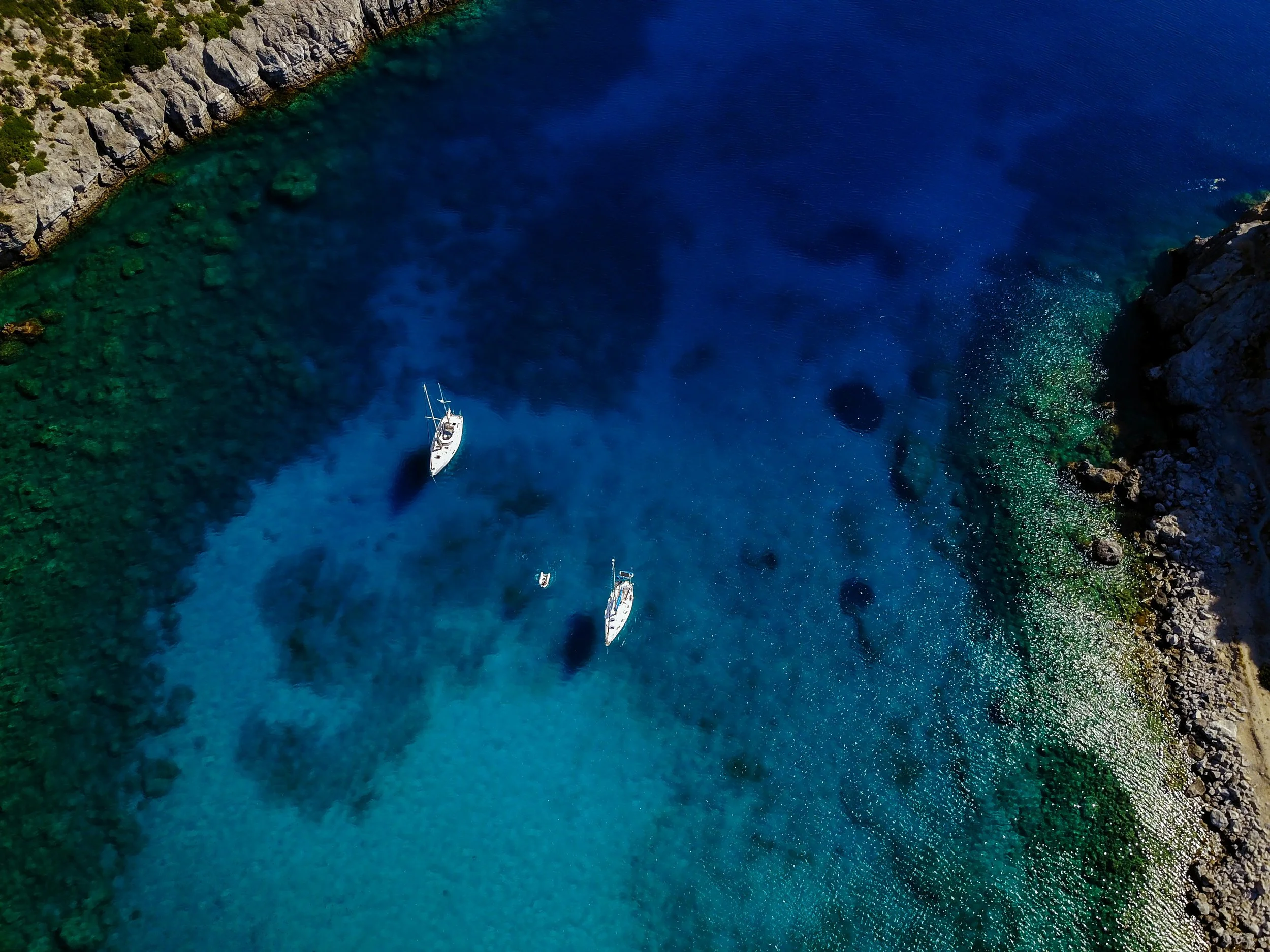
Explore Now reframed travel discovery as a community-led experience, shifting from algorithmic lists to human recommendations grounded in real journeys and shared insight.
-
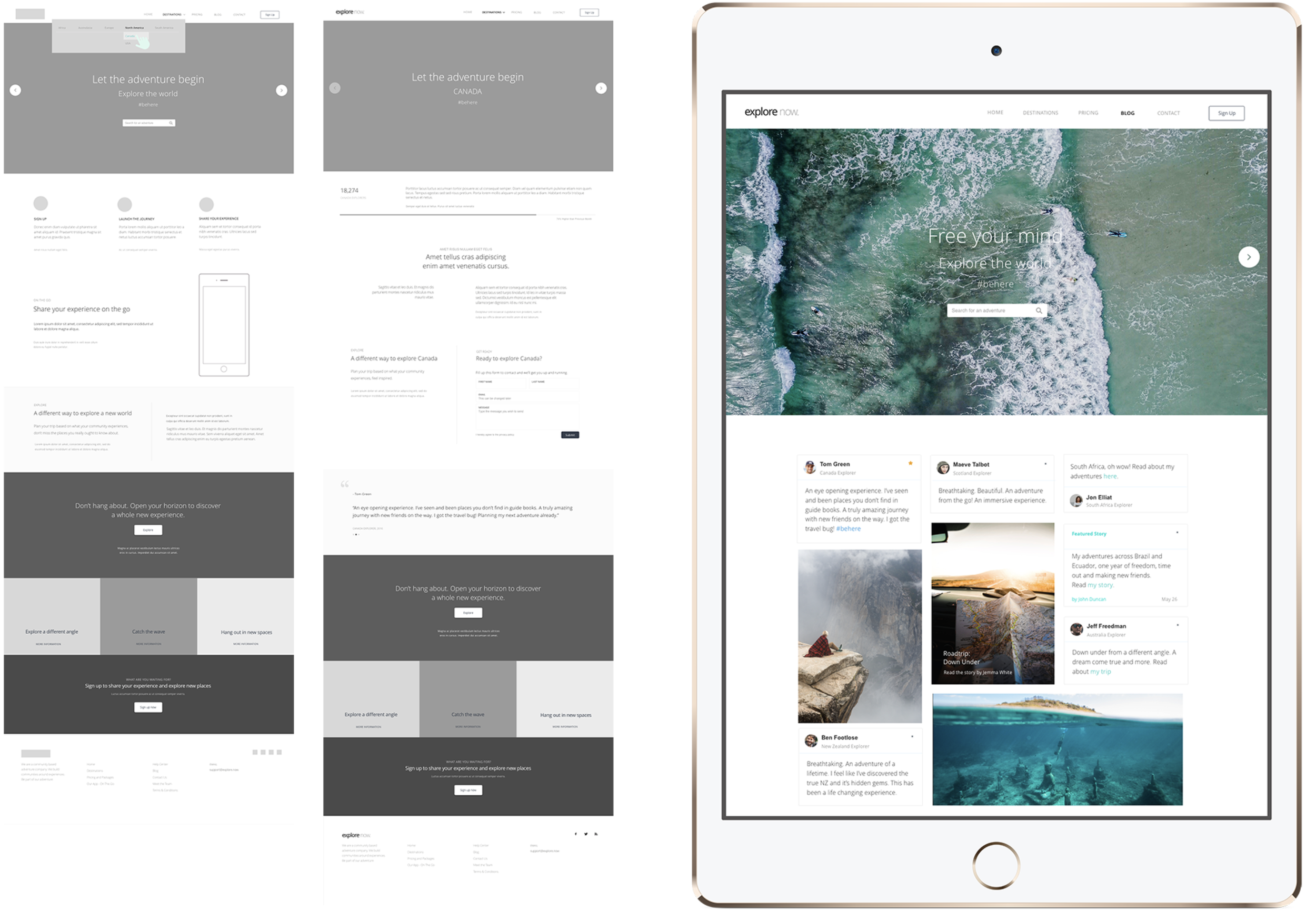
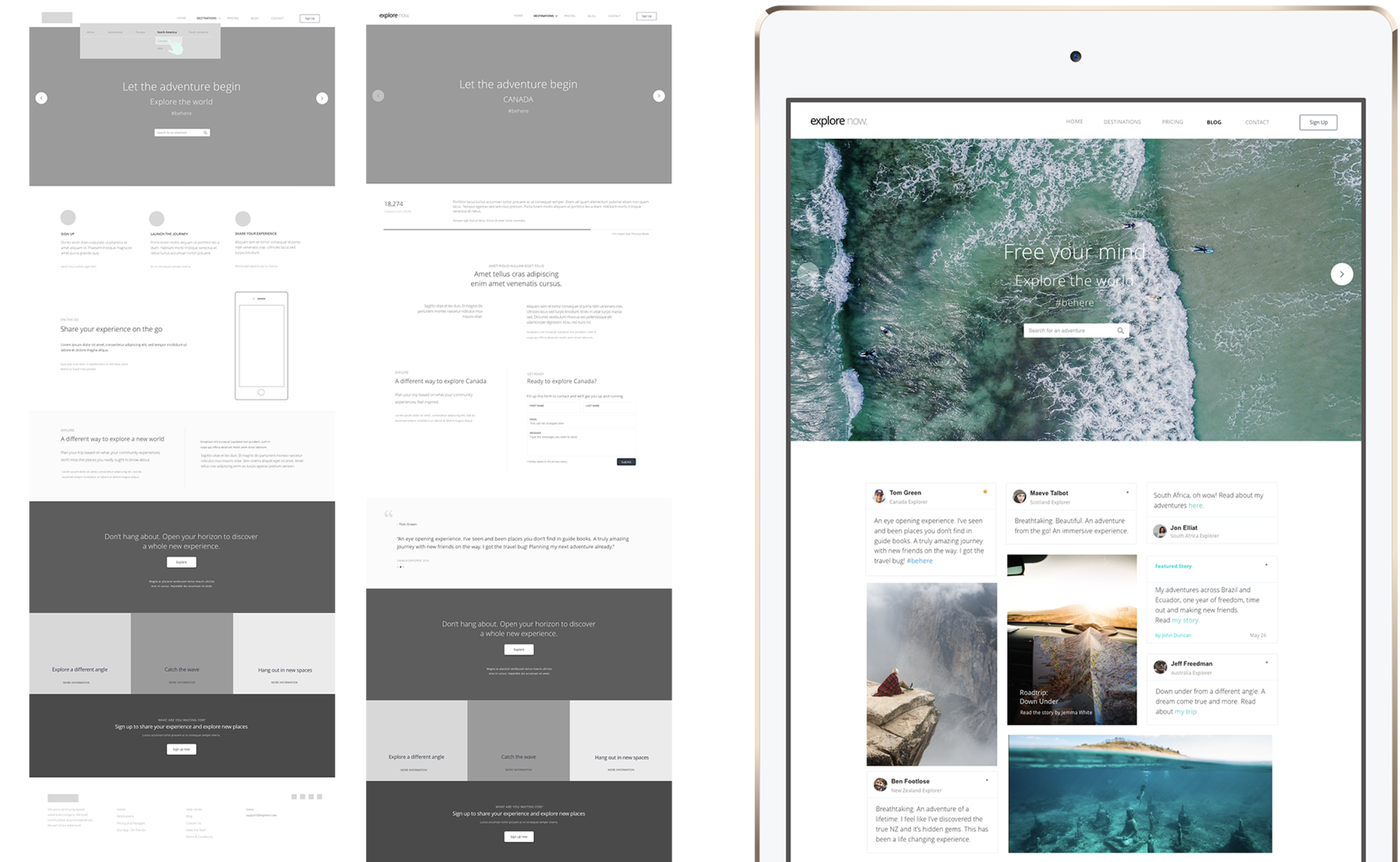
![Wireframing & Information Architecture]()
Wireframing & Information Architecture
Early wireframes prioritised clarity and flow, structuring information to support exploration without overwhelm and allowing users to orient themselves quickly within the experience.
-
![Usability Testing in Context]()
Usability Testing in Context
Usability testing surfaced hesitation and drop-off, guiding refinements to navigation, language, and interactions while keeping the experience cohesive.
-
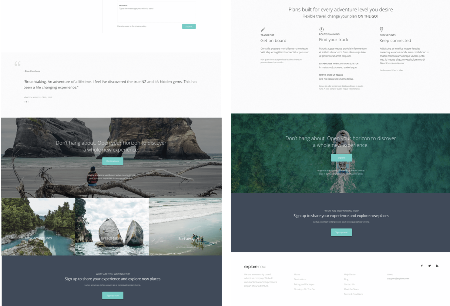
![Product Experience & Pricing Models]()
Product Experience & Pricing Models
The product explored trust-led value exchange, testing how perceived credibility, curation, and community influence willingness to engage, return, and eventually pay.
-
![Driving Product Adoption]()
Driving Product Adoption
Adoption was encouraged through familiarity and confidence rather than urgency, using clear entry points, low-friction exploration, and social validation to reduce decision anxiety.
-
![UX Research-Led Discovery]()
UX Research-Led Discovery
Qualitative interviews and behavioural research showed that trust, social proof, and lived experience drive travel choices more than traditional filters.
-
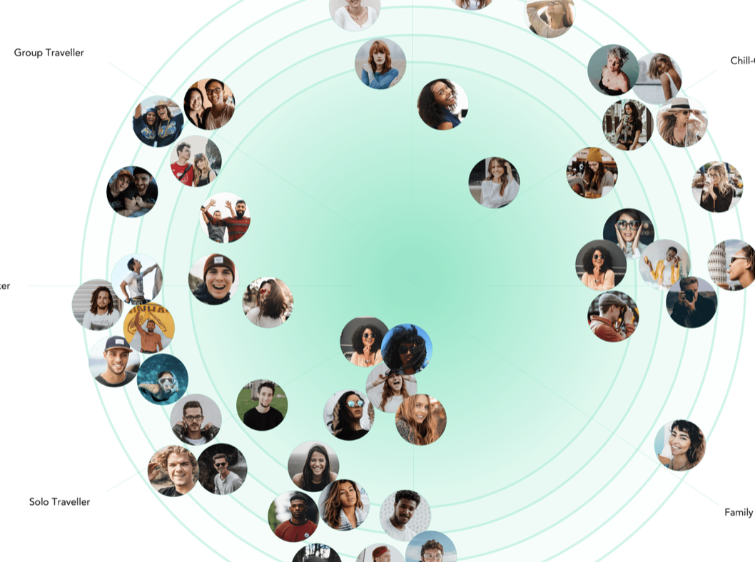
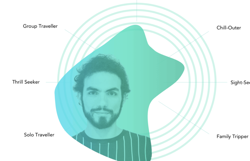
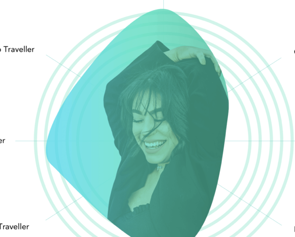
![User Behaviour Across Personas]()
User Behaviour Across Personas
Three core behavioural patterns emerged: explorers seeking inspiration, planners seeking reassurance, and delegators seeking trusted shortcuts, each shaping distinct interaction paths.
-
![Trust-Based Decision Making]()
Trust-Based Decision Making
Storytelling, reviews, and transparency were used to reinforce credibility and support confident decisions in a trust-led conversion space.
What I Learned, the Challenges I Met, and My Biggest Takeaway
This project reinforced how important it is to balance research with design judgment. User insight provided direction, but moving the product forward often required trusting instinct to make decisions in ambiguous spaces where patterns were still emerging.
One of the biggest challenges was designing credibility without institutional authority. Trust had to be earned through the experience itself, using community signals, language, interaction design, and clear structure. This required careful trade-offs, resisting feature creep, and designing with restraint so the product felt confident rather than persuasive.
The key takeaway for me is that strong product design doesn’t begin with features or solutions. It begins with understanding how people make decisions, what they rely on when uncertainty is high, and how design can reduce friction while increasing confidence.
Explore Now started as an MVP, but it became a powerful lesson in behaviour-led design for me. Paying close attention to early signals, hesitation, and engagement revealed how thoughtful UX decisions can surface emerging needs and hint at markets before they fully form.
If This Resonates…
If you’re building early-stage products, exploring new categories, or designing experiences where behaviour leads the way, I’d love to work together. I’m especially drawn to: Discovery-heavy products, Platforms built on trust and taste and Teams who value instinct as much as data.
If that sounds like you, let’s talk.