
Designing a Behaviour-Led Cooking App for Novice Cooks
Project: Noms
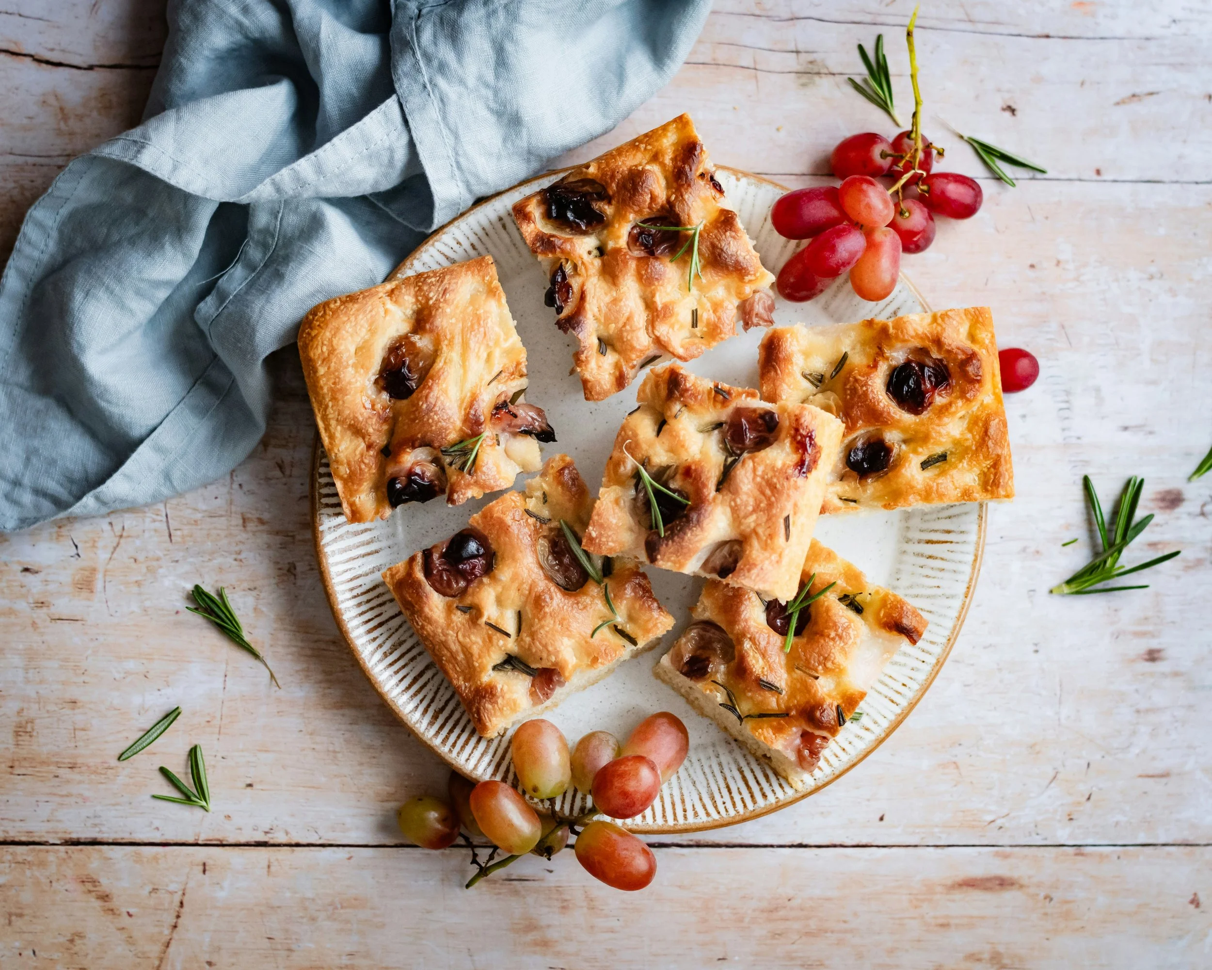
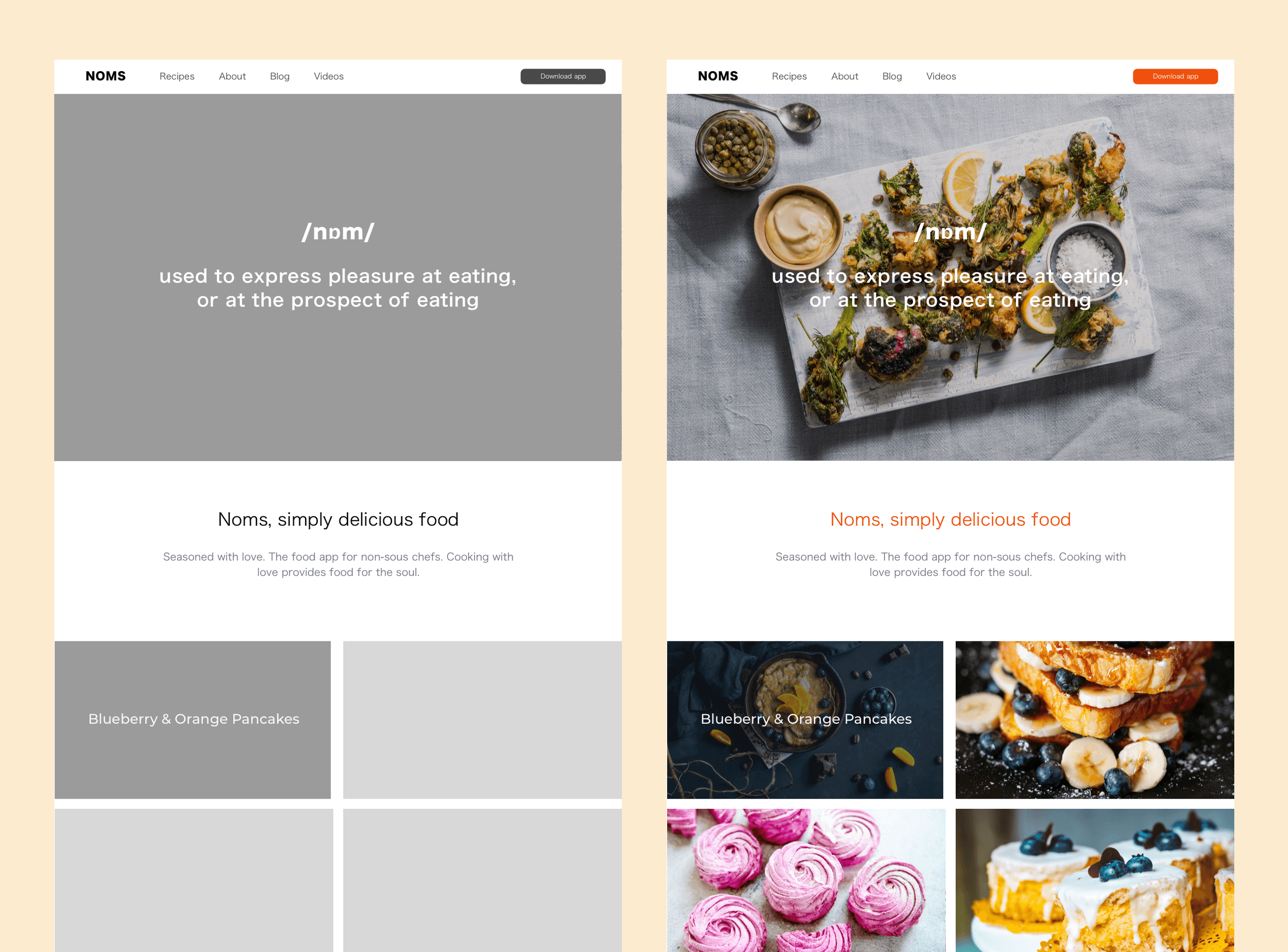
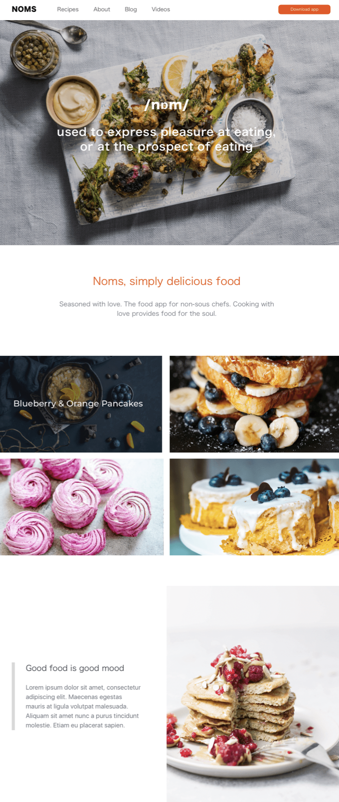
Noms is a mobile-first product design created to help novice cooks confidently decide what to cook, how to prepare it, and what to buy, without overwhelm. Simply delicious food. Seasoned with love.
The challenge wasn’t to build another recipe app. It was to design a decision-support product for people who feel uncertain, rushed, or intimidated by cooking, and to do so with clarity, empathy, and simplicity.
I approached Noms as a product UX and behaviour problem, not simply a visual or content exercise.
As Product Designer and UX Lead, I owned the full MVP lifecycle, from discovery and research through information architecture, interaction design, usability testing, optimisation, and high-fidelity prototyping across mobile and desktop.
The result was a focused, testable MVP that demonstrated how thoughtful UX product design can turn friction, hesitation, and indecision into confidence and momentum.
The Project in a Nutshell
This project started from a very real problem. For many people, cooking isn’t about passion, creativity, or exploration. It’s about uncertainty:
Not knowing what to cook
Feeling overwhelmed by instructions
Struggling to translate recipes into action
Forgetting steps mid-way
Buying ingredients without a clear plan
Most cooking apps assume a level of confidence users simply don’t have. Noms was designed for people like me at the time: novice cooks who want inspiration, but need reassurance, structure, and simplicity to move forward. That insight shaped every design decision.
-
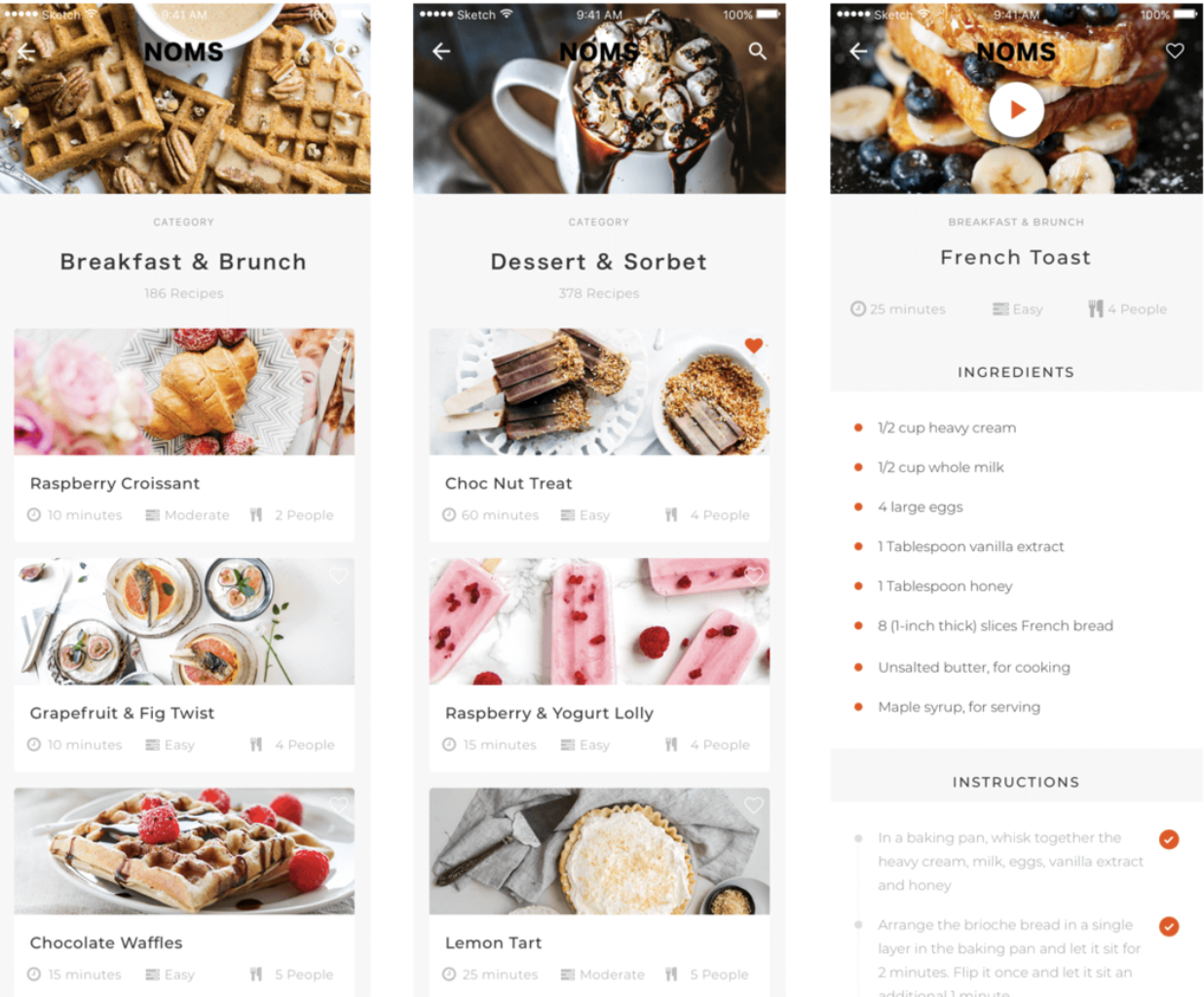
Noms is a cooking and meal-prep app that combines:
Recipe discovery
Smart filtering
Step-by-step cooking support
A clear ingredient shopping list
into one calm, intuitive experience.
The core question driving the product was not “what recipes should we show?”
It was:“How do we help someone decide, commit, and finish cooking without feeling overwhelmed?”
-
User research revealed a consistent pattern:
People weren’t failing at cooking because they lacked recipes.
They were struggling because of decision fatigue and cognitive overload.The gap wasn’t content. It was structure. Noms was designed to:
Reduce decision time
Make preparation feel manageable
Turn instructions into progress
Replace anxiety with confidence
-
Product Designer / UX Designer / MVP Owner
I led:
User research and interviews
Problem framing and feature prioritisation
Information architecture and interaction design
Wireframing and prototyping (low → high fidelity)
Usability testing and iteration
Conversion and engagement optimisation
Mobile-first UX with desktop parity
-
I design products by:
Starting with real behaviour, not assumptions
Treating UX as a decision-support system
Prioritising clarity over features
Testing early and adjusting fast
Respecting MVP constraints
I care deeply about how products make people feel while using them, especially in moments of uncertainty.
What Worked and What I’d Build Next
What Worked:
User engagement centred strongly around discovery and learning, which made navigation and hierarchy critical. By keeping the interface deliberately simple and visually calm, the product allowed imagery to lead, helping users feel inspired rather than instructed. This approach encouraged exploration while reducing cognitive load, especially for novice cooks.
Think-aloud usability testing offered clear insight into how users moved through the experience, where they felt confident, and where friction appeared. Observations were captured and synthesised through affinity mapping, allowing recurring patterns to surface quickly. These insights informed iterative refinements to flows and interactions, ensuring changes were grounded in behaviour rather than assumption.
Conceptually, the MVP performed well. Users described the experience as intuitive, approachable, and visually engaging. Most importantly, it delivered the features users expected without overwhelming them, reinforcing that the product focus was right for its intended audience.
What I’d Add Next:
Future iterations would explore deeper personalisation and health-related insights, including calorie tracking or nutritional context per recipe. Several users also expressed interest in lightweight social sharing, allowing them to save or share recipes within their existing networks. These features were intentionally excluded from the MVP to preserve clarity and focus, but they form a natural next step once core behaviour is validated.
-
The hardest part of this project was staying true to MVP discipline.
Research surfaced many valuable ideas:
Calorie tracking
Dynamic ingredient scaling
Reverse recipe search by pantry contents
Step-by-step video guidance
But the challenge was knowing what not to build yet.
Feature restraint became a design decision.
-
I began by exploring how people actually plan, prepare, and experience cooking, focusing on moments of hesitation and frustration rather than ideal behaviour. Through interviews and observation, clear patterns emerged that shaped the product direction.
Key insights:
Simple and achievable: Users rarely try new recipes unless instructions feel clear, manageable, and time-efficient. Short prep and cook times mattered.
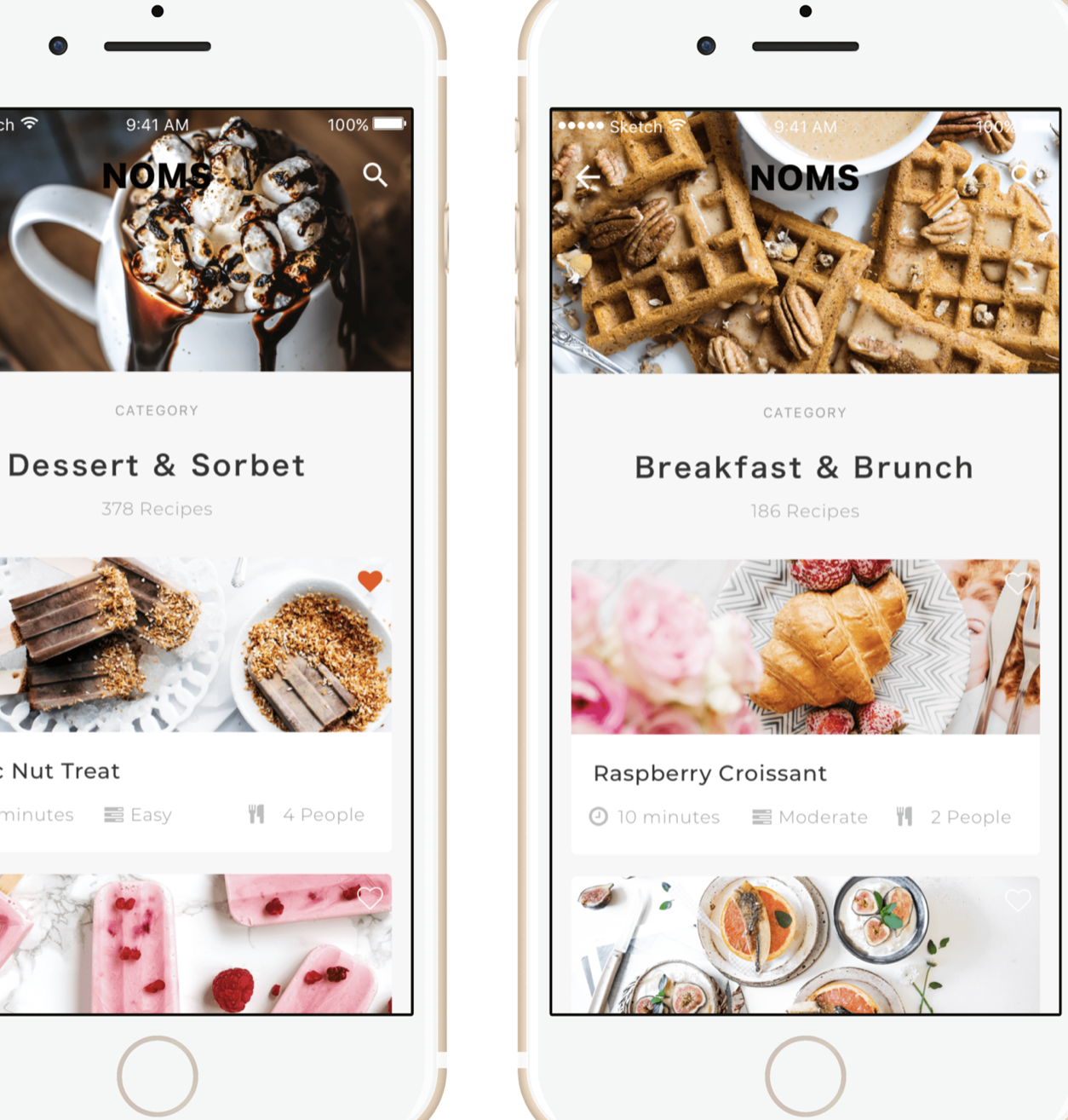
Decision fatigue: Many novice cooks struggled with what to cook, defaulting to familiar meals. Clear categorisation and strong visual inspiration helped unlock exploration.
Ingredients first: Weekly shoppers wanted a concise, scannable ingredient list with easy-to-source items and no unnecessary detail.
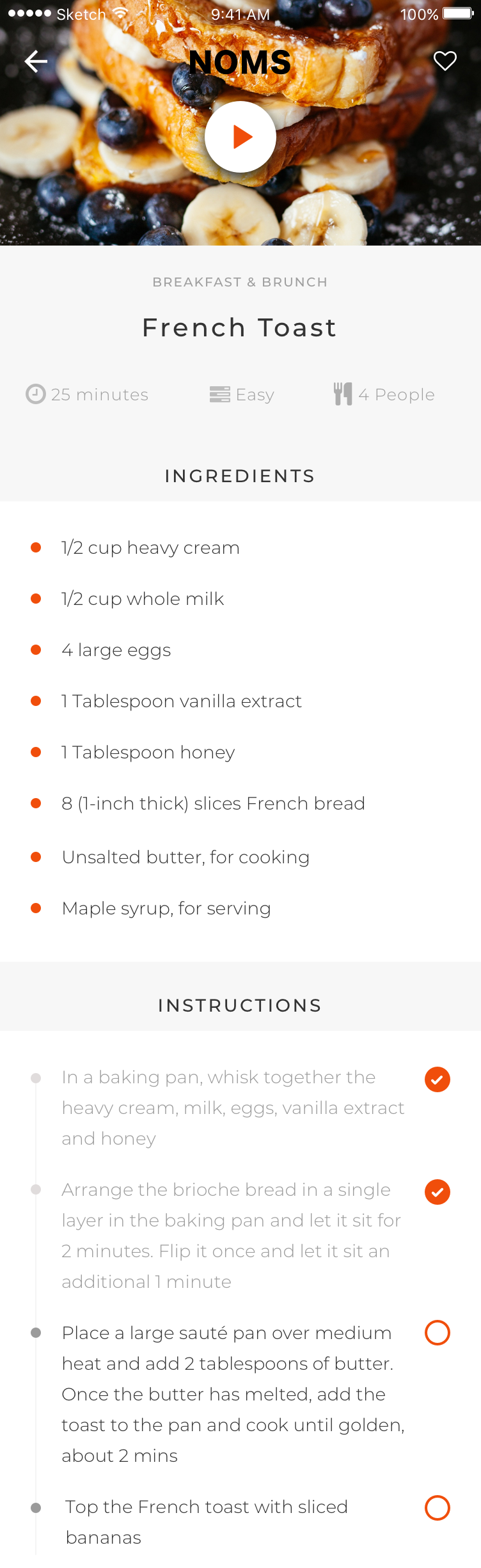
Step-by-step clarity: Cooking instructions often felt overwhelming. Users wanted visible progress, simple check-offs, and reassurance about what comes next.
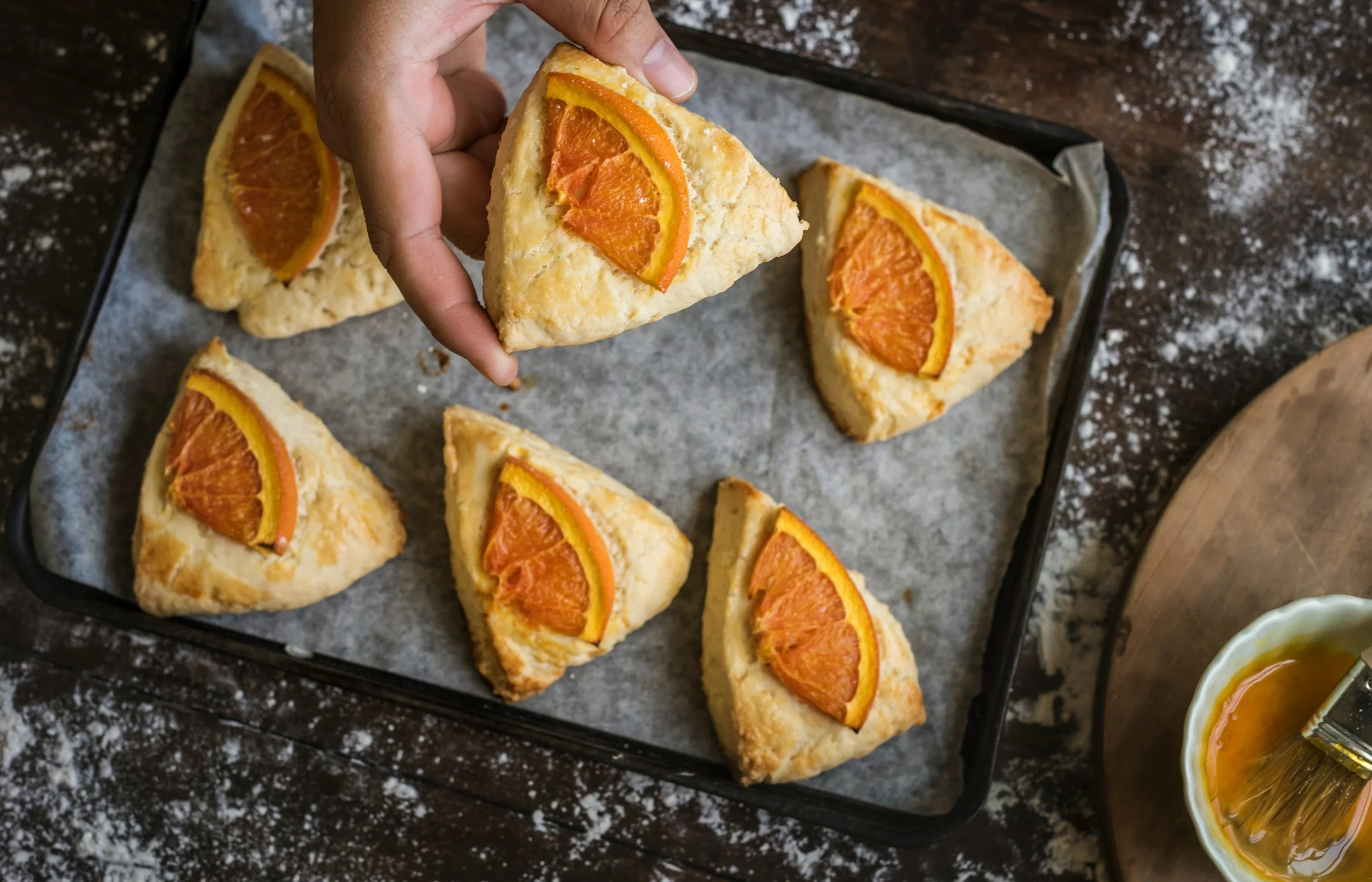
Visual appeal: Appetite-driven imagery played a critical role in recipe selection and confidence to begin.
These findings reinforced a core product principle: reduce uncertainty at every step, and cooking becomes less intimidating and more inviting.
-
I translated research insights into a tightly scoped MVP that prioritised clarity, ease, and momentum. The goal was to help users decide faster, feel capable sooner, and stay oriented throughout the cooking process.
Key product decisions included:
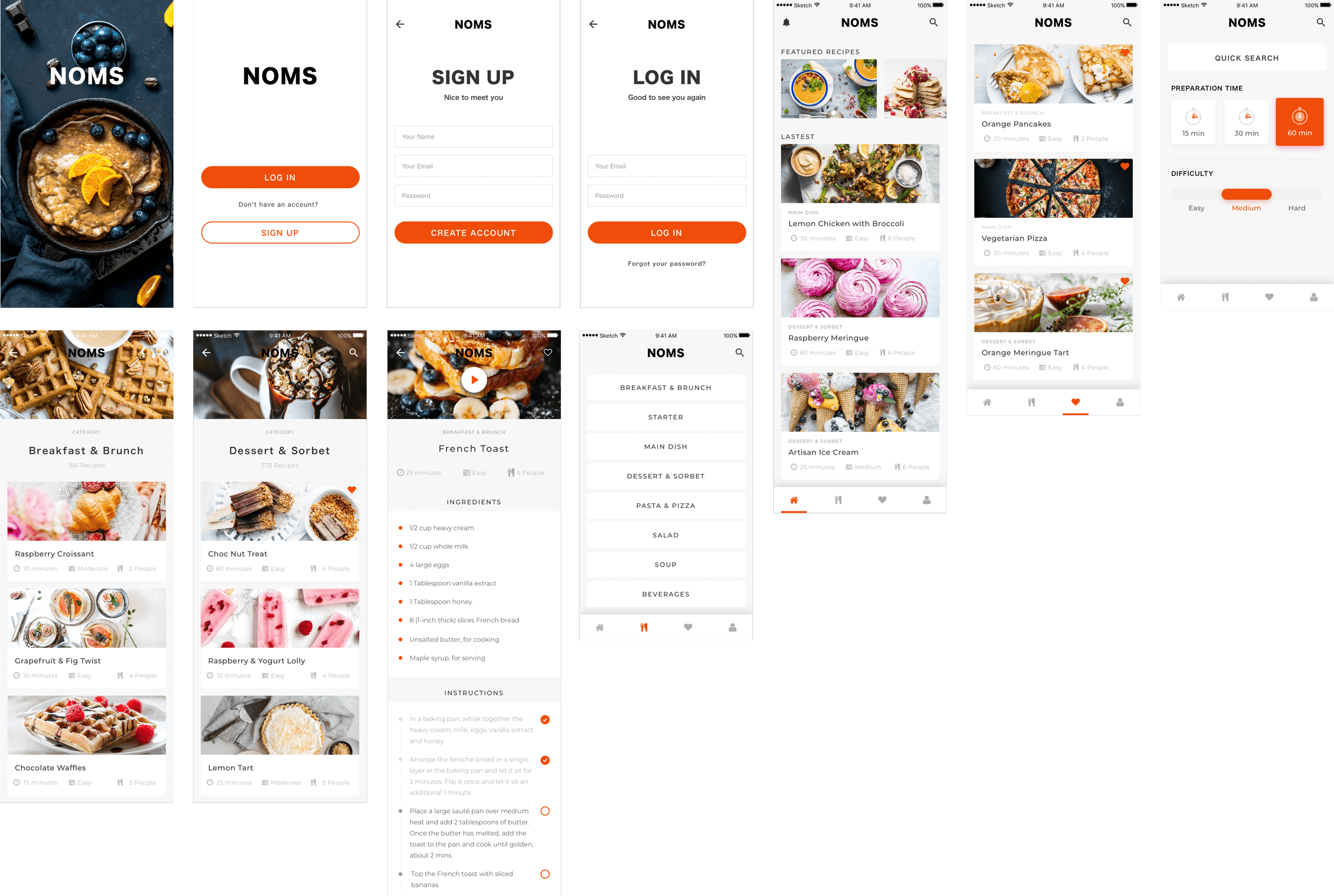
Smart filters based on real decision drivers: meal type, difficulty, and cooking time
Clear effort and time indicators to make recipes feel immediately approachable
A simple, scannable ingredient list aligned with weekly shopping habits
Step-by-step progression with checkmarks to reduce cognitive load
Lightweight personalisation through favouriting, supporting future discovery without friction
To protect the MVP, I deliberately deferred advanced features, such as dynamic portion scaling, video instructions, or ingredient-based reverse search. This restraint kept the product focused, testable, and user-centred, while leaving a clear roadmap for future iteration once behaviour validated the core experience.
-
Navigation hierarchy was designed around decision flow, not content volume.
The experience was structured to support:
Fast inspiration
Low-friction selection
Confident progression
Completion satisfaction
Information architecture focused on:
Minimal cognitive load
Predictable patterns
Clear task ownership per screen
-
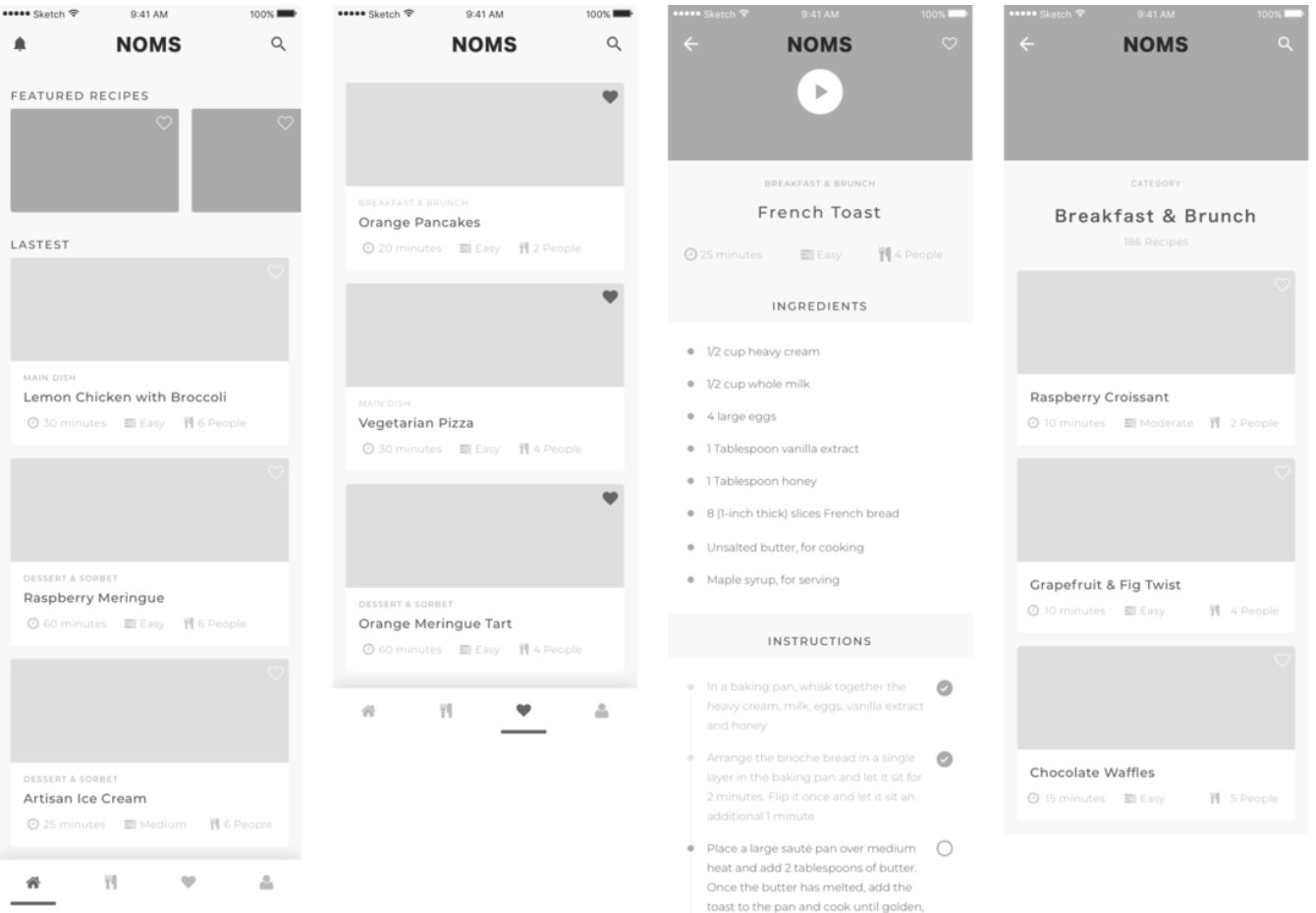
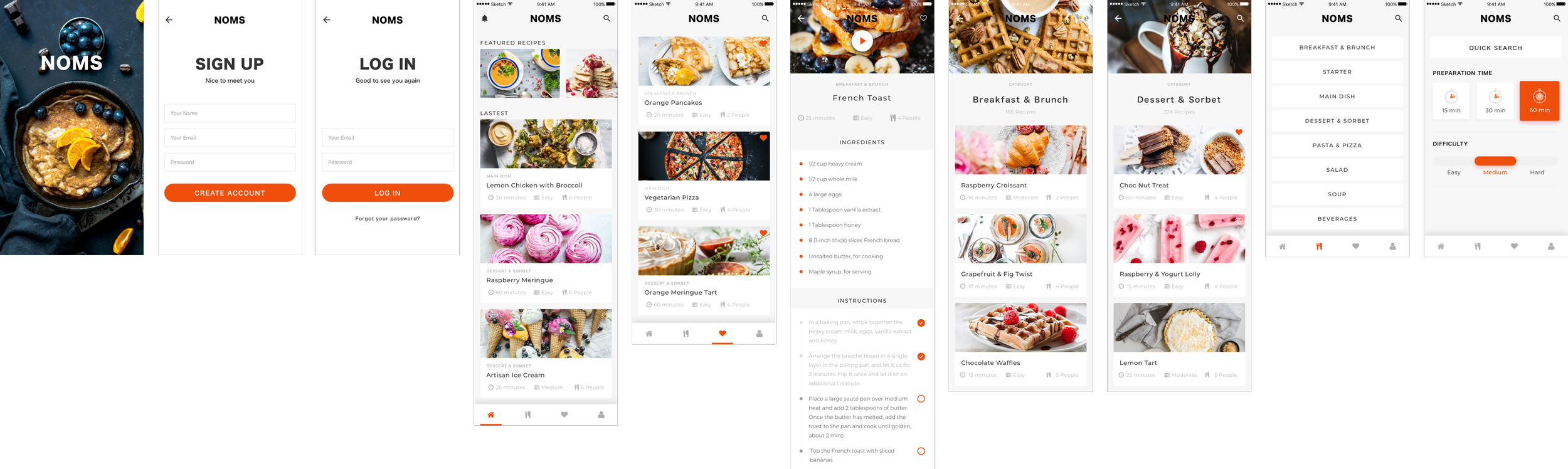
Initial low and high fidelity wireframing and prototyping were used as core product thinking tools, helping shape flow, and decision-making before visual refinement.
Started with low-fidelity sketches to explore hierarchy, task flow, and cognitive load for novice cooks
Focused on moving users from uncertainty to action through clear progression
Translated validated flows into digital wireframes and interactive prototypes
Used lightweight prototypes to test navigation, step-by-step cooking flows, and key decision points
Iterated quickly based on usability feedback before committing to high-fidelity
This approach ensured the MVP prioritised clarity, confidence, and ease of use from the first interaction.
-
I conducted a series of usability tests, asking participants to think aloud while completing key tasks.
Observed friction points included:
Hesitation during recipe selection
Confusion about step order
Anxiety about ingredient completeness
Using affinity mapping, I grouped findings and iterated quickly using lightweight prototyping tools.
Each iteration reduced uncertainty and improved task completion.
-
Conversion was designed into the product from the start.
I tested:
CTA placement and language
Registration friction
Sign-up sequencing
Trust cues and reassurance patterns
Heatmaps and click tracking informed refinements that improved engagement and reduced abandonment.
-
The final MVP experience prioritised:
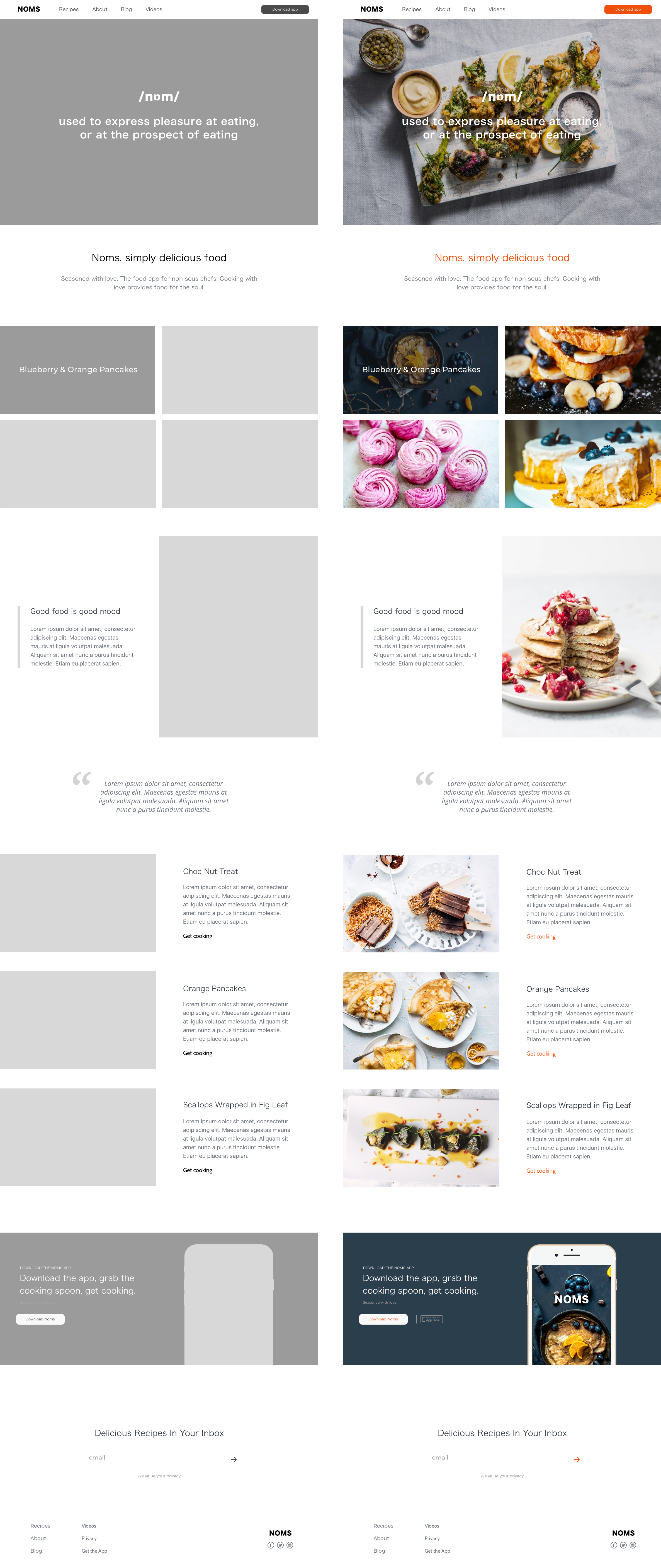
Calm, distraction-free layouts
Strong visual hierarchy
Sensory appeal through imagery
Clear next steps at all times
Users consistently described the product as:
“Simple, stylish, and easy to follow.”
Which was the exact design goal.
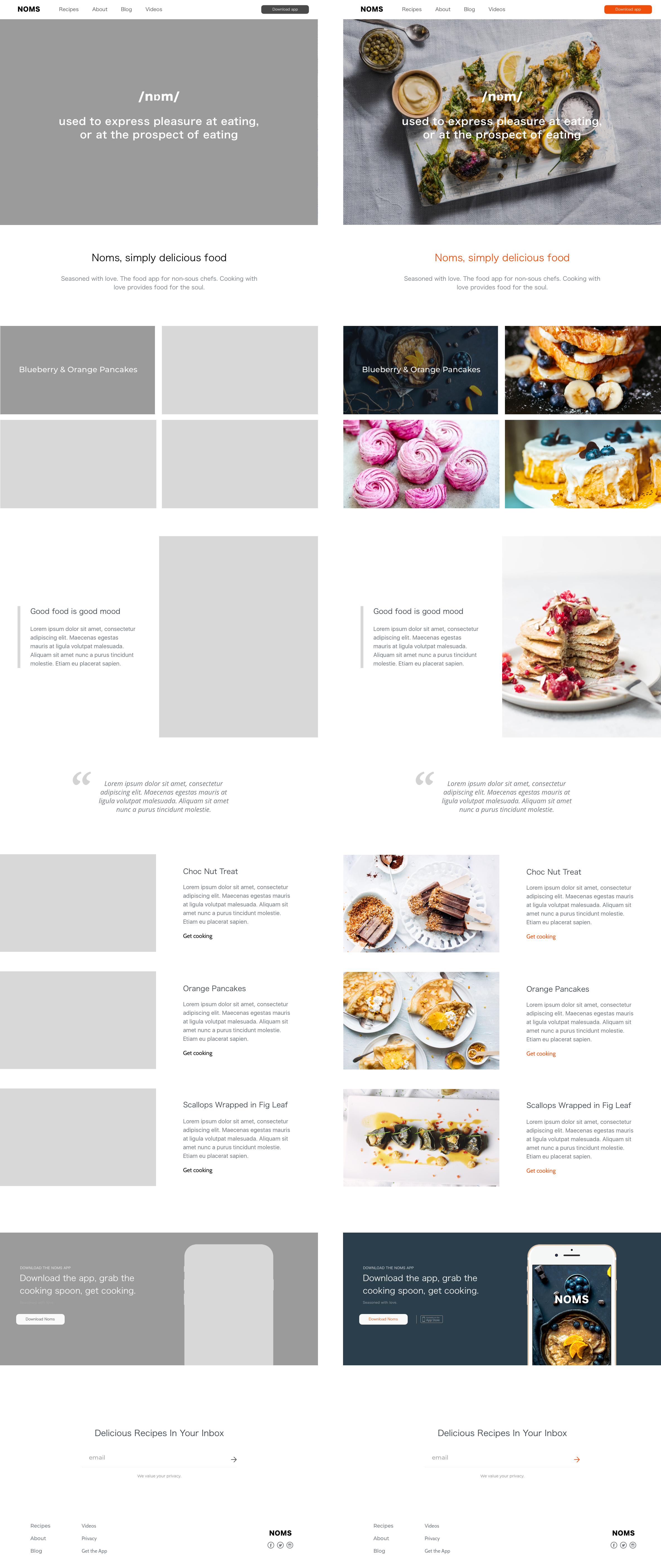
Leading UX Product Design for a Novice-First Cooking Platform
-
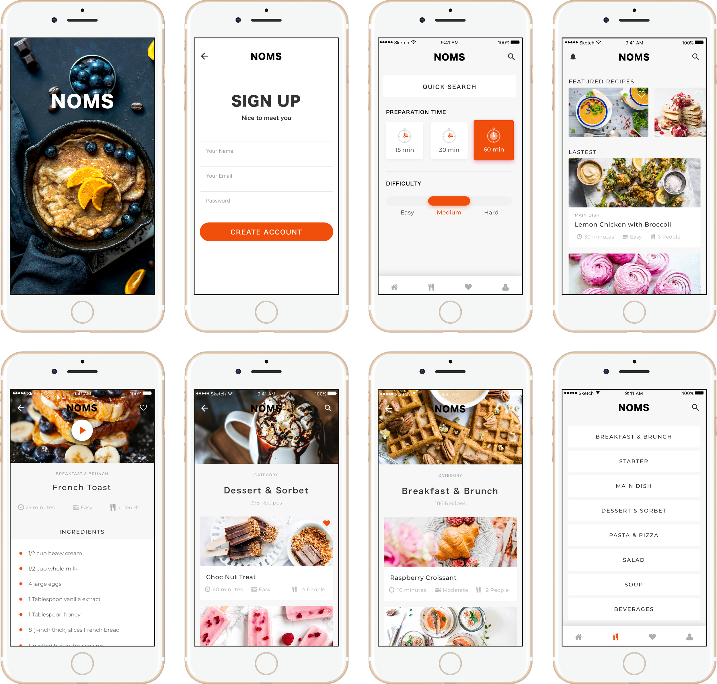
![Product UX Design]()
Product UX Design
Designed the app as a decision-support system, not a recipe catalogue, helping users move from uncertainty to action with minimal cognitive load.
-
![Immersive Product Experience]()
Immersive Product Experience
The experience was shaped to feel deliciously simple, encouraging, and supportive, allowing users to focus on cooking rather than navigating the product.
-
![Low- and High-Fidelity Design]()
Low- and High-Fidelity Design
Moved from micro-frames to high-fidelity prototypes to validate structure early and refine interaction detail only once behaviour was confirmed.
-
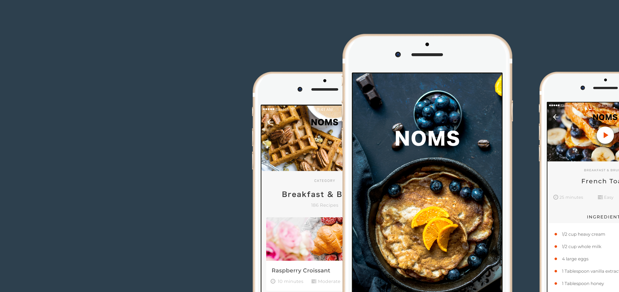
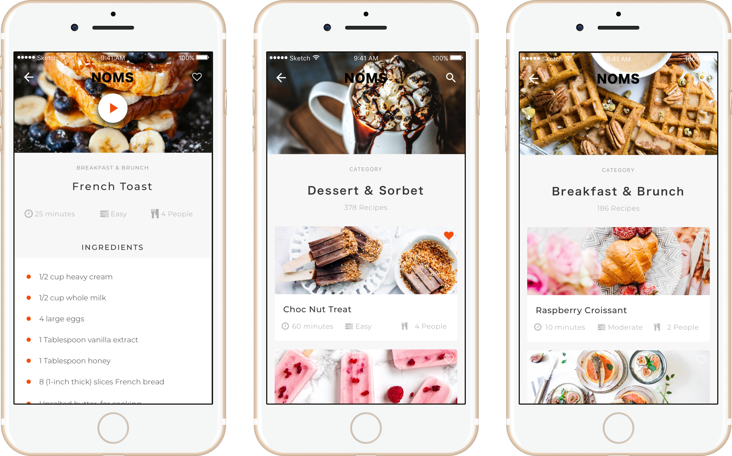
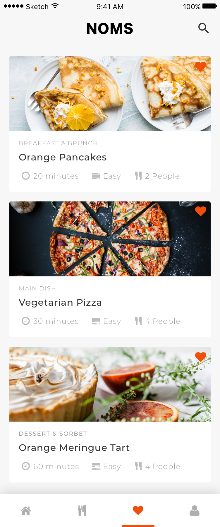
![App Design (Mobile-First)]()
App Design (Mobile-First)
Designed mobile-first to support in-kitchen use, with layouts optimised for quick glances, large touch targets, and minimal scrolling.
-
![User Journeys for Different Cooking Confidence Levels]()
User Journeys for Different Cooking Confidence Levels
Mapped journeys for beginners, cautious improvers, and repeat users, ensuring the experience adapted to varying confidence and familiarity.
-
![Information Architecture of a Connected Experience]()
Information Architecture of a Connected Experience
Structured recipes, steps, and ingredients into a single coherent flow, reducing mental context switching during cooking.
-
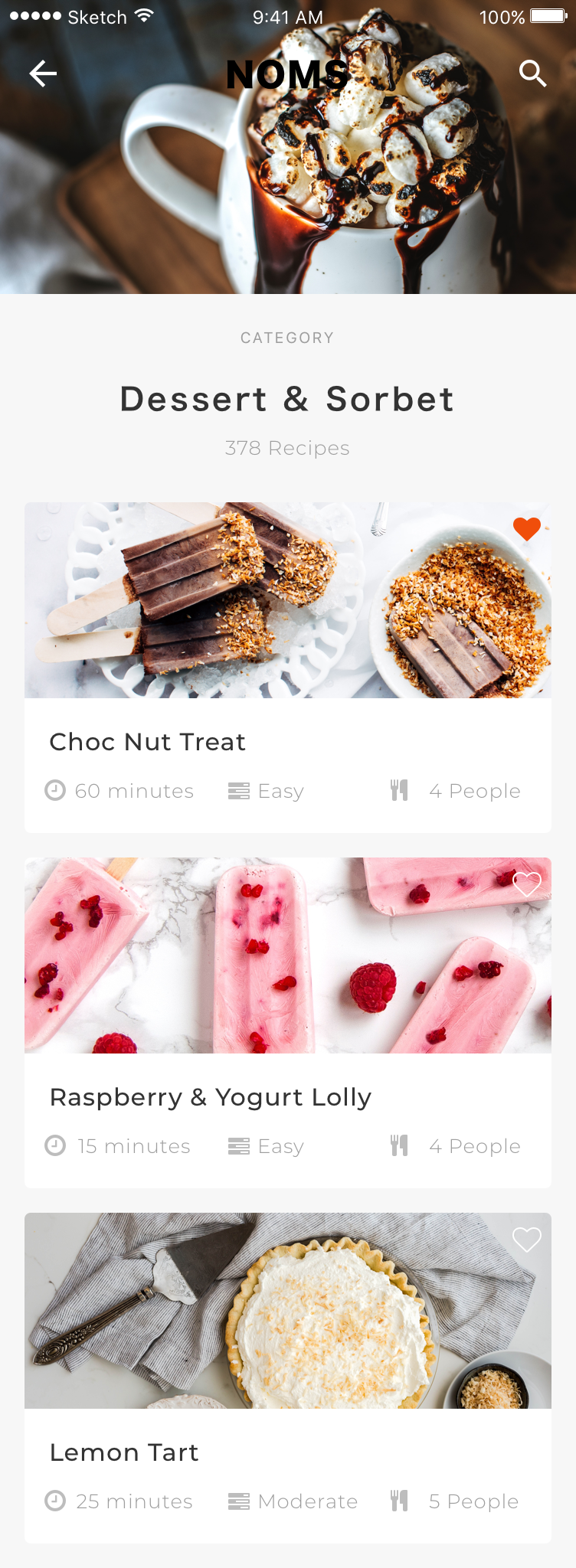
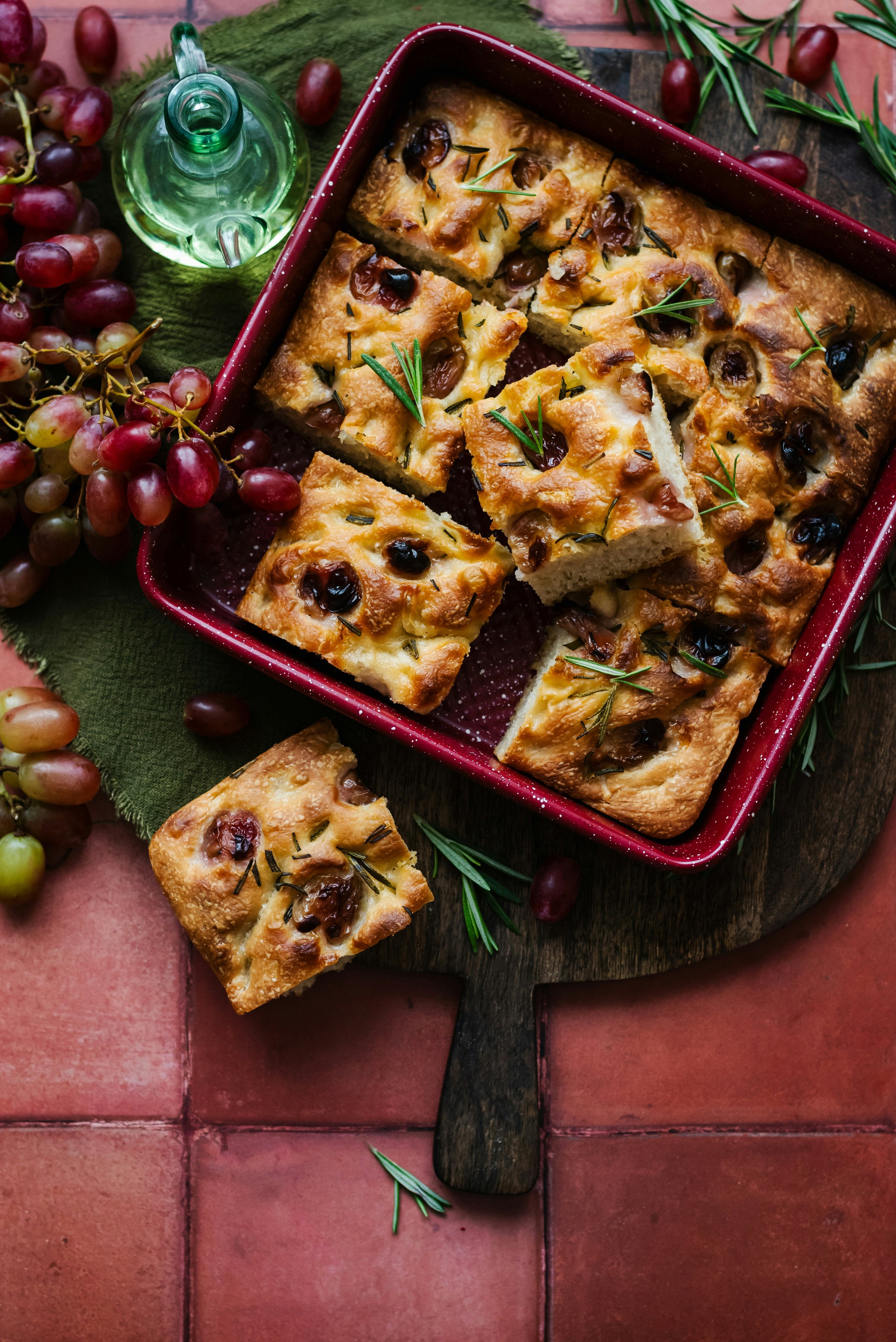
![Food Photography & UI Design]()
Food Photography & UI Design
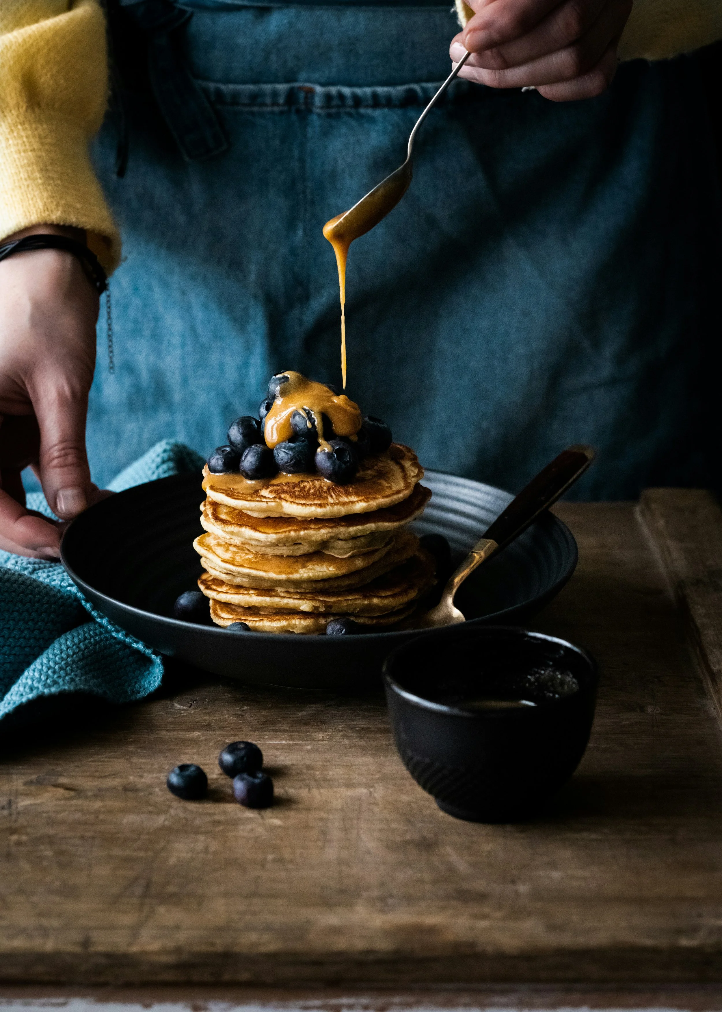
Used appetising imagery and warm colour palettes to stimulate appetite while maintaining visual restraint to avoid distraction.
-
![Cross-Platform Experience (App & Web)]()
Cross-Platform Experience (App & Web)
Ensured design consistency across mobile and desktop so users could discover recipes on one platform and cook on another without friction.
-
![Usability & Ease of Use]()
Usability & Ease of Use
Reduced friction through familiar patterns, clear affordances, and language that matched real-world cooking behaviour.
-
![Product-led Delivery]()
Product-led Delivery
I led the project from discovery through delivery, using focused sprints and testing cycles to keep momentum high and decisions anchored to user needs.
-
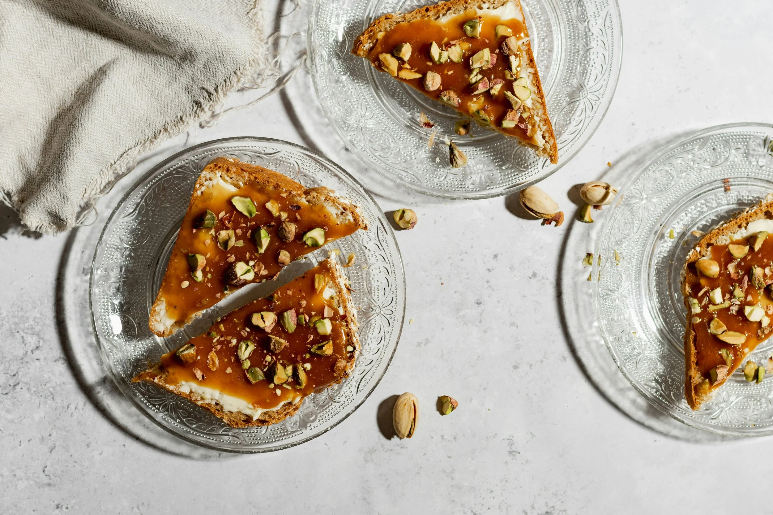
![Food Research & Colour Psychology]()
Food Research & Colour Psychology
Visual design choices were informed by food behaviour research, using colour to signal warmth, simplicity, and approachability.
-
![MVP Feature Prioritisation]()
MVP Feature Prioritisation
Applied strict prioritisation to protect focus, validating core value before considering expansion.
-
![Progression & Step Completion Design]()
Progression & Step Completion Design
Designed a clear, checkable step system so users always knew what was done, what was next, and where they were in the process.

What I Learned, the Challenges I Met, and My Biggest Takeaway
This project fundamentally shaped how I approach product UX design. It reinforced that the most impactful products aren’t built around ideal behaviour, they’re built around real hesitation. Designing Noms meant understanding uncertainty, decision fatigue, and low confidence, and then turning those moments into structured, supportive experiences that help users move forward.
I learned that great UX doesn’t eliminate complexity, it organises it into something people can handle. Confidence isn’t created through encouragement or clever copy, but through clear structure, predictable steps, and visible progress. Working within an MVP constraint sharpened my product thinking, forcing prioritisation around a single, meaningful problem rather than feature accumulation.
The biggest challenge was resisting over-design. Research revealed many opportunities, but the real work was deciding what not to build. Every interaction had to earn its place by reducing friction at the exact moment a user might hesitate. That discipline is where product clarity emerged.
My biggest takeaway is this: strong product UX starts where people pause. When you design for uncertainty rather than confidence, you unlock momentum, trust, and genuine engagement. That principle has stayed with me across every product I’ve designed since.
If This Resonates…
If you’re building a product that needs to simplify complexity, support learning, or guide people through decisions with confidence, I’d love to collaborate.
Let’s design something that feels intuitive, useful, and genuinely human.