

Designing an E-Commerce Experience for a Lifestyle Brand
Project: Vintage Vanilla
Vintage Vanilla was a product design and eCommerce project focused on translating a tactile, lifestyle-driven jewellery brand into a high-performing digital experience.
Rather than treating the website as a visual storefront, I approached this as a product, UX, and growth challenge: how to design an eCommerce experience that builds trust, supports different buying behaviours, and converts intent into confident action, without losing the brand’s emotional appeal.
As UX Product Designer and digital lead, I owned the experience end to end, from research and strategy through UX design, CRO, interface design, and digital marketing alignment.
The result was a cohesive eCommerce product that balanced emotion and optimisation, delivering a frictionless buying journey that supported brand growth, discovery, and conversion across web and mobile.
What I’d Been Working On
Vintage Vanilla was preparing for its digital debut.
The brand already had a strong physical presence and aesthetic identity, but the challenge was clear: an online store needed to do more than display products. It had to communicate feeling, support different shopper mindsets, and earn trust quickly.
The opportunity sat at the intersection of:
• E-Commerce UX design
• Conversion optimisation
• Behaviour-led design
• Lifestyle branding and growth marketing
This wasn’t about building “a nice shop”. It was about designing a buying experience that felt as considered as the jewellery itself.
-
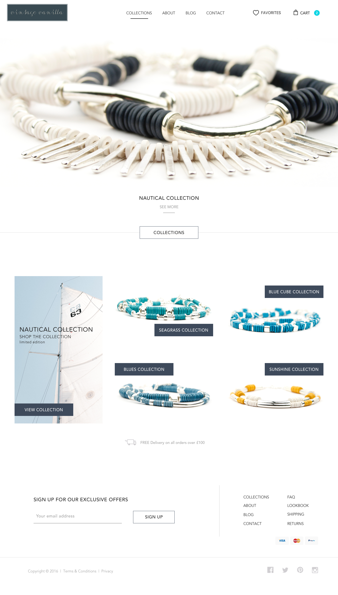
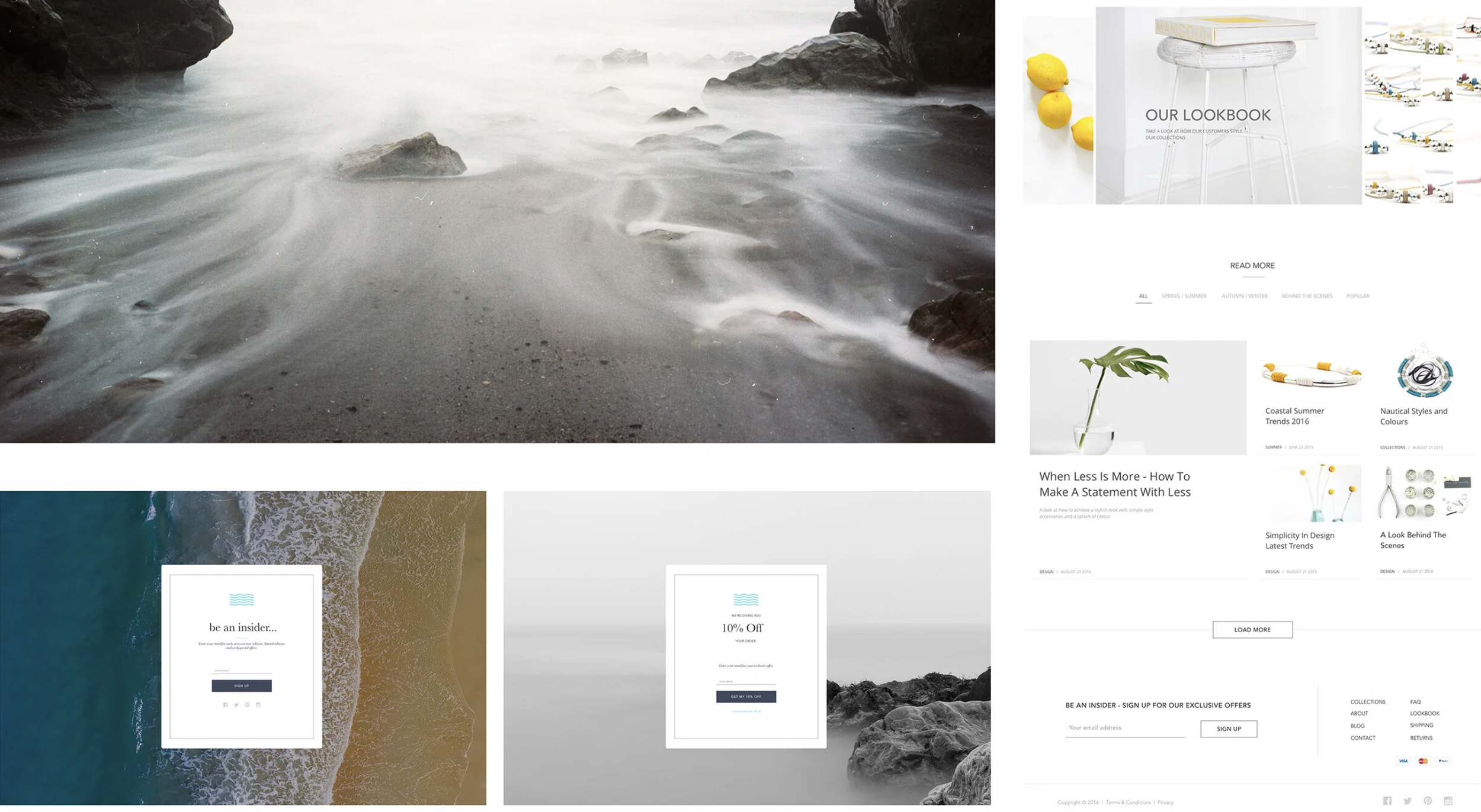
Vintage Vanilla is a nautically inspired jewellery brand built around self-expression, simplicity, and coastal elegance.
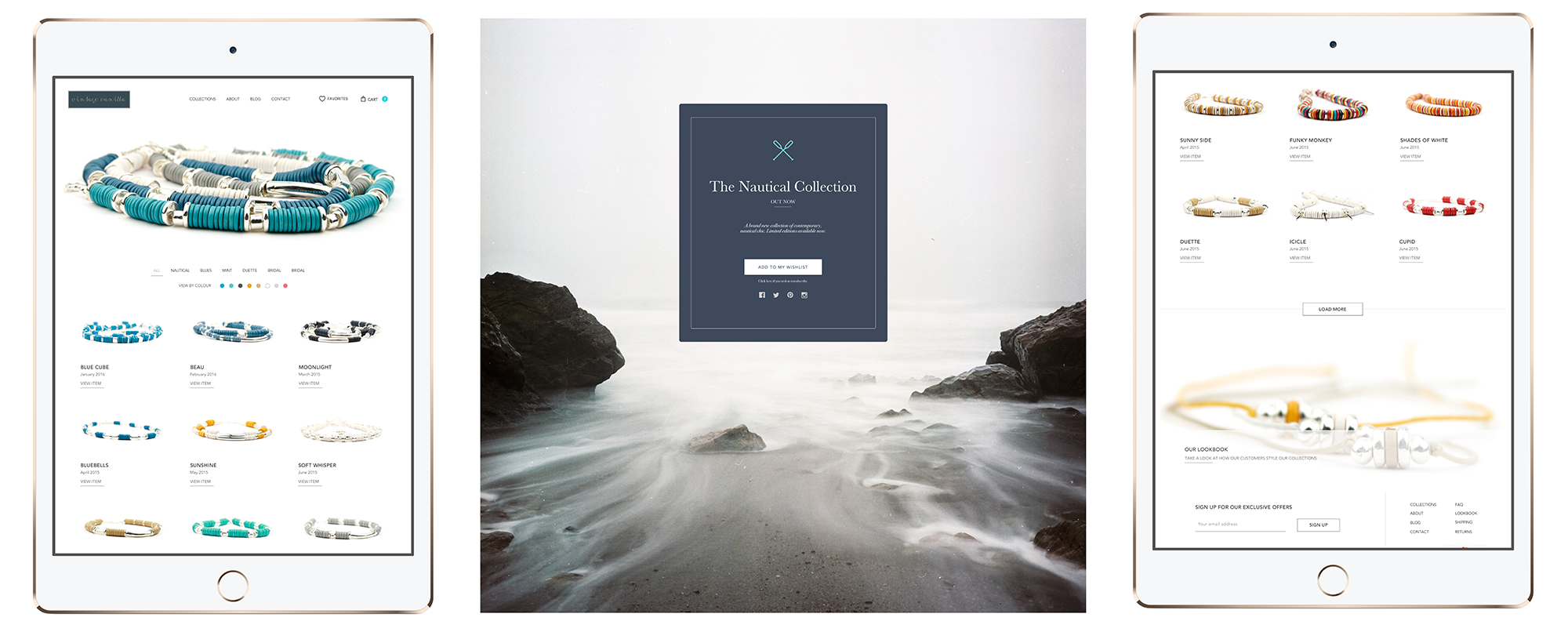
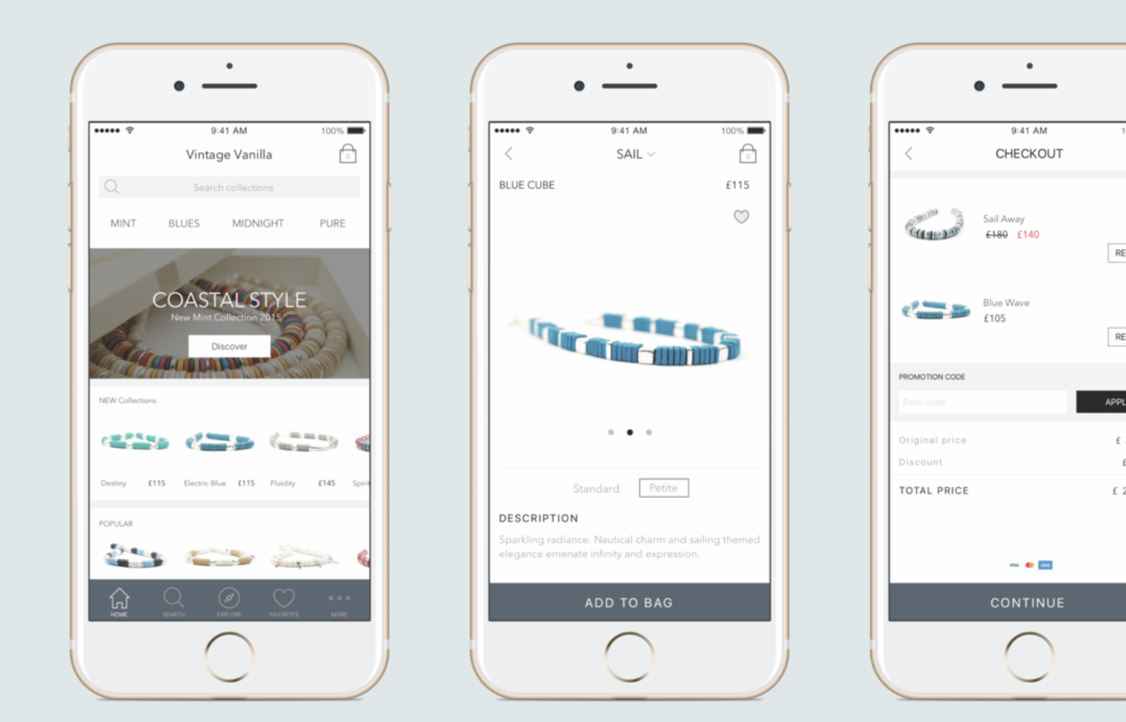
The eCommerce platform needed to:
• Reflect the brand’s understated, effortless aesthetic
• Support exploration and browsing as well as fast purchase
• Reduce friction at key decision points
• Work seamlessly across desktop and mobileMost importantly, it needed to answer one core question:
What should a customer feel at the moment they decide to buy?
That emotional lens shaped every design decision that followed.
-
UX Product Designer, CRO Lead, and Digital Marketing Partner
I owned the project end to end, including:
• Product and UX strategy
• Research and behavioural analysis
• Information architecture and user flows
• Wireframing and interface design
• Conversion optimisation and checkout design
• Design system and brand alignment
• Digital marketing and content strategy supportThis was a hands-on, ownership-driven role, balancing UX craft with commercial outcomes.
-
I approached Vintage Vanilla as a product, not a collection of pages. The experience was designed as a continuous journey, from discovery and exploration through reassurance, decision, and checkout, with each step intentionally shaped to reduce uncertainty and support confidence.
Design priorities focused on:
Clear hierarchy and information architecture to guide decision-making
Intuitive, distraction-free layouts that let products and brand lead
Familiar interaction patterns to reduce cognitive load
Emotional consistency across touchpoints to build trust
UX, content, and visual design were treated as one system. Conversion optimisation was embedded from the start, not added later.
The result was an e-commerce product where clarity, usability, and brand worked together seamlessly, making conversion a natural outcome of a well-considered experience rather than a forced tactic.
-
Vintage Vanilla reinforced a core belief in my approach to digital product design: progress comes from restraint, not accumulation. In eCommerce especially, the temptation is often to add more features, more content, more persuasion. This project required the opposite, making deliberate decisions about what not to include, and focusing on clarity, flow, and intent.
One of the central challenges was designing for multiple shopper behaviours within a single experience. Product-driven buyers, cautious researchers, browsers, and one-off shoppers all needed to feel supported without the product becoming fragmented or confusing. Solving this meant prioritising structure over surface, designing clear decision paths, and allowing the interface to adapt subtly to different user mindsets without calling attention to itself.
What this project highlights about how I work is my focus on designing for decision-making. I start by understanding how people evaluate trust, how they move from interest to confidence, and where hesitation appears. From there, I shape experiences that reduce cognitive load, support momentum, and let users feel in control rather than pushed.
My biggest takeaway is that strong eCommerce product design lives at the intersection of emotion, clarity, and optimisation. When brand, usability, and behavioural insight are designed together, conversion stops feeling like a tactic and becomes a natural outcome of a well-considered experience.
-
This project was designed and evolved using a product-led toolset focused on clarity, speed, and real user insight.
Product Design & Collaboration
Figma for end-to-end product design, wireframes, high-fidelity UI
Miro for user journeys, research synthesis and experience mapping
Frontify for maintaining brand consistency and design system governance
Research, Testing & Validation
UserTesting for moderated usability testing across key journeys
Maze for fast concept validation, messaging clarity, and decision-path testing
Webeo for structured CRO experimentation and conversion insight
Behavioural Analytics & Optimisation
Hotjar for heatmaps, session recordings, and friction analysis
Product Delivery & Team Workflow
Asana for project planning, prioritisation, and delivery tracking

Why E-commerce Became My Design Playground
E-commerce drew me in because it’s one of the most honest product environments. Users arrive with intent, hesitation, and emotion, and every design decision immediately shows up in behaviour.
What fascinates me is that strong e-commerce UX isn’t about persuasion, it’s about understanding how people decide. How they evaluate trust, compare options, hesitate, and gain confidence. Small choices in structure, language, and interaction timing can radically change outcomes, and those patterns are visible, they can be tested and yes, they are, measurable.
This led me into continuous testing and optimisation as a design discipline. Watching real users scroll, pause, abandon, or convert shaped how I design far more than assumptions ever could. Each iteration focused on reducing cognitive load, clarifying value, and supporting confident decisions.
That mindset carries through all my work. Whether e-commerce, SaaS, or learning platforms, I design products around real behaviour, clarity, and intent, so conversion becomes a natural outcome of a well-considered experience.
-
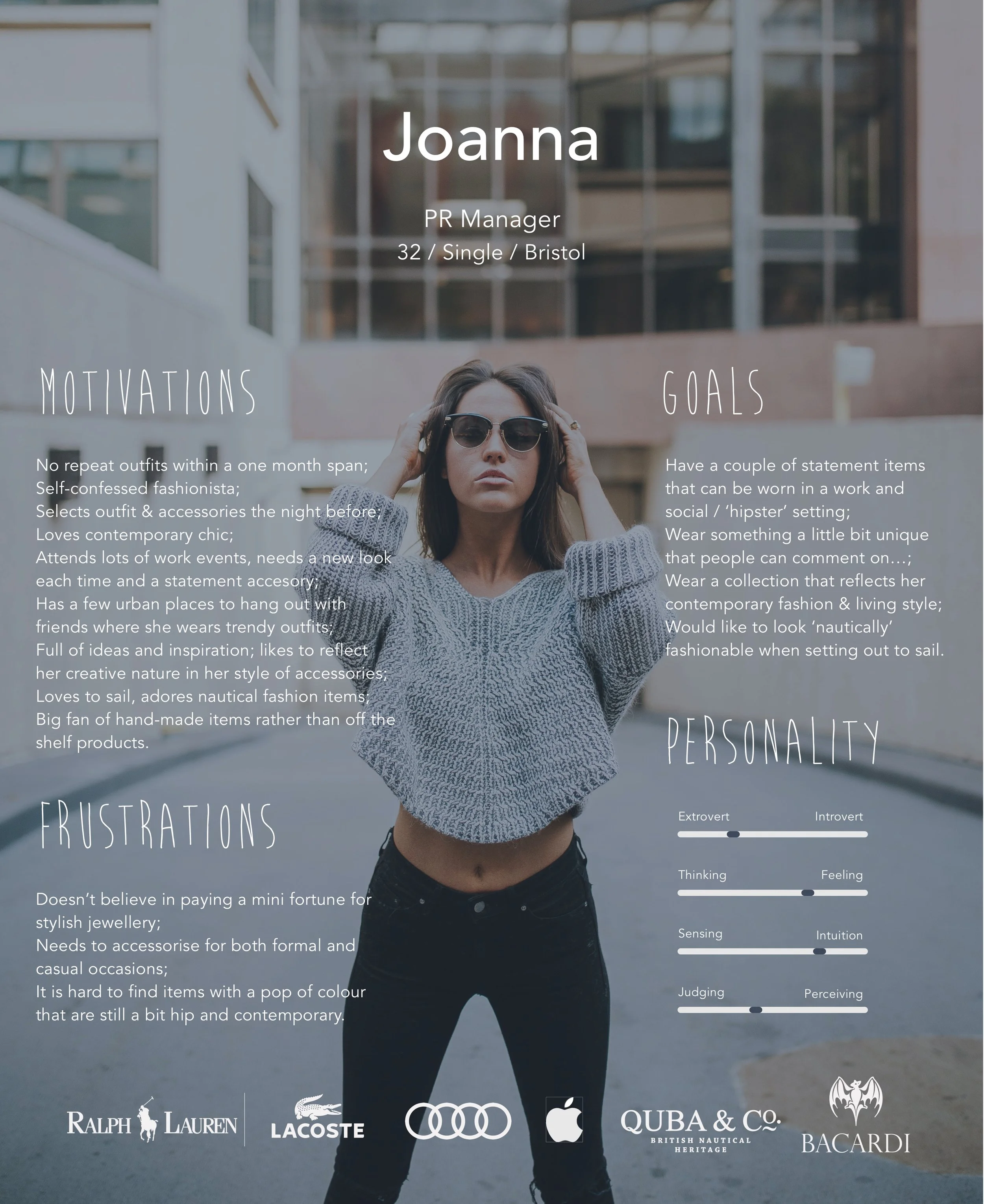
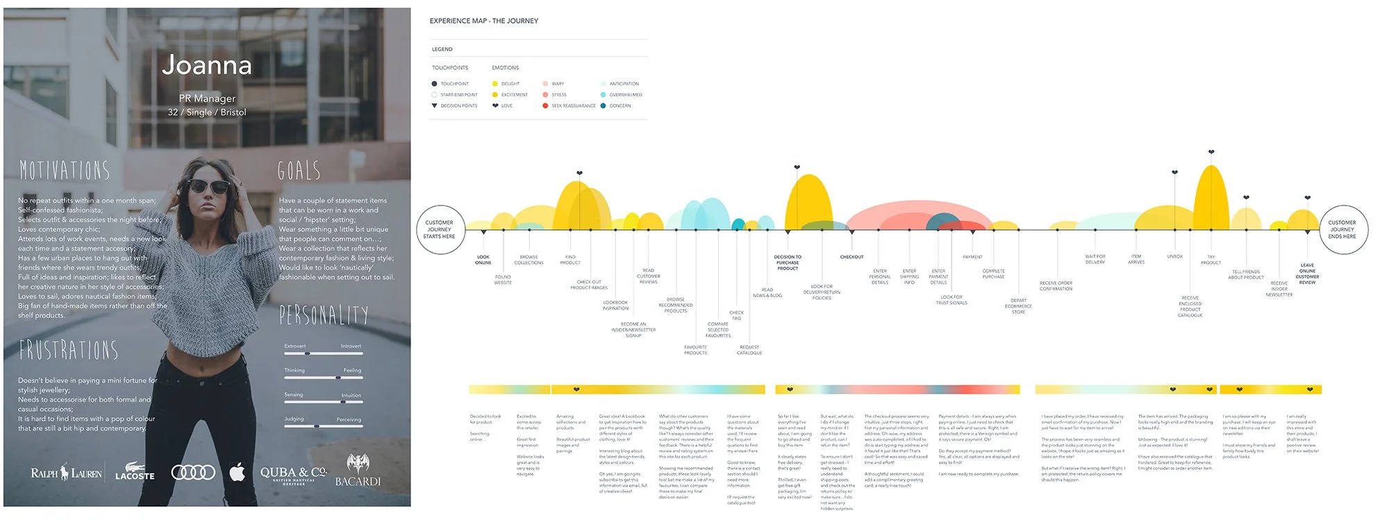
Research focused on how people shop, not just who they are.
Methods included:
• Competitive analysis
• ECommerce behaviour research
• User personas and empathy mapping
• Journey mapping and “moments of truth”This led to four core shopper behaviours:
• Product-focused
• Research-driven
• Browsers
• One-off shoppersEach behaviour influenced navigation, content depth, trust signals, and checkout flow.
-
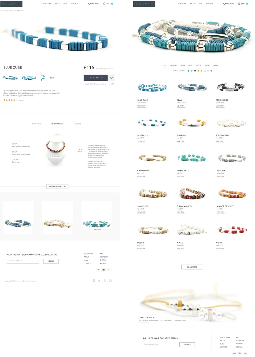
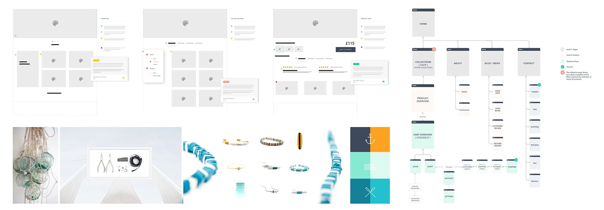
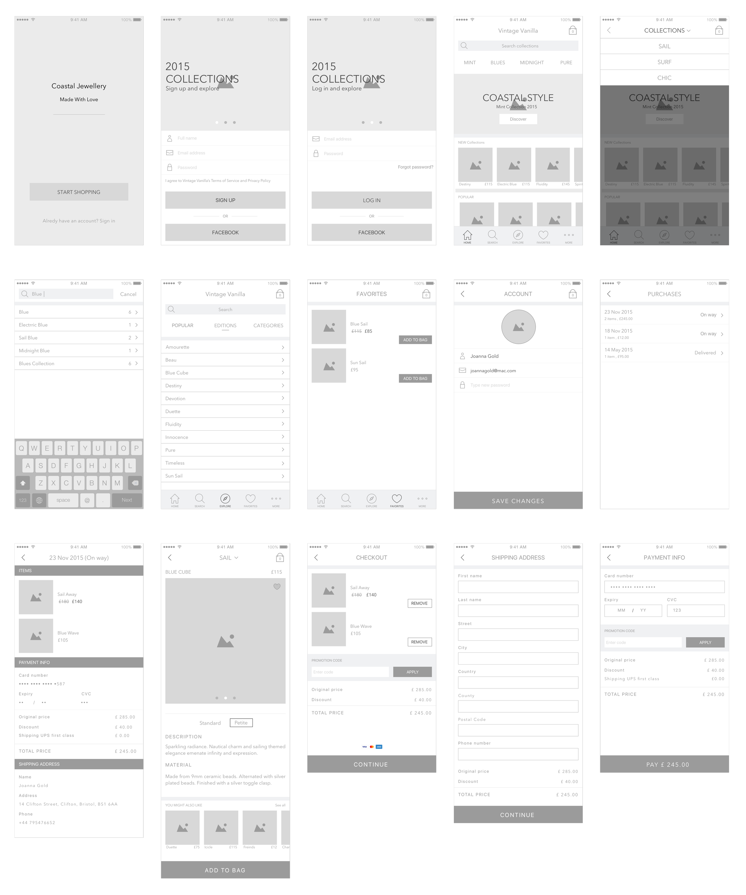
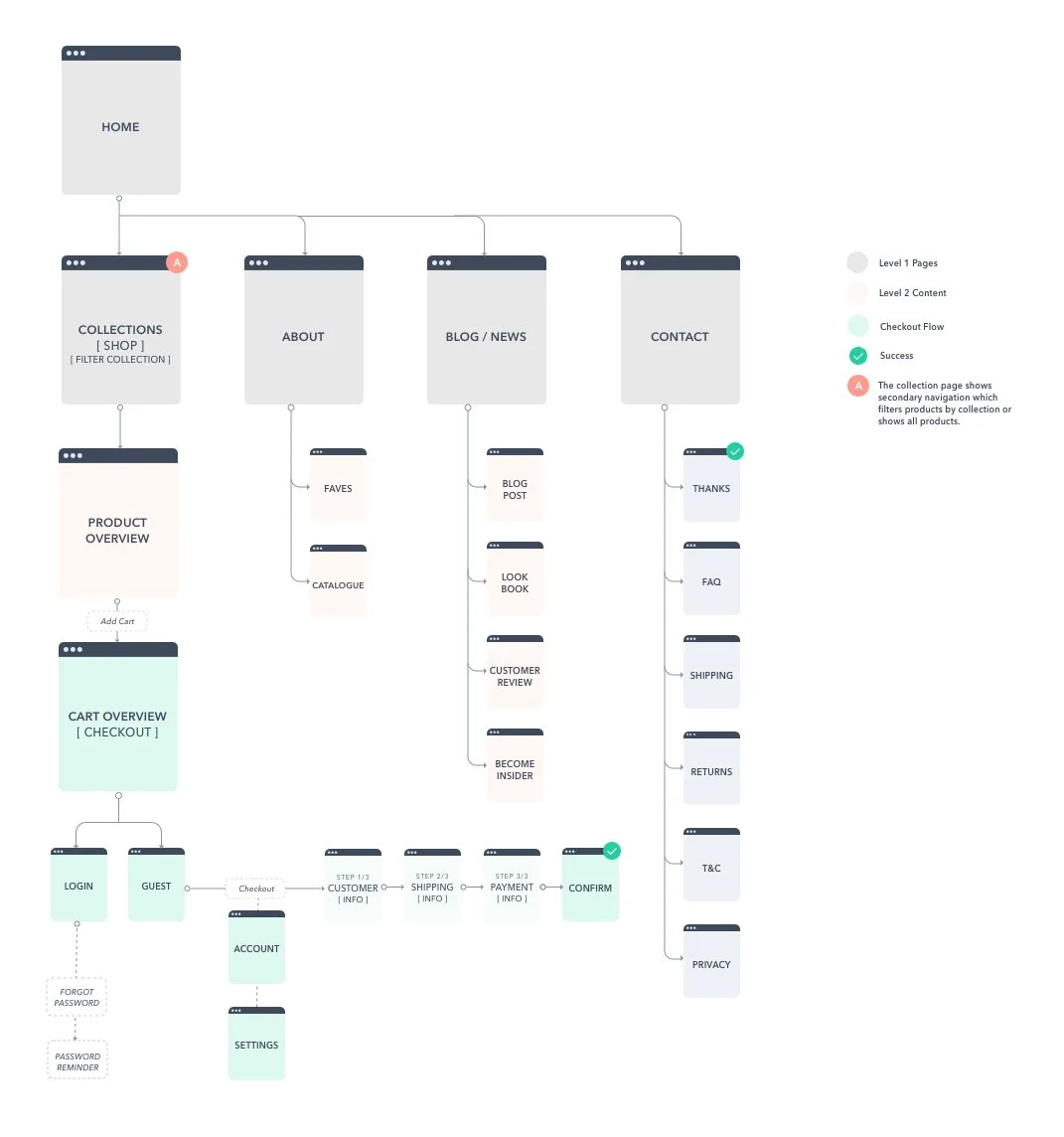
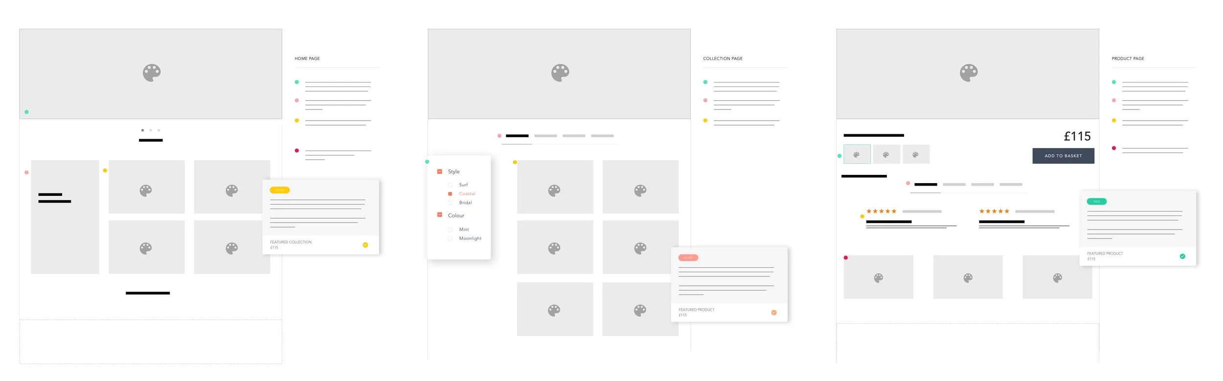
Before visual design, I defined a clear information architecture.
Work included:
• Sitemap creation
• Card sorting and tree testing
• User stories and Kano Model prioritisation
• Micro-frames → low-fidelity → high-fidelity wireframesThe structure ensured users could:
• Find products quickly
• Understand value without friction
• Move forward confidently at their own pace -
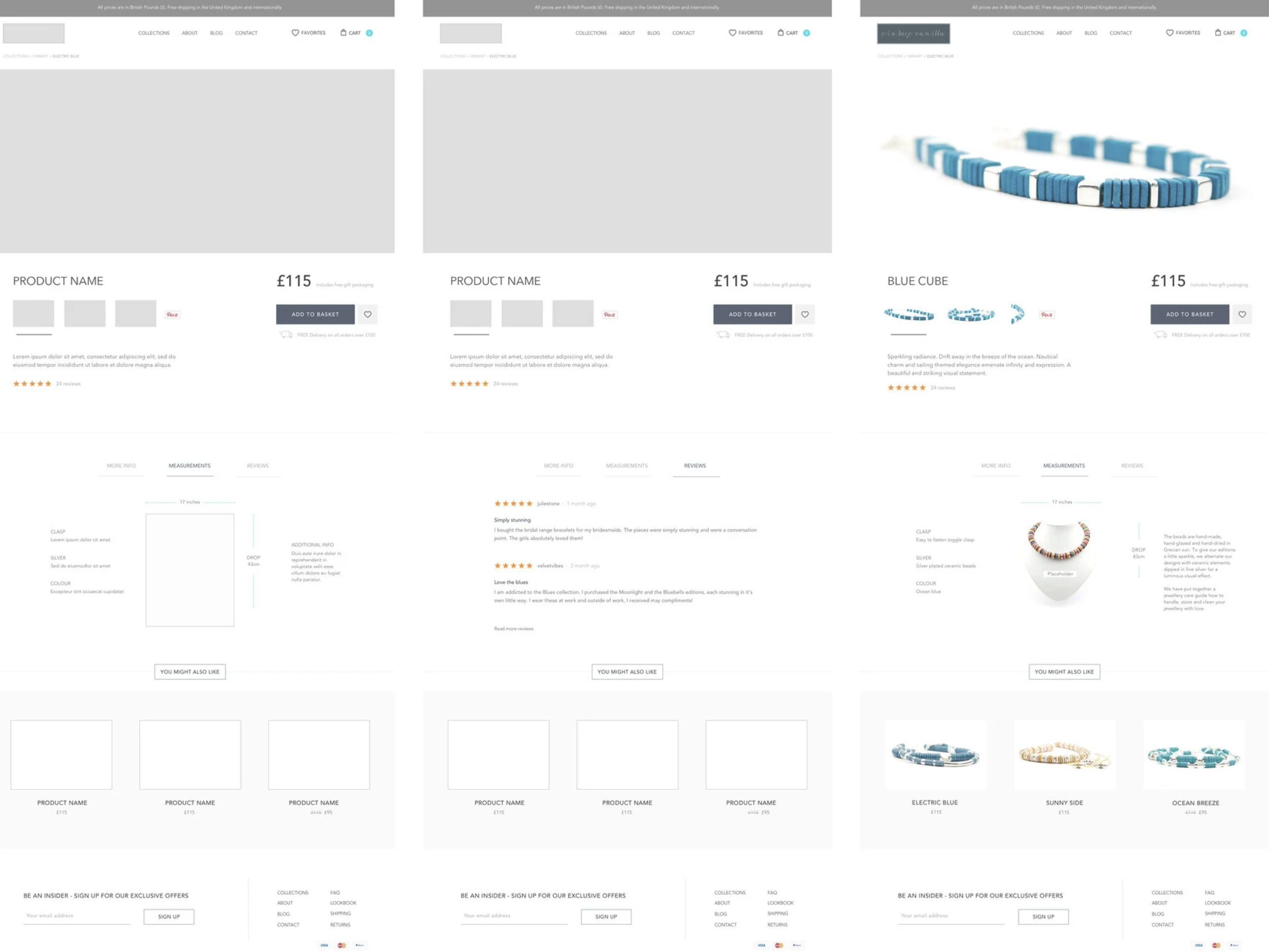
CRO was embedded from the start.
I tested and refined:
• CTA placement and wording
• Product messaging clarity
• Page hierarchy and scroll behaviour
• Trust and reassurance cuesOptimisation focused on removing hesitation, not increasing urgency.
The result was a buying experience that felt natural, credible, and effective.
-
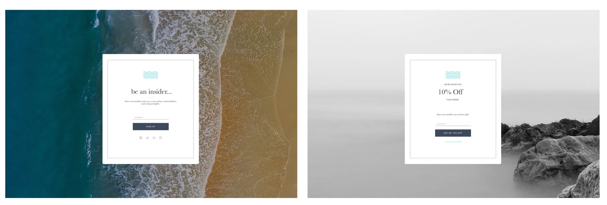
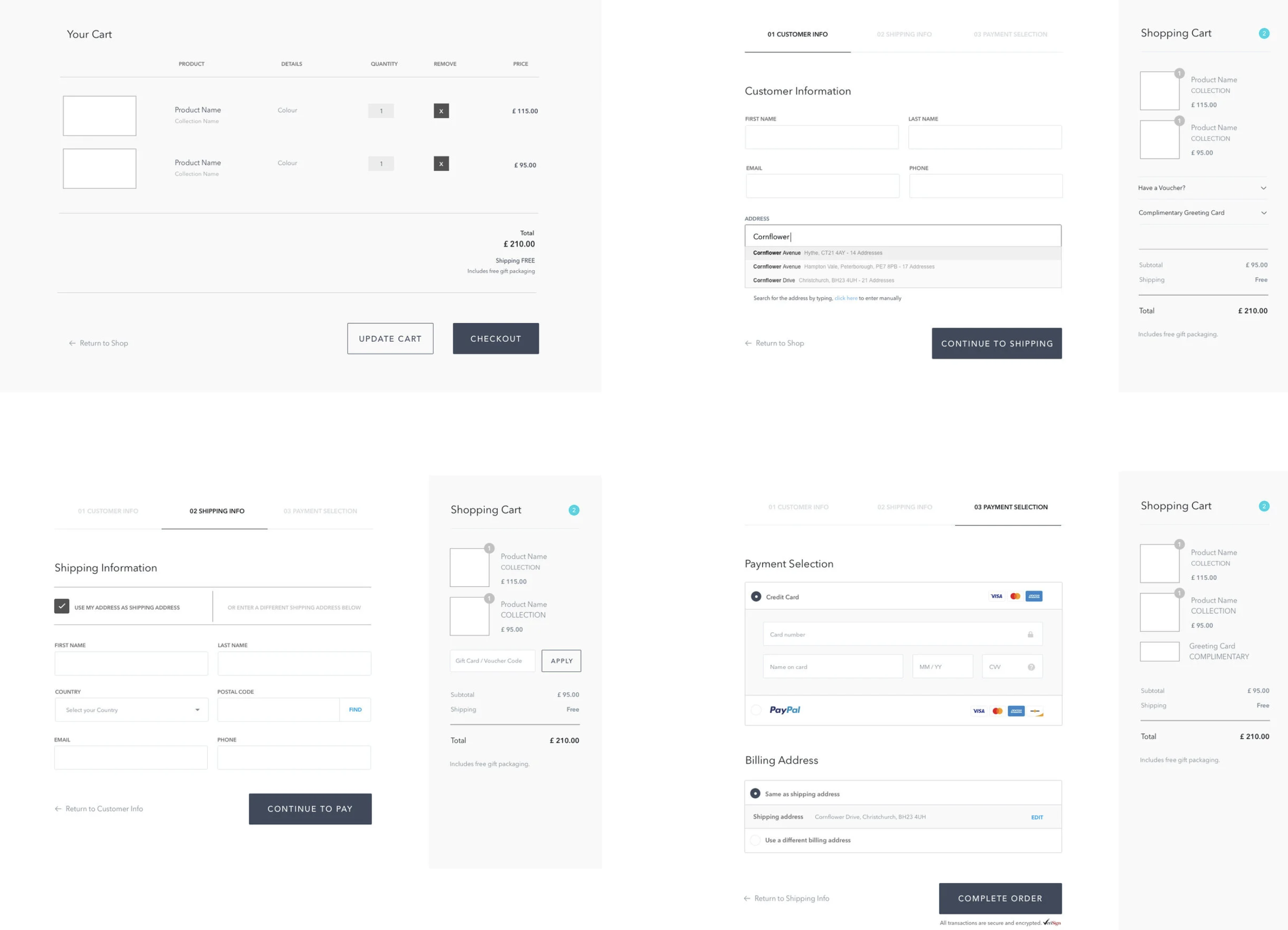
Checkout was designed as a critical behavioural moment.
Using the Fogg Behaviour Model, I reduced friction once motivation was high:
• Fewer steps
• Clear progress
• Strong trust signals
• Fast information entryThe experience respected the psychology of commitment, helping users complete without second-guessing.
-
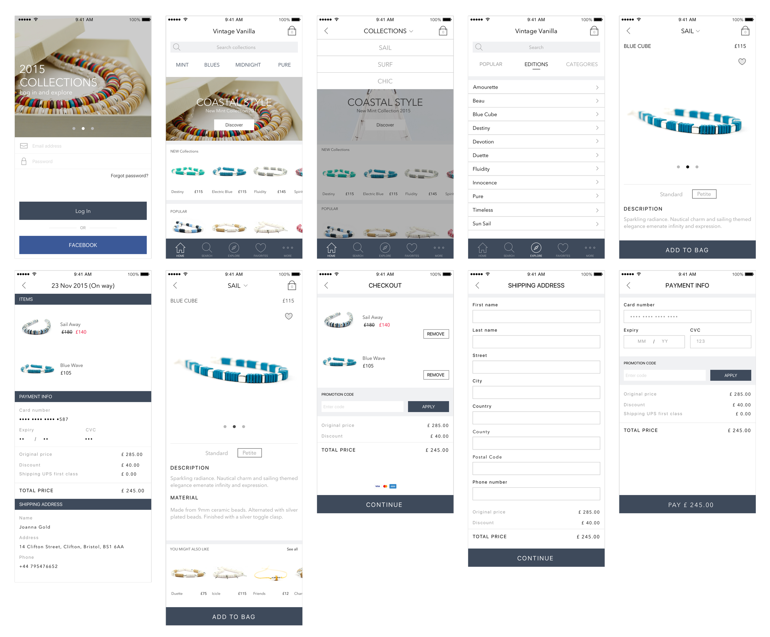
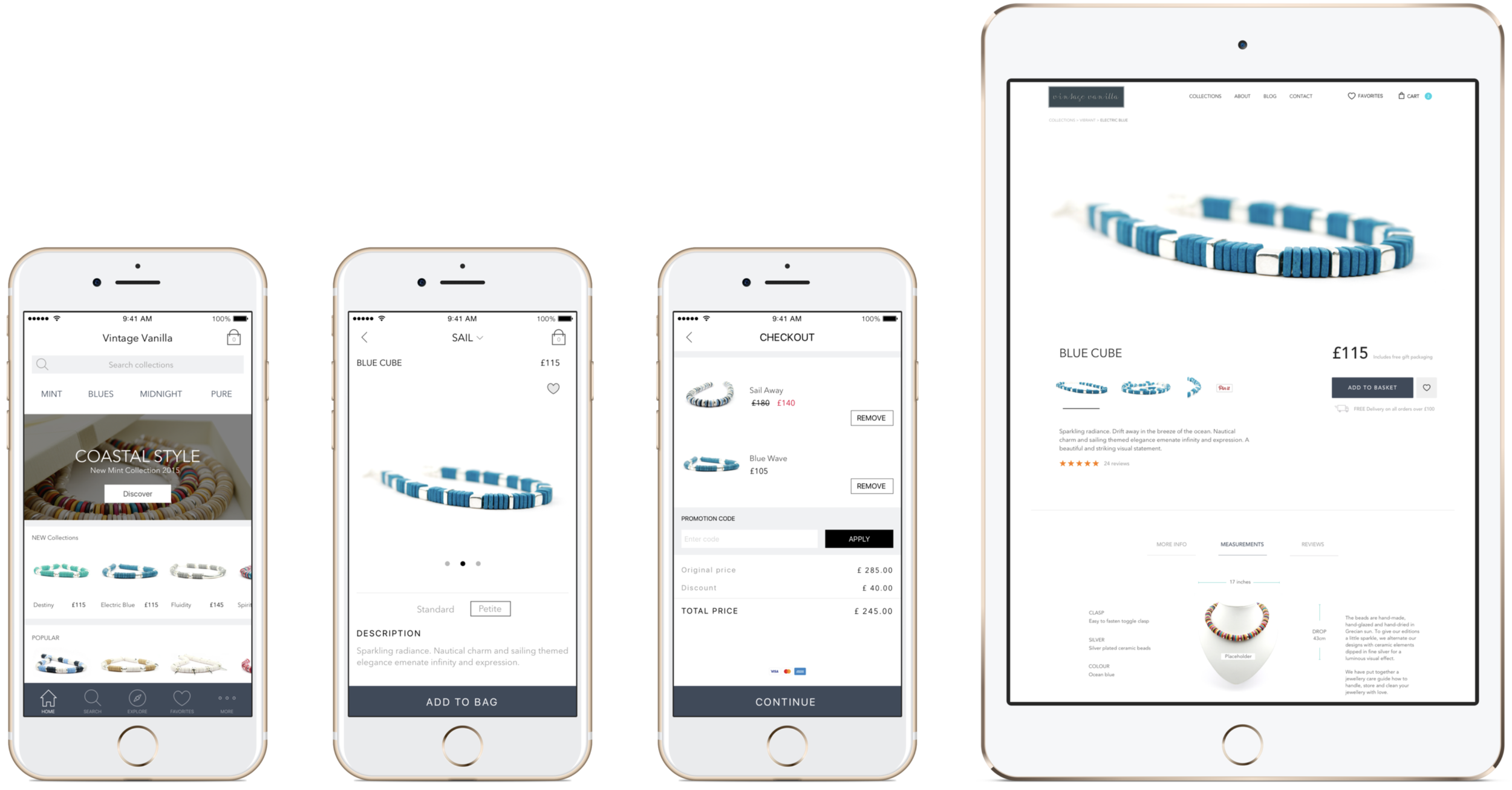
The UI followed principles of:
• Simplicity
• Familiar mental models
• Visual hierarchy
• Brand-aligned colour psychologyDesign supported desire without overwhelming attention. Aesthetic choices were always tied back to usability and conversion.
-
Social proof and storytelling were treated as product features, not add-ons.
Key elements:
• User-generated content
• Reviews and shared imagery
• Lookbooks and lifestyle storytelling
• Integration with social channelsPop-up stores extended the digital experience into physical space, reinforcing trust and community while feeding content back into the product ecosystem.
Designing E-Commerce as a Product Experience
-
![UX Design]()
UX Design
The experience was designed around how users think, compare, and decide, with clear flows that reduce uncertainty and support confident progression through the journey.
-
![Digital Marketing Experience]()
Digital Marketing Experience
Product, content, and messaging were aligned to ensure the experience and conversion worked seamlessly together.
-
![Growth Marketing]()
Growth Marketing
Growth was driven through behavioural insight, not tactics, using experimentation to improve discovery, engagement, and conversion at key decision points.
-
![User Journey Design]()
User Journey Design
The journey was mapped end-to-end from first impression to post-purchase confidence, identifying moments of hesitation and designing reassurance into the flow.
-
![Concept Testing & Iteration]()
Concept Testing & Iteration
Early concepts were tested quickly and iterated based on real user reactions, allowing direction to be validated before visual or technical investment increased.
-
![High-Fidelity UI Design]()
High-Fidelity UI Design
High-fidelity designs balanced brand expression with usability, translating emotional intent into calm, intuitive interfaces that supported trust and conversion.
-
![Low-Fidelity Design]()
Low-Fidelity Design
Low-fidelity wireframes focused on structure, hierarchy, and flow, ensuring usability and clarity were resolved before visual design was introduced.
-
![Information Architecture (IA)]()
Information Architecture (IA)
The IA was designed to surface the right information at the right moment, helping users orient themselves and make decisions without cognitive overload.
-
![User Research & Buying Behaviour]()
User Research & Buying Behaviour
Research focused on understanding how different shopper types evaluate trust, price, and risk, informing design decisions across content, layout, and interaction.
-
![User Testing]()
User Testing
Usability testing highlighted friction, hesitation, and confusion, enabling targeted refinements that improved flow and reduced abandonment.
-
![Conversion Optimisation (CRO)]()
Conversion Optimisation (CRO)
CRO was embedded throughout the design process, using testing and behavioural data to refine CTAs, messaging, and progression rather than relying on assumptions.
-
![Product Thinking & Ownership]()
Product Thinking & Ownership
The project was approached as a product, not a website, with clear ownership over discovery, design decisions, iteration, and measurable outcomes.
-
![Checkout & Address Validation]()
Checkout & Address Validation
The checkout experience was designed to minimise effort and reinforce trust, reducing friction during address entry and payment to support completion.
-
![Trust & Credibility Signals]()
Trust & Credibility Signals
Design elements such as social proof, reassurance messaging, and consistency across touchpoints were used to build confidence without adding noise.


What I Learned, the Challenges I Met, and My Biggest Takeaway
This project reinforced how important it is to balance research with design judgment. User insight provided direction, but moving the product forward often required trusting instinct to make decisions in ambiguous spaces where patterns were still emerging.
One of the biggest challenges was designing credibility without institutional authority. Trust had to be earned through the experience itself, using community signals, language, interaction design, and clear structure. This required careful trade-offs, resisting feature creep, and designing with restraint so the product felt confident rather than persuasive.
The key takeaway for me is that strong product design doesn’t begin with features or solutions. It begins with understanding how people make decisions, what they rely on when uncertainty is high, and how design can reduce friction while increasing confidence.
Explore Now started as an MVP, but it became a powerful lesson in behaviour-led design for me. Paying close attention to early signals, hesitation, and engagement revealed how thoughtful UX decisions can surface emerging needs and hint at markets before they fully form.
If This Resonates…
If this project reflects how you think about product design, eCommerce, and growth-led UX, I’d love to work together.
I enjoy partnering with teams who value clarity, behavioural insight, and design as a strategic driver of commercial outcomes. If you’re building, scaling, or refining a product where experience and performance matter, let’s talk.