
Imagine that a user has been browsing through your website, then decides to leave without doing any of the things you want them to do...
Users tend to price compare, look for promotions, coupon hunt, and search for important needs like free shipping, etc. Over 68% of shopping carts are abandoned.
Using analytical exit-intent technology based on real time user behaviour you can make one more effort to convert visitors as they are about to leave your site. By detecting when someone is about to drop off your site, you can employ corrective measures right at that pivotal moment.
There are three main purposes to effectively use this technology:
Reduce site abandonment by giving abandoning visitors a reason to stay on a site and recapture their interest;
Increase conversions by getting visitors to complete their purchase;
Find out why visitors are leaving by learning what makes visitors tick by asking them about their experience when they’re about to leave a site.
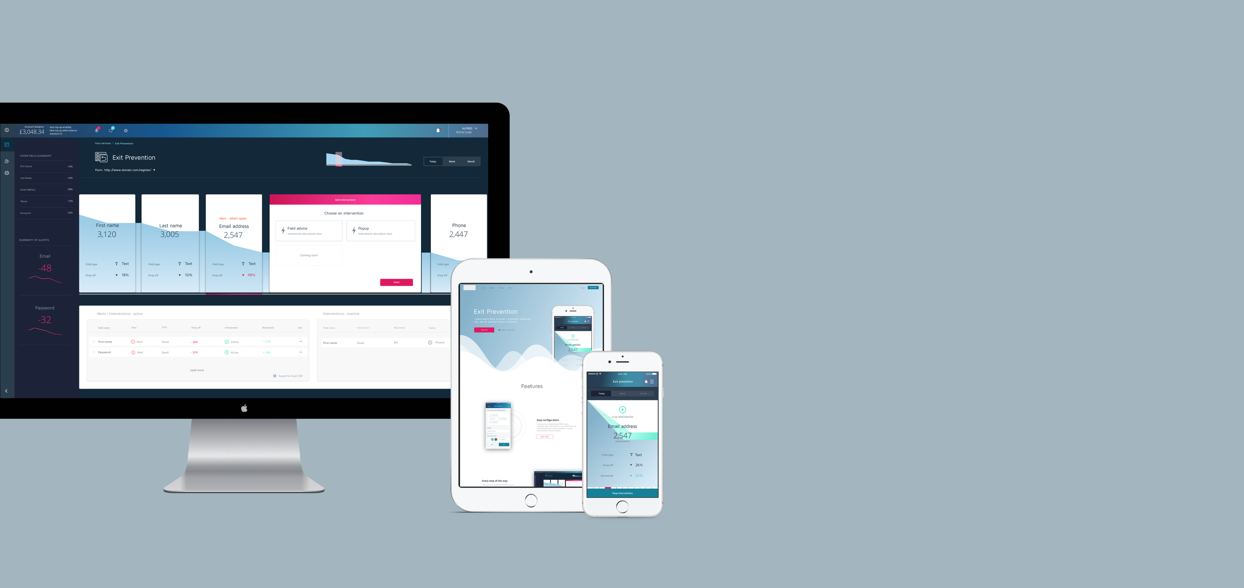
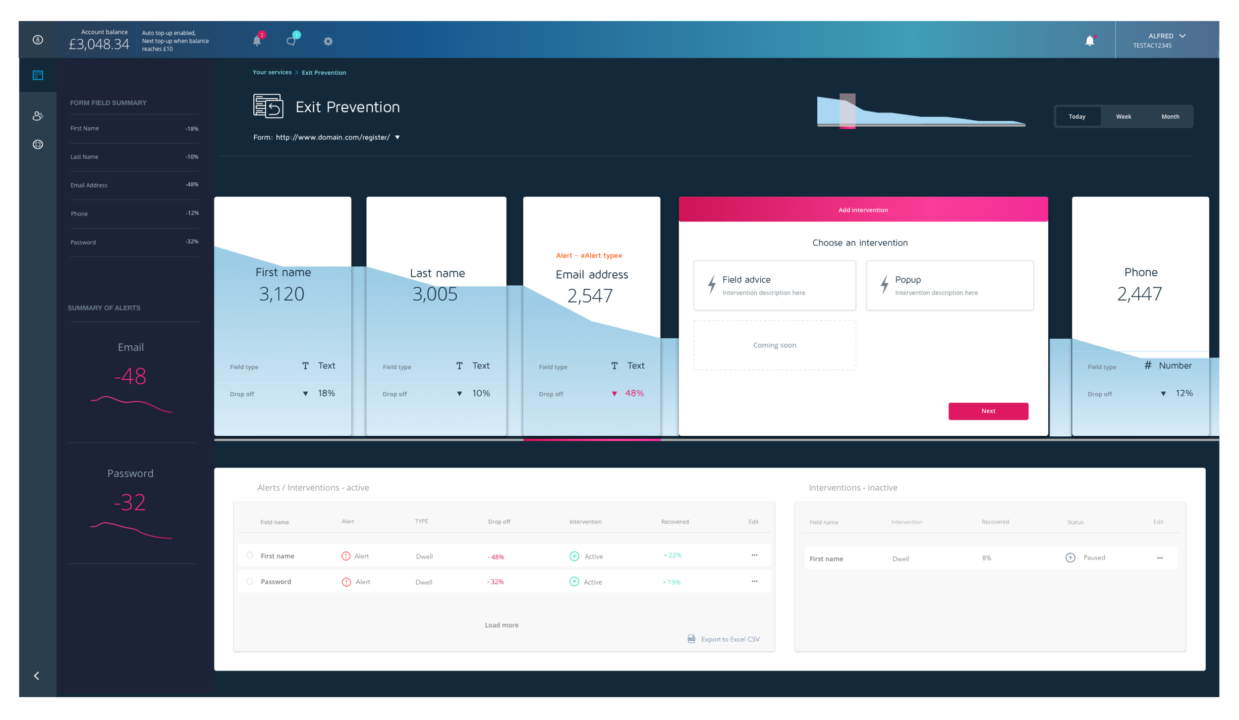
My challenge was to design a ‘digital control room’ to help users (across desktop and mobile) be proactive by providing at-a-glance information to make the best sense of the data, analyse trends and drive decision making — without overwhelming the user.
This project included: Research, User Flows, Low and High Fidelity Wireframing - Desktop and Mobile
Tracking behaviour
The challenge was to explore options to try and re-engage the user during that very ‘moment of indecision’ and keep users on a site and prevent cart abandonment with behavioural based messaging at key points in the checkout, registration or sign up process.

Keeping the user engaged
User Behaviour Scenarios
A user is about to close a page, and moves their mouse to the top left /right window.
A user is highlighting the product name/code in order to paste into a search engine and potentially find a better price elsewhere.
The user is filling in a form and their flow is interrupted by an element that for whatever reason, causes them to lose focus and not submit or move forwards.
The user is reluctant to provide personal or sensitive information and gives false or dummy data in order to register.
The user spends a particularly long time on a specific field. This may be because they don’t understand or don’t have information to hand.
Multiple data entries and deletions in a field may mean a user is confused about what data to provide, or how it should be formatted.

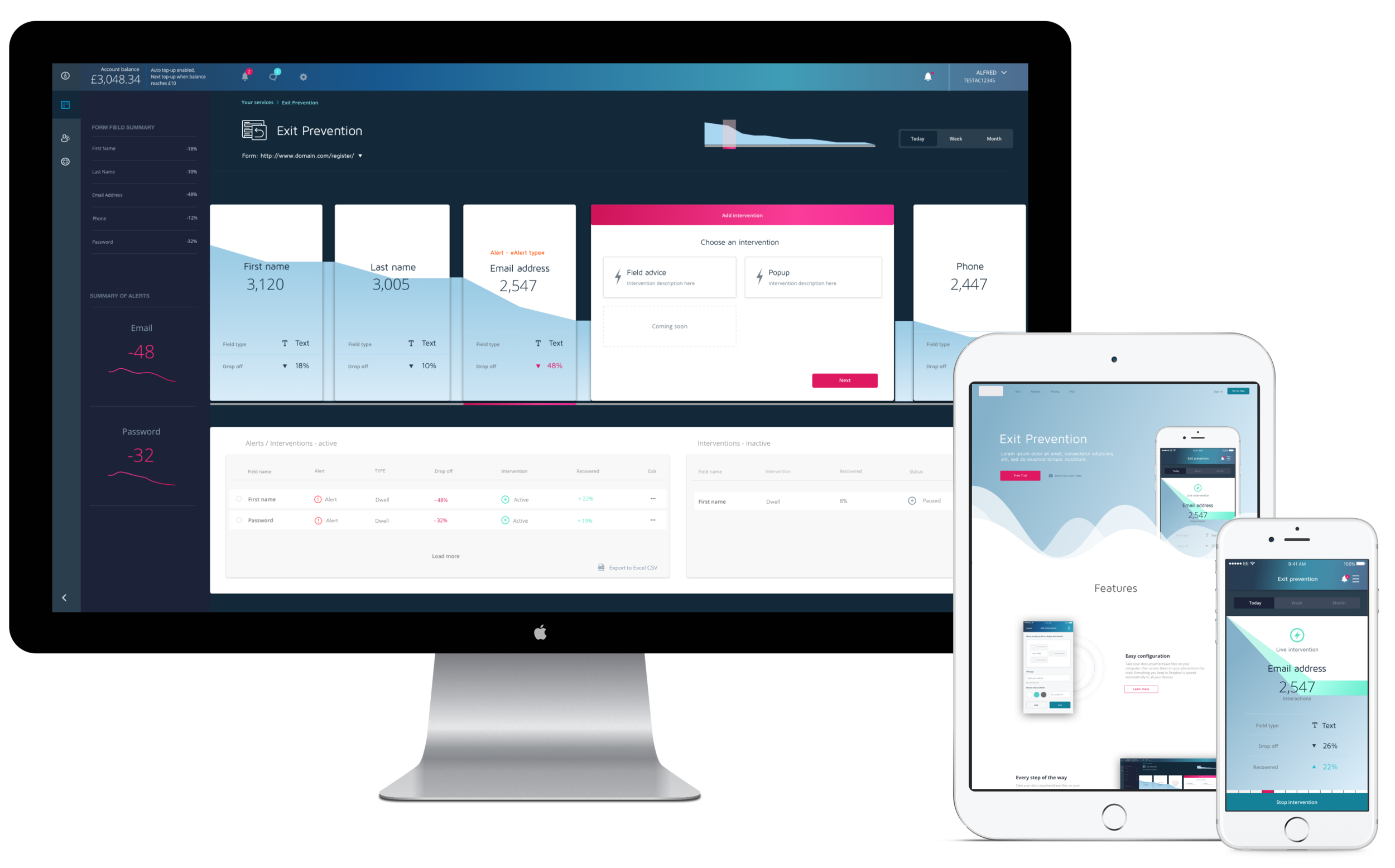
The challenge
My mission was to design a dashboard view that presents trends and risk areas, and updates users on what happens to guide the user to take appropriate action as they are engaged in time-sensitive tasks. I came to appreciate that data representation is a complex task; and not overwhelming the user with information is a challenge in itself.
Key takeaways
Each dashboard has a very specific purpose it serves. Getting this wrong renders all efforts meaningless. The type of dashboard and its role should be determined by the user roles & needs you seek to satisfy. Don’t hide information or rely on interactions too much — remember, the primary purpose of dashboard reporting is to surface information at a glance, relying on too many interactions dilutes the whole purpose.