

When the days of “above the fold” are over
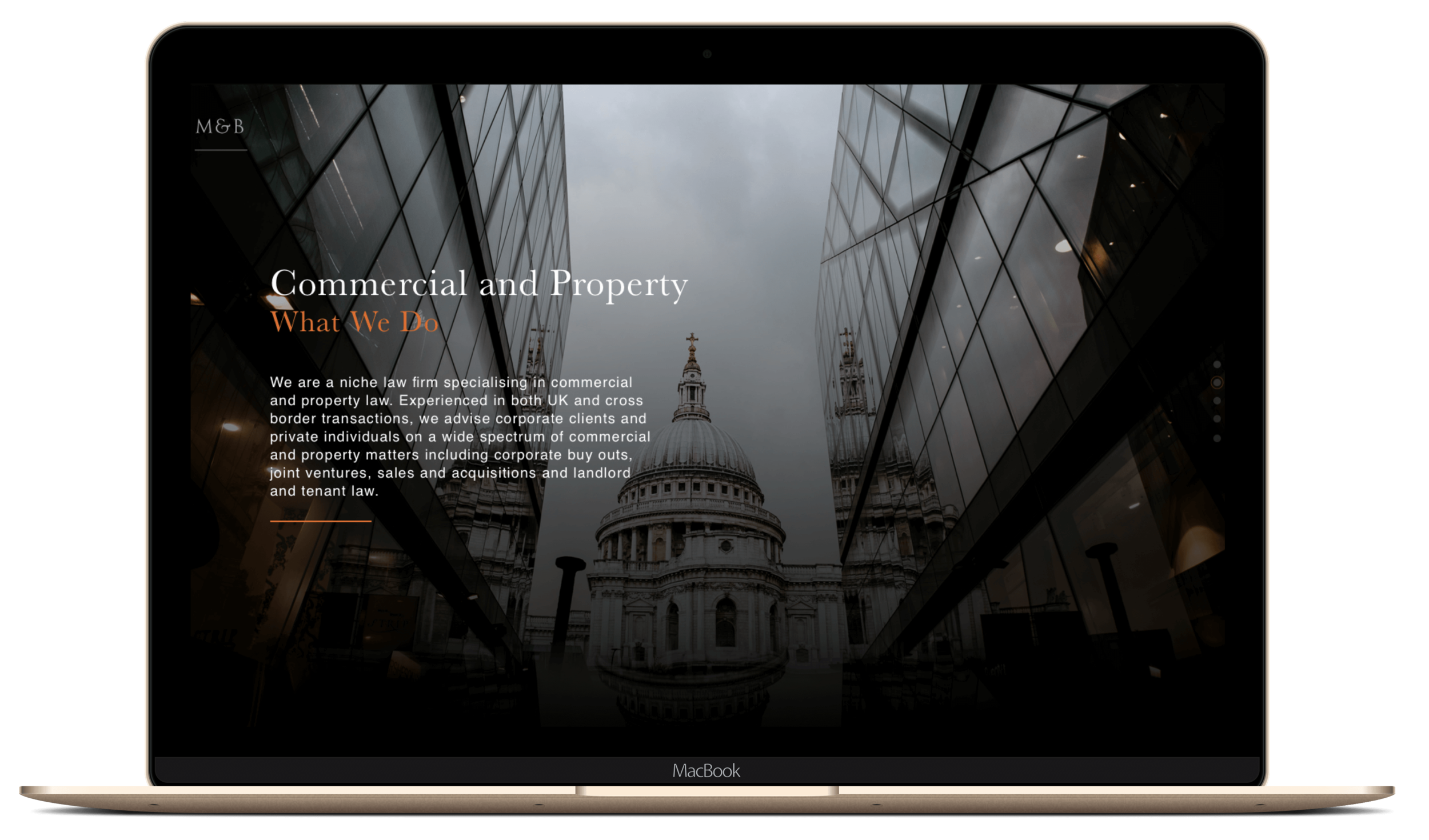
Based in Soho Square, M&B is a niche firm of property lawyers specialising in property finance and property insolvency law. Having worked with M&B since their inception back in 2011, the firm tasked me to explore how to create an immersive browsing experience for their users by merging the parallax effect with long-scrolling to deliver their end-to-end story and offering to their audience.
This project included: User Flows, Wireframing, User Interface Design
There are too many different screen sizes to accurately predict “The Fold”
True: The fold is important for setting the expectations of the rest of the page. However, a call to action should be placed in a position whereby the visitor has been most persuaded to act upon it (and that’s not necessarily ‘above the fold’).
The UX of the Visual Interface
This long-scrolling site concept creates a linear step-by-step experience. It gives the user a sense of control and comfort as they keep scrolling at their own pace and satisfaction. The long scroll makes navigation intuitive and keeps the user focused and on topic. I incorporated parallax scrolling to create an illusion of depth and immersion. I wanted to create more than ‘an entertaining visual effect’; my goal was to create a smooth visual narrative that would keep a user engaged.
Scroll ‘pages’ break up the content into digestible chunks of information that all relate to the main theme — overall creating an immersive browsing experience. Applying the single page layout I segmented the content to break it up into sections using different background colours and section headers to draw the eye, and above all to help users consume content faster and easier without any problems - in a concise yet encouraging way. I used various techniques to achieve visual hierarchy such as size, colour, contrast, proximity, and repetition. Since this layout contains a number of sections, I tried to use both the F-pattern and the Z-pattern for different sections in order to diversify the site structure.
Using Hotjar, I calculated the average fold score so that I could visualise the part of the page most visitors see before they start scrolling. Heat maps allowed me to track user behaviour on the site to understand how visitors interact with page elements. To avoid creating a logical end (or a ‘false bottom’), I had to set expectations with the visitor to keep them engaged .. and scrolling.


The challenge
Applying the parallax effect created a challenge for me. I had to consider aspects such as loading time, intuitiveness and responsiveness for the mobile version of the site. To benefit from the parallax design technique, I used this effect carefully to keep the UX pleasant and intuitive.
Key takeaways
When creating longer-scrolling sites, I had to keep in mind that users still require a sense of orientation (their current location) and navigation (other possible navigation options). The solution for this problem was a sticky dot menu indicator in a vertical orientation.