

Mixing data science with user insights to find trends and behaviours over time, in real time.
The project: Build a data visualisation product that is an online resource for insight into past, present and future eCommerce and retail shopping trends - with the ability to mix and customise real data and present trends in a meaningful way to identify behavioural correlations.
This project included: Research, User Flows, Information Architecture, Wireframing, Interaction Design
Real-time insights
Data visualisations that offer a combination of historic data and real-time information that is useful for identifying emerging trends and real-time insights.
The Science Behind the Data
Building a data visualisation product with the purpose of delivering trends and insight is fundamentally different to most front-end web builds that try to guide their users toward a single action or set of actions (e.g. buying a product, sharing a link, signing up to a newsletter). But when the goal of a product is to deliver insight through data, this linear model of an end-to-end user flow does not apply in its traditional form. I had to shift my mindset that there is no defined task to complete.
I didn’t have the capacity to conduct robust UX workshops due to budget and time constraints. However, having recently conducted extensive research and mapped out a suite of user personas for this brand, I felt I had a good baseline understanding of some of the potential users; in addition, I had extensive conversations with other internal teams to validate my thinking and gain further insight into the type of users of this ‘analytics and insights portal’, and their needs and expectations. Essentially, what this meant was to pull apart some of the leading analytics dashboards and study the UX to see what I could learn, understand data display patterns and familiarity patterns to increase the speed of adoption by reducing potential friction for a user and build confidence in using the portal.
What I had noticed reviewing some of these analytics portals was one important factor — a lack of impetus on the end user experience while designing and building insight-driven analytics platforms. On some of the analytics portals I reviewed and benchmarked as part of my research, I felt that UX considerations often took a back seat as data science teams seemed to focus more on the ‘engineering of the portal’ (..quite rightly so! but sometimes forgetting that the user is human…). This emphasised my approach to give adequate consideration to the user experience to foster end user adoption from the very beginning.
Guiding UX Principles
I consider Design Thinking as a process that you go through to create solutions; I then add a pinch of Human-Centred Design as a mindset that overlays design thinking to ensure that the products are actually relevant and beneficial for the intended purpose. I adopted an approach I would lovingly refer to as “UX-led analytics” (essentially, where the user experience and interfaces are conceptualised upfront, before data engineering gets involved). In this context, I infused the project with some guiding UX principles:
Get the right insights to the user at the right time and in the right format. For this principle to work, I had to understand who really are the users, what do the users really want, which formats satisfy the requirements, how should I provide only the data that is absolutely required at this point (must have vs nice to have insights), what mental models and data formats are users familiar with or what format would they expect to see the insights presented in.
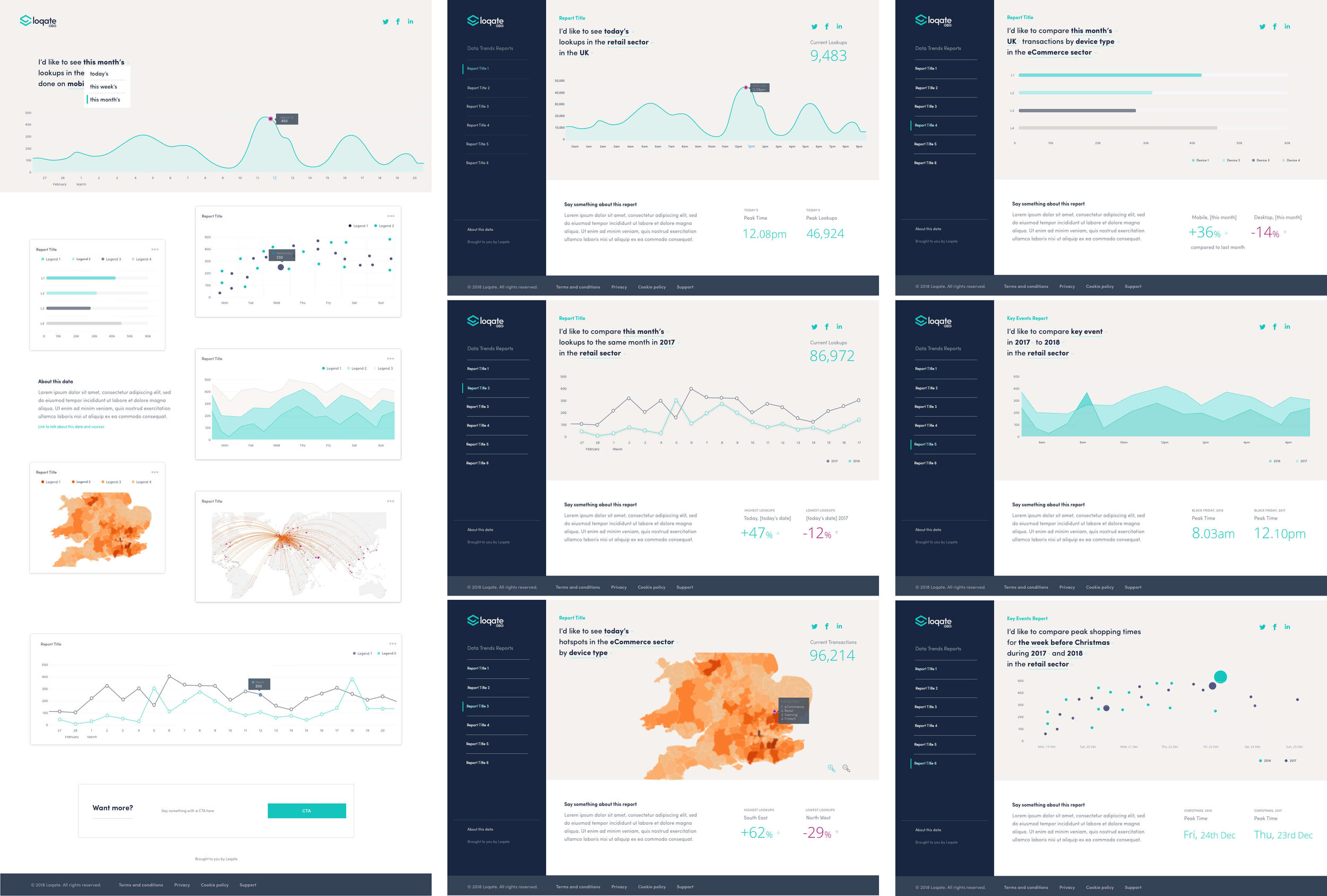
Adopt a truly user-centred design approach to enhance the UX and usage. I focused on understanding and empathising with the users to augment their experience in a positive way — ensuring that users are engaged when retrieving the insights that matter to them, and explicitly displaying filtered data along with the current filters applied; as well as indicating specific events or time intervals that may have led to a specific forecast or event; (and even incorporating tooltips along the way to explain the definition of metrics or highlighted event summaries in context).
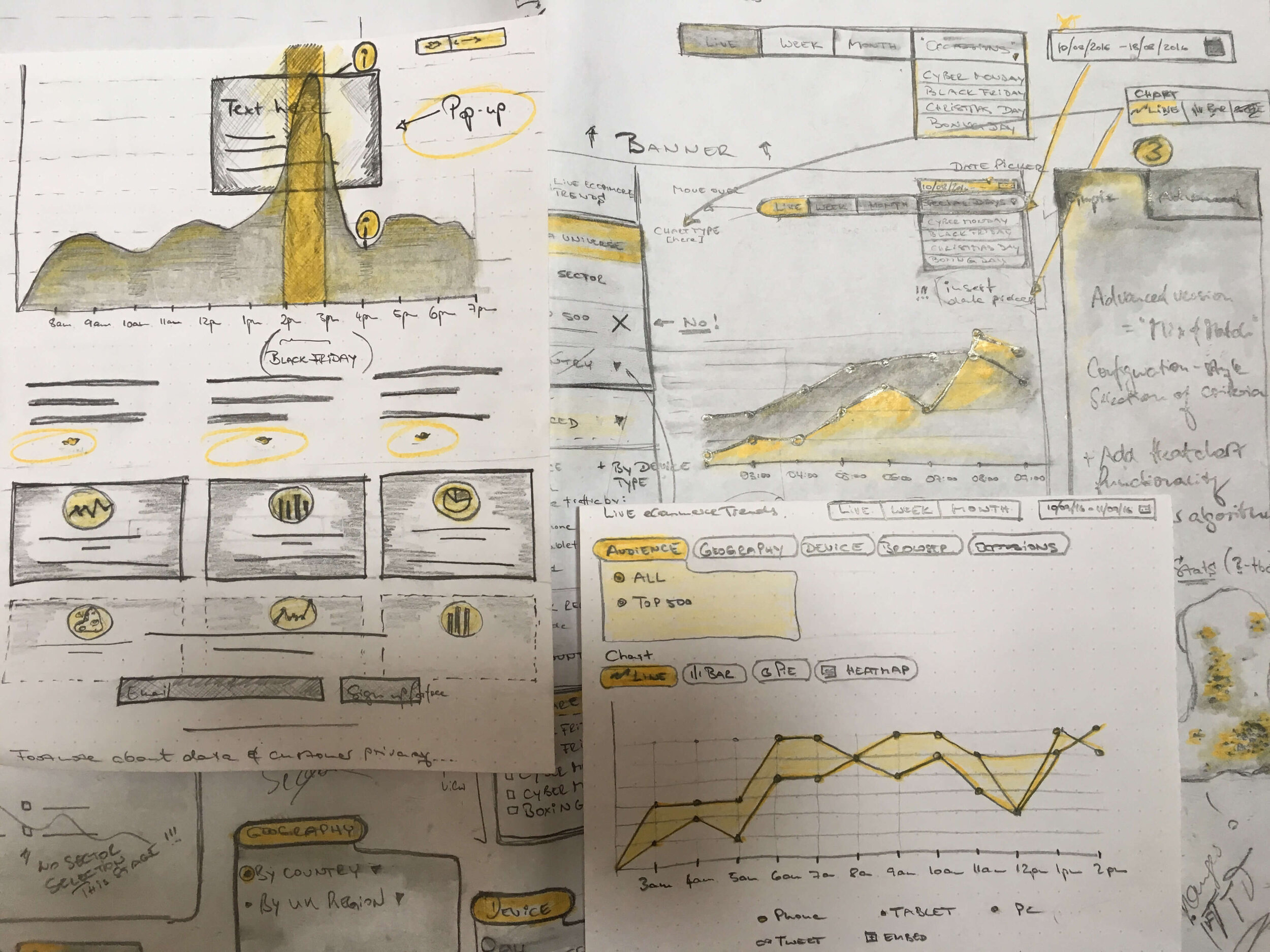
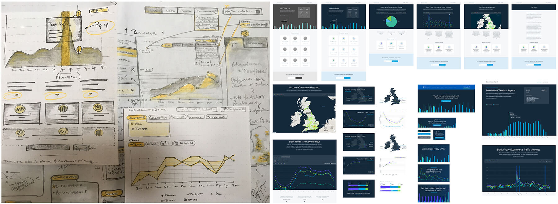
The design process was done systematically beginning with understanding anticipated user journeys and subsequently using good old pen and paper sketches, followed by building wireframes and a prototype to validate journey elements and interactions — and multiple rounds of designs created in Sketch (+ Invision). I created a modular component system based on the brand style-guide to allow the product to scale gracefully without becoming unusable. This also gave the design team the flexibility to work in an iterative process and make improvements to the interface.

Approachable Data Visualisation
Defining the user flow for this product was an entirely new kind of challenge and I was aware that the user flow can easily become a maze of tangled journeys. So, I turned the user flow into something I refer to 'insight stories approach’. My thinking derived from the fact that the typical user of this product is likely to have a set of questions when they set out to explore the insights presented to them. My job was to anticipate these questions and provide intuitive and logical ways to answer their questions and guide the user to find their answer. Finding the answer to a question does not necessarily represent the end of their journey, in fact, it might raise another question and the quest to find the answer starts over… The focus here was choosing the best possible way to visualise data points, enable easy data comparison and filter through various sets of data.
My goal was to make the dashboard easy to navigate and to provide clear ways to jump between the insights and not get lost in hierarchies. I carefully crafted the division of reports to separate the insights with a workflow that allowed for quick overviews. I used a question-answer approach to mix the data using natural language filters to build a custom trend analysis (for example: “I’d like to compare this year’s Black Friday shoppers in the UK to last year’s Black Friday shoppers”). Choosing the right chart type for the specific set of data and purpose is very important. I had to find ways in which to present the data in a visually informative manner using line charts, bar charts, heat maps, scatter and area charts, doughnuts, etc. so that users can understand trends. I experimented with mapping live information onto geographical interfaces (with the help of a data scientist!). Users can create their own dynamic display to visualise layers of information in multiple views, easily aggregating data via filters — with the ability to create complex and interactive visualisations, with the flexibility to allow users to easily customise the insights portal.
Effectively using colour means the insights clearly communicate the data and underlying trends. I identified that the best way to engage users is through ‘colour-blocking’ — balancing monochromatic background colours against brighter colours to highlight important insights and trendlines. Making the plot interactive so users can see data when they hover and labelling the bars made interpretation even faster.
The result was a successful product launch on time. The design aesthetic had to be an equal blend of clean simplicity and user friendliness — ultimately, to convey a sense of visualising complex data without the fear that it would be too complex to interpret the insights. My biggest learning in this project is to appreciate that designing insight portals that users love is as much an art as it is a science. Well designed portals and intuitive interfaces (yes, truly with the end user in mind) have a far better chance of being adopted and ultimately, provide a better return on analytics investments.
The challenge
The main challenge was to provide an intuitive way to quickly analyse and create informational awareness of complex data points whilst leveraging rich content experiences through interactive and customisable elements.
Key takeaways
Everyone uses data differently. Not all dashboards serve the same purpose, which is why it is important to clearly understand what questions users need to be answered—before designing and prototyping a solution.