

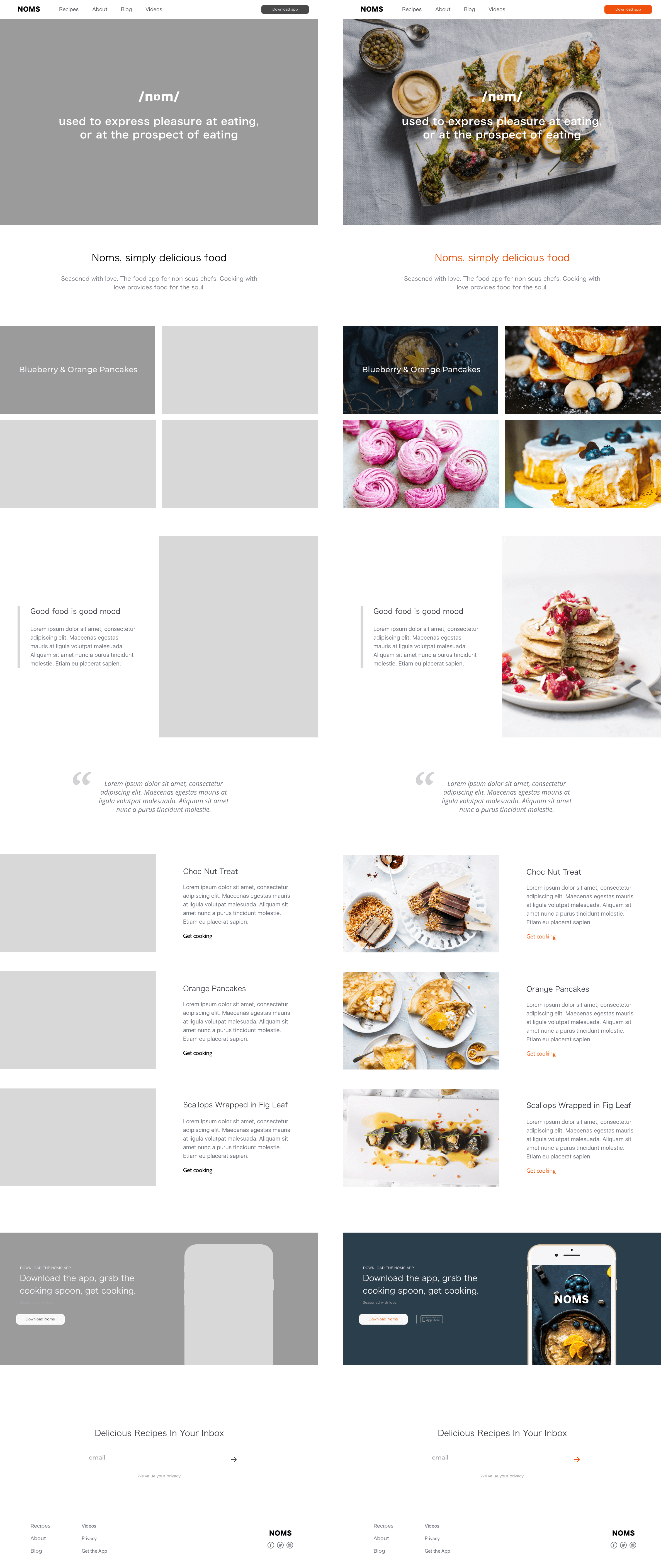
Noms. Simply delicious food. Seasoned with love. The food app for non-sous chefs.
The task on hand was to come up with an MVP for a design of a mobile application on meal preparation for novices (like myself) that combines the functionality for cooking and buying what’s necessary for the meal. The app had to be simple to use to engage the user from the first seconds and let them interact according to their personal preferences. The MVP had to include the following functionality: search bar, category filter functionality and recipe cards. My tasks can be broken down as follows: define what users are looking for and what is important to them in a cooking app; develop ideas how to satisfy these needs; build a prototype to test my ideas; and implement my ideas to create an MVP for the app - along with the desktop version. This is user-centered design. So to ensure that my product did exactly that, I conducted 5 usability tests.
This project included: Research Interviews, Information Architecture, Design Sprints, Wireframing, Prototyping, User Interface Design, User Testing, Proof of Concept.

Cooking with love provides food for the soul…
Inspire me what to cook but keep it super easy and simple. The way how the content is organised is as important as the content itself — finding an interesting recipe depends on a convenient search.

User Research and Findings
I began by asking questions that explored meal preparation habits followed by more specific questions to discover how people use (and cope with) meal preparation instructions (Describe for me what it looks like when you plan your meals? Can you tell me about your frustrations with meal planning? etc. etc.) My research yielded some interesting results which I grouped into the following categories:
Simple and Easy: Rarely do users say that they try new recipes unless they’d feel comfortable with being giving clear instructions how to prepare a new meal; and most people said they’d look for simple preparation and short cooking times in their recipes.
Not knowing what to cook: For most novice cooks it takes them a lot of time to decide what to cook and they often end up cooking a tried and tested recipe over and over again. These types of users were looking for a way to categorise meals in a very easy fashion along with mouth-watering visual inspiration to encourage them to try something new.
Ingredients: Most people I spoke with only go shopping once a week. When looking for a recipe, they want one that summarises the required ingredients in an easy to read shopping list format — no fuss, just ingredients that are easy to source.
Step by step: A lot of people feel overwhelmed when following cooking instructions. They were looking for a progress style indicator to check off their steps they had completed as they often could not remember if they had or had not completed the previous cooking step … and quite often would in fact look up how to cook an ingredient rather than a meal;
Imagery: When engaging their taste buds users will pick a recipe with a deliciously looking image.
Condensing my research findings and prioritising the needs of the users, my core focus was on:
Helping the user streamline their decision making process by designing smart filters that matter to them - I grouped recipes by categories (breakfast, dinner, salads, dessert, etc.) and hierarchy (by difficulty and time of cooking).
Indicating the ease of meal preparation via a difficulty selector: easy / medium / hard;
Incorporating cooking time functionality via a preparation time selector: 15 mins / 30 mins / 60 mins;
Stating a clear shopping list of all ingredients needed;
Adding simple check-marks for each completed step of the meal preparation process;
And finally, in the interest of keeping functionality down to an MVP, I added the ability to shortlist recipes via means of ‘liking/favouriting’ something to explore in the future; and to build a more personalised experience.
As this project was based on an initial MVP, I had to prioritise specific functionality over ‘nice to have’ features which I would have liked to include at a later stage in product development, such as dynamically changing the quantity of ingredients based on the number of people; or adding video/visual instructions step-by-step; or taking it one step further to find a way to add a ‘reverse search’ based on the ingredients a user might have in their fridge and find recipes based on the contents of their own pantry — or why not push the limits and present suggestions based on missing ingredients…
Conversion Optimisation (CRO)
Conversion optimisation was embedded into every stage of the user journey, ensuring that each interaction was designed to drive sign-ups and registrations. I started by conducting thorough e-commerce user testing, running usability sessions to uncover friction points in the sign-up and registration processes. A/B testing was key to refining key elements like CTA buttons, form layouts, and content presentation to determine which variations resulted in the highest registration rates. For example, adjusting the placement and wording of the 'Sign Up' button saw a notable increase in click-through rates, while simplifying the registration form and adding trust signals like customer reviews boosted user confidence.
I also conducted audience segmentation testing to customise the experience based on user personas, aligning the content and calls to action with their unique needs and motivations. By analysing heatmaps and click-tracking data, I was able to identify which parts of the sign-up flow captured attention and which parts were being ignored, leading to a smoother, more intuitive registration process.
The result? A frictionless experience that encouraged more users to register and engage.
The Experience
I realised that the core engagement for the user is in the discovery and learning of new recipes, thus the navigational hierarchy was crucial in the design of the prototype screens. Main emphasis on the design was to keep to a very simplistic and clean layout; allowing the mouth-watering imagery to take centre-stage and entice a user to cook up something new.
Testing the prototype gave me a window into how user think — what they enjoyed about the app and even what added frustration. I asked the participants to speak aloud while performing a set task. I noted all my observations on the PostItNotes. Then I used affinity mapping to find similarities among my observations and to group them by issue with respective potential solutions. I used a nifty app called MockinBot to create revised iterations of my prototype and reconnect any links between the screen journeys.
Conceptually, the MVP worked! The app included the features that users wanted and expected to see. Stylistically, the feedback was extremely positive, simple, stylish, easy to navigate and the imagery spoke to users’s senses and encouraged exploration of new recipes to try. Throughout the entire design process I had to remember who I was designing for: novice cooks. This app might not be helpful for experienced cooks who know what and how to cook. One of the frustrations that I uncovered was that the health conscious aspect needed further exploration on my part. Some users suggested that they would like to see a way to count and track calories by recipe — I would love to build in that functionality in future iterations of the app. The other element I’d like to explore is social integration with Facebook or Instagram to allow for seamless sharing to the user’s existing social circle - maybe one for the future…

The challenge
My biggest challenge was to adhere to the mindset of keeping the app to an MVP. My research findings included some ideas for some pretty comprehensive and diverse functionality which I had to prioritise and shortlist down to avoid overloading the screen but also to initially test a new MVP. Feature prioritisation was a real challenge…
Key takeaways
One thing I learned is that research is ever so important, and keeping the user at the centre of it all is crucial - at the end of the day, this is an example of true and very hands-on user-centred design. I also learned how much I love engaging with users to find out what they think, feel and how they use new products.