
From beads to an immersive eCommerce experience
he goal was to craft a beautifully simple eCommerce store that embodied the playful elegance of the client’s nautically themed jewellery. With a focus on personal expression and storytelling, the design needed to inspire users while seamlessly connecting desktop and mobile experiences.
The client’s digital debut was more than just a store—it was an experience. The eCommerce site brought their products and philosophy to life, carefully positioned to resonate with the brand’s core audience. By blending engaging content with eCommerce UX best practices, I delivered a frictionless, delightful journey that boosted brand awareness and encouraged product exploration.
The design mirrored the brand’s essence: simple, effortless, and understated nautical chic. Much like the jewellery, the site had to reflect seamless execution.
The ultimate question driving the project: What will users feel when they buy the product? This emotional focus ensured every element—from navigation to imagery—delivered a unified and meaningful experience.
This project included: Research, Competitive Analysis, User Personas, Journey Mapping, Affinity Mapping, Card Sorting, Tree Testing, Wireframing, User Interface Design, Usability Testing, Design System, Branding and Digital Marketing
Make it stand out.
I curated materials that captured the brand’s style, voice, and emotional resonance, translating them into a cohesive design language. This process ensured the eCommerce site not only aligned with the client's vision but also evoked the desired emotions.
Each eCommerce shopper is unique. Different types of shoppers rely on different elements of the site. Through research into eCommerce behaviour, I identified distinct shopper categories, each with unique needs and motivations:
Product-Focused Shoppers
Highly goal-oriented, these users know what they want and seek efficiency. To cater to them, I prioritised:
Descriptive product names and high-quality images.
Robust search functionality for quick product discovery.
Intuitive navigation and a streamlined checkout process.
Research-Shoppers
imilar to product-focused shoppers, researchers are goal-driven but require more reassurance before buying. Building trust was key, so I incorporated:
Detailed product descriptions and user reviews.
Transparent return policies and secure payment options.
Persistent shopping carts and accessible help/support features.
Browser-Shoppers
On the other end of the spectrum, I defined a user category which I refer to as browsers - and the opportunity to turn browsers into shoppers is great! However, their shopping experience revolves around different criteria and areas of interest to engage them:
Sections for new arrivals, sales, and popular items.
Related and suggested product recommendations.
Easy sharing options for products they like.
One-Off Shoppers
Visiting for a specific need, these users often don’t plan to return. I simplified their experience by:
Avoiding mandatory account registration.
Providing clear, concise product information for quick decision-making.
User Persona
From this analysis, I developed personas to humanise insights and align the design process with user goals. These personas guided the creation of an eCommerce experience that was empathetic, efficient, and engaging for all user types. The challenge lay in ensuring flexibility to serve all groups while maintaining a cohesive and seamless experience.
User Journey and Experience Map
My aim was to capture the essence of the end-to-end user experience, mapping out interactions from the user’s perspective. This process visually outlined:
Touchpoints: Key moments of contact across various channels.
Influences: External and internal factors that shape the experience.
"Moments of Truth": Positive interactions that build trust and leave users with good feelings, strategically placed to counter frustrations or pain points.
By identifying these critical moments, I crafted a roadmap to optimise touchpoints, ensuring a seamless, engaging, and emotionally resonant experience for users at every stage of their journey.
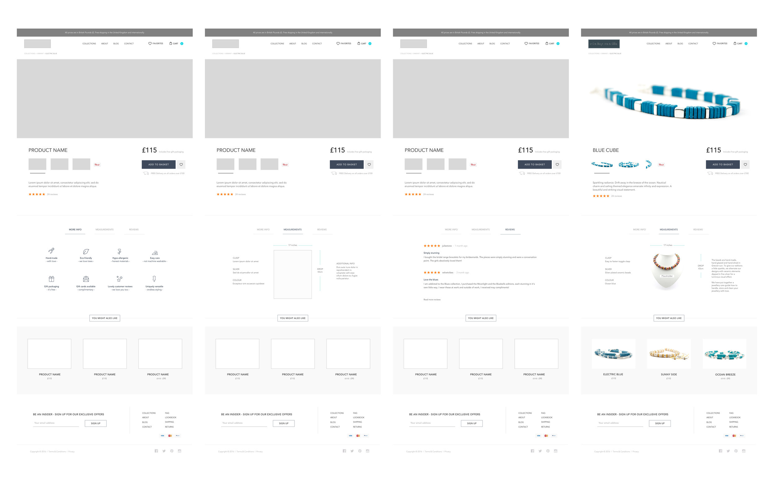
UX Wireframes
I began by summarising user needs through user stories, which helped define tasks. Using the Kano Model, I prioritised features, turning stories into actionable tasks for user flows and page wireframes. Before screen design, I developed a structured sitemap and information architecture (IA), mapping relationships and dependencies to ensure a seamless, frictionless journey.
Before jumping to the screen design, I created the overarching structure and relationship between all areas and pages of the store. I created a structured sitemap and information architecture (IA) outlining interdependencies and user flows to ensure a frictionless user journey and delightful experience. I then started my wireframing with a micro-frame … leading to low and high fidelity wireframes and prototypes. My initial research gave the clues what information was required to make an informed purchase decision.
Conversion Optimisation (CRO)
I put conversion rate optimisation (CRO) front and centre, treating every CTA, sales message and audience segment like a puzzle piece in the bigger picture of engagement and sales. I ran A/B tests on call-to-action (CTA) placements, wording, and styling to find the sweet spot between inviting and action-driven. Product messaging was refined through iterative testing, ensuring the right balance of persuasion and authenticity—because no one likes a pushy salesperson (especially online).
The result? A more compelling, high-converting experience that spoke to the right people in the right way at the right time.
Optimising the Checkout
For the checkout experience, I applied the Fogg Behaviour Model (Behaviour = Motivation x Ability x Trigger) to design a process that minimised friction.
The payment stage needed to create a trusted environment. Once users start filling out shipping information, they become the victims of the psychological principle of commitment. I had to make the process of information entering easy and fast - and above all, eliminate any user friction as part of this crucial step.
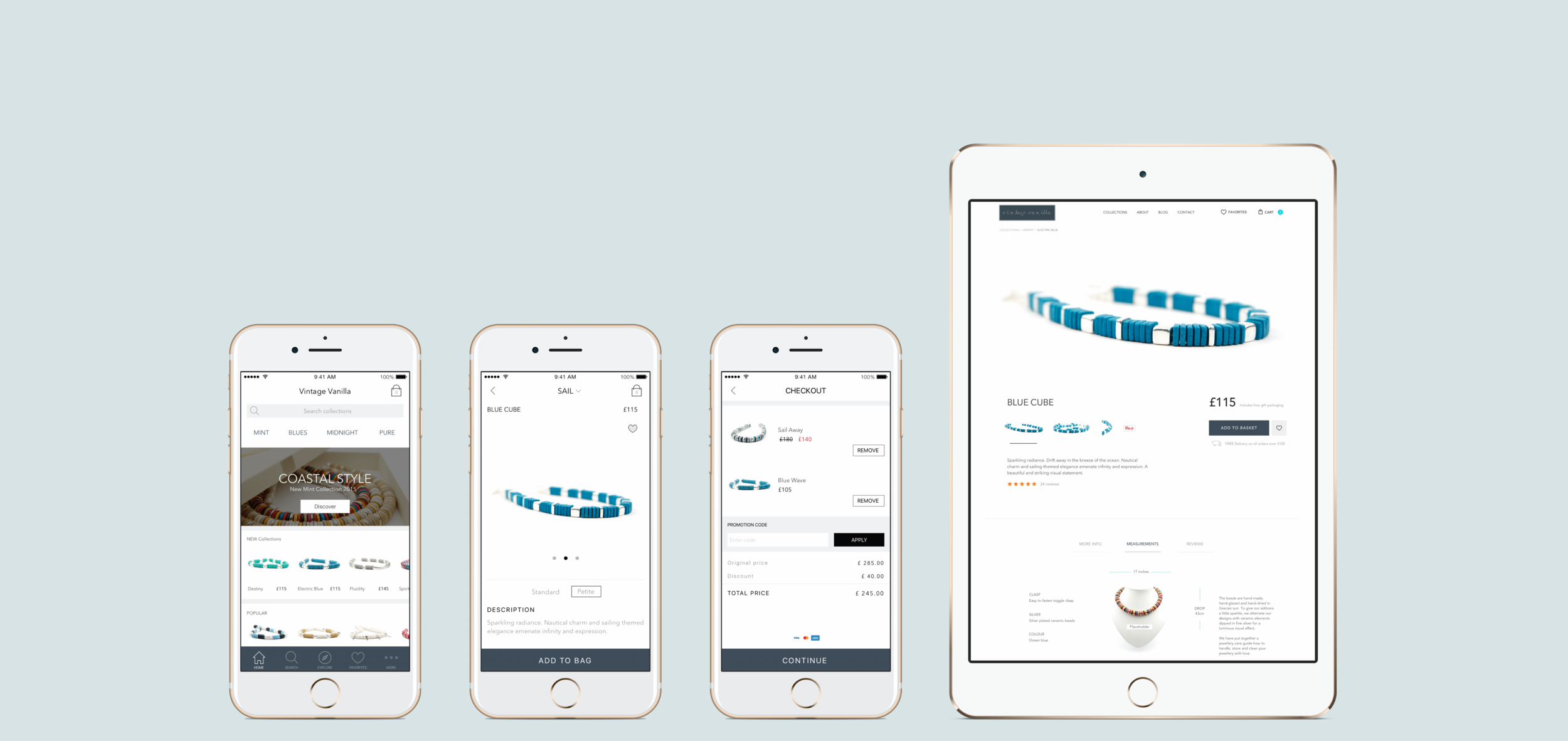
User Interface Design
The UI design adhered to the laws of simplicity, inspired by Hick’s Law, to minimise cognitive load. Buttons, images, and choices were pared down to essentials, ensuring clarity and usability.
Key design principles included:
Mental Models: Aligning with user expectations for familiarity and ease.
Colour Psychology: Using brand-aligned colours to strengthen emotional feedback.
Visual Hierarchy: Highlighting core interaction zones for instant recognition.
Aesthetic Satisfaction: Crafting a clean and visually pleasing interface that enhanced desirability and user satisfaction.
Creating the App
Starting with paper prototypes, I digitised wireframes in Sketch, iterating based on usability testing. I built high-fidelity prototypes in InVision to gather feedback and maintain project momentum. To refine the experience, I used Hotjar to analyse user behaviour, uncover insights, and implement data-driven adjustments.
The result was a seamless and immersive shopping experience, combining robust UX principles with intuitive UI design to delight users and drive engagement.
Social Trust and User-Generated Content (UGC)
At Vintage Vanilla, social interaction was key, encouraging customers to share their experiences with products across social media. The concept of pop-up stores further enhanced this by providing a tactile, immersive environment where customers could fully engage with the brand’s coastal-inspired ethos. Alongside product sales, the pop-up store offered educational experiences on ocean cleanups and coastal living, aligning with Vintage Vanilla’s mission.
Nielsen’s research shows that 92% of consumers trust “earned media” from friends and family, making social touchpoints critical for building brand trust. By featuring user-generated content in the lookbook—such as pictures, reviews, tweets, and blog posts—the brand encouraged customers to amplify their own voices and experiences. This approach shifted the focus from self-promotion to authentic, peer-driven brand awareness.
The User Generated Content was particularly impactful due to its raw, authentic nature—real customers sharing real moments with the products. This honesty and transparency created a deeper emotional connection with the brand.

The challenge
A good e-commerce user experience is crucial to all shopper types, but different elements take on significance based on the shopper's goal. Each shopper type requires a tailored approach to meet their specific goals—whether product-focused, browsing, or researching—while ensuring a smooth and enjoyable overall experience.
Key takeaways
In this project, I considered various elements:
Operational Simplicity: Streamlining processes for ease of use.
Visual Design: Using visuals effectively to support the product rather than overwhelm it.
Brand Tone and Voice: Crafting a tone that aligned with the brand’s identity and resonated with users.
Holistic Customer Experience: Ensuring the entire user journey, from website to pop-up store, created a cohesive and delightful experience across all touchpoints.
By balancing these factors, I created an eCommerce experience that not only catered to different user needs but also fostered a sense of community and connection with the brand.